


Preview
Case Study
ION
Brand Architecture • Brand Development
Originally created in 2016 by creative agency FutureBrand, the ION guidelines didn’t solve a gap with business structure, making the brand difficult to understand.
As Lead Designer I took ownership of the creation and execution of the templates.
Client: ION Group, Enterprise
Role: Brand Designer, Brand Development
Challenge & Approach
A house of brands.
Though vast and detailed, IONs intended style guide didn’t capture the structure and livelihood of ION. From mergers happening up to twice a year, to a library of products on the website, the brand needed a visual system that encased portfolios and their products. This system needed to work through all of branded touch-points, ensuring a consistency in visual language with intended order and clarity.
Refocusing the identity.
With a clear understanding of the brand structure, the identity was reviewed to restructure elements in a way that could sustain the structure and growth, while reflecting ION’s core values. Which led to revising the identity’s mood from multi-colored expression to a grounded, but bold, look.

Lock-ups
A clear portfolio.
Creating distinction at this level was very important, because it helped viewers understand which portfolio of products to look for.
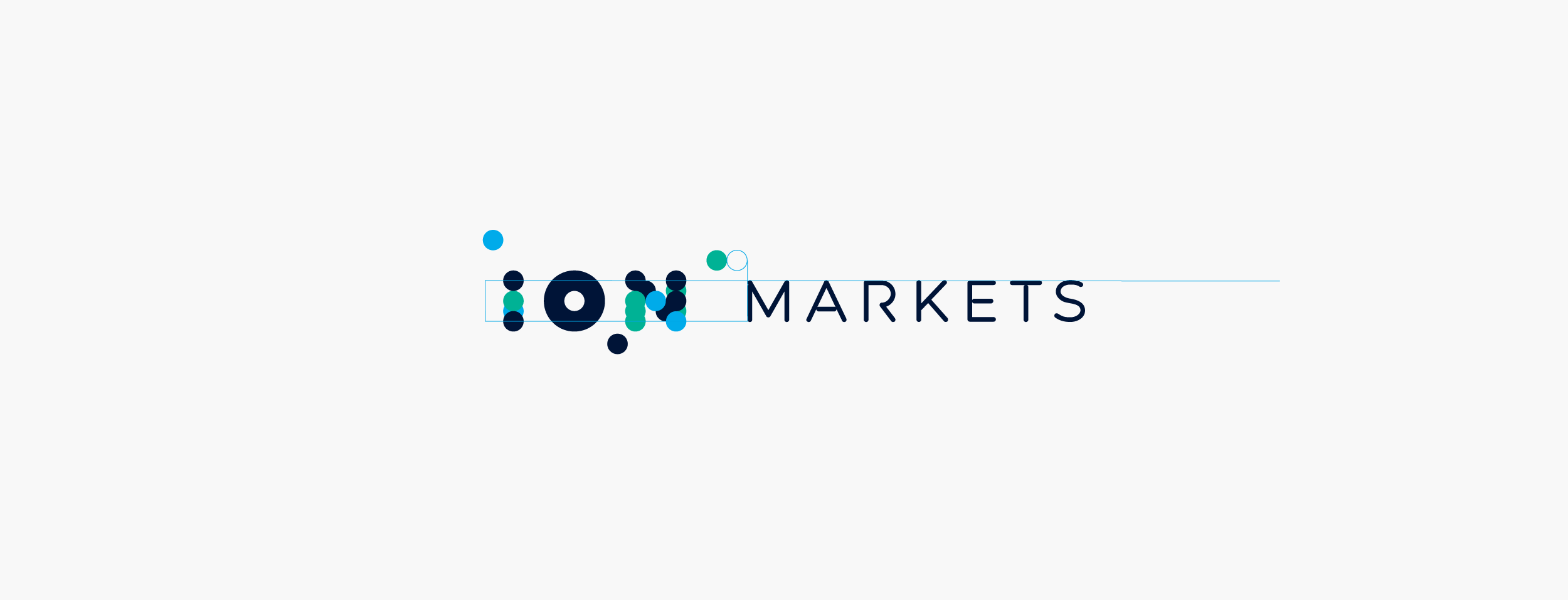
Details of how the horizontal lock-ups were measured against the logo
Portfolios
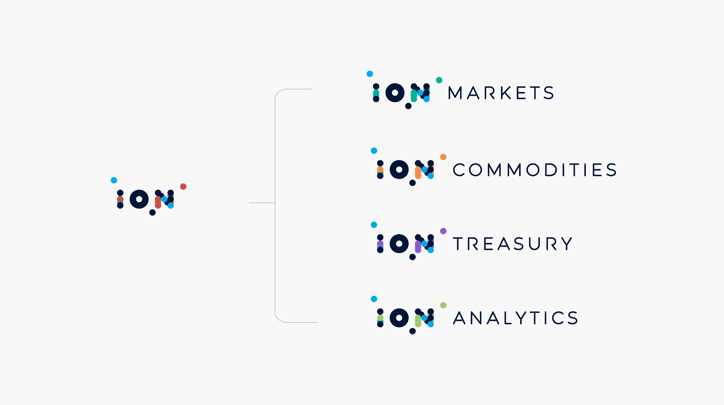
A color was assigned to each portfolio using ION’s color palette, followed by a lock-up using ION’s unique designed font “Expression”. Originally intended as a way to create visual flair on words like “Automat[ion]”, “Innovat[ion]”, they served as a way to create a branded logotype.
Products
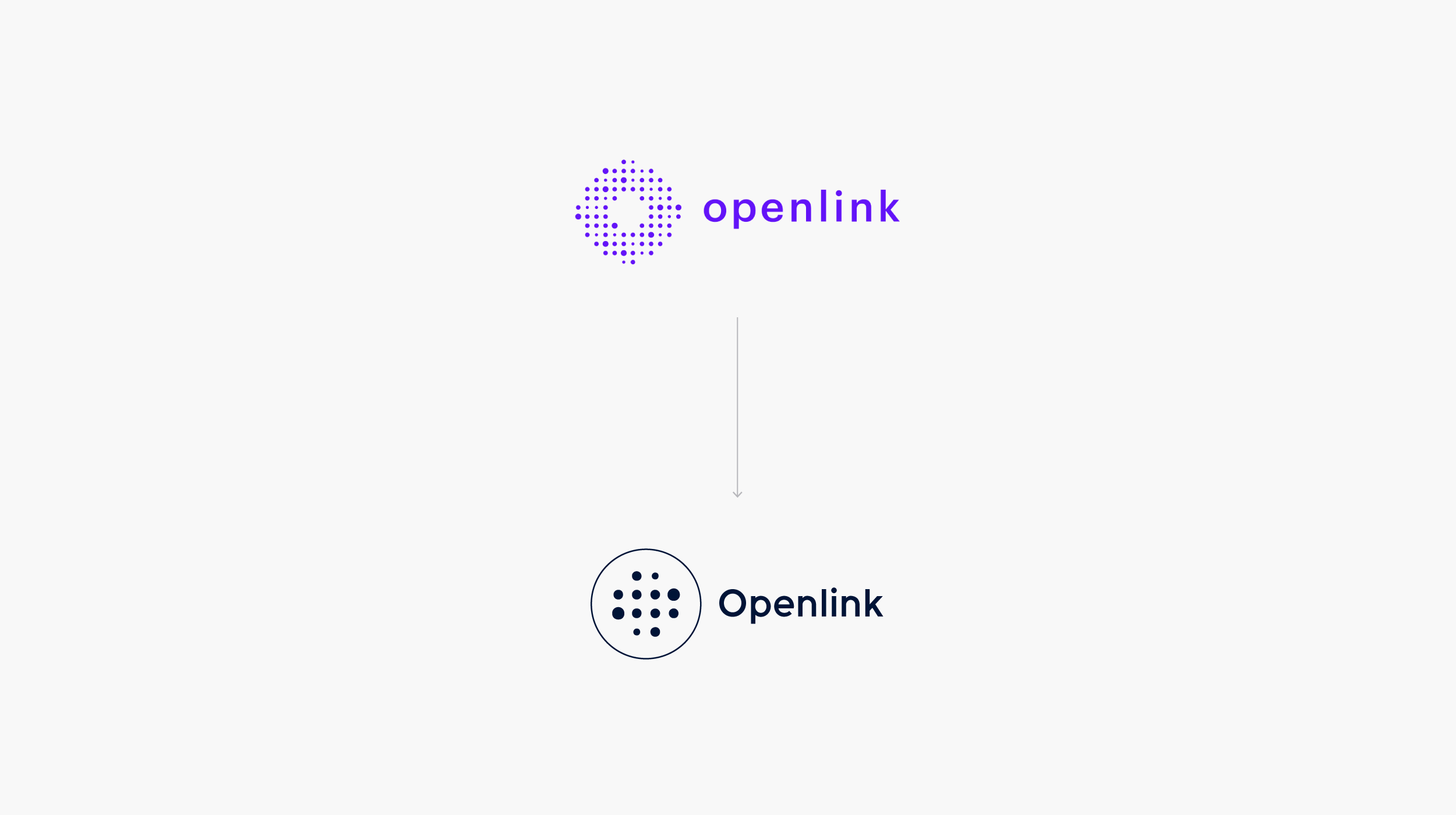
To find a way to unify over 40 products, the solution was to encase their logos in a circle and replace their logotype with IONs font. In many cases, like Openlink, the logos needed to be reworked to account for legibility as software icons.
Building Structure
Once the portfolio and product lockups were strategized, the product, content, and social media team provided structure for all their marketing collateral, to build a system around business needs.

Arrangement of nucleus and ion
Graphical Elements
To refocus ION’s mood, elements like illustrations and their concepts were reframed to not take center stage. A concept that was retained was the relationship between the center of the ION logo (nucleus) and it’s surrounding circles (ions).
By maximizing the size of the nucleus and creating a relationship with a single ion, the negative space created a sophisticated balance that mirrored ION’s brand direction.
With various arrangements, they provided the foundation of the graphical treatment that makes ION today.
The A4 Collateral System
Having the fields of content finalized, the work was to create a system that gave prominence to the portfolio, product and type of document, while being flexible for content in various lengths.
A grid was created to provide structure and design leeway, while content was anchored to paragraph and character styles. Specs were documented for product lock-up placement and size, to maintain consistency, as the CC Library was used to host the assets.
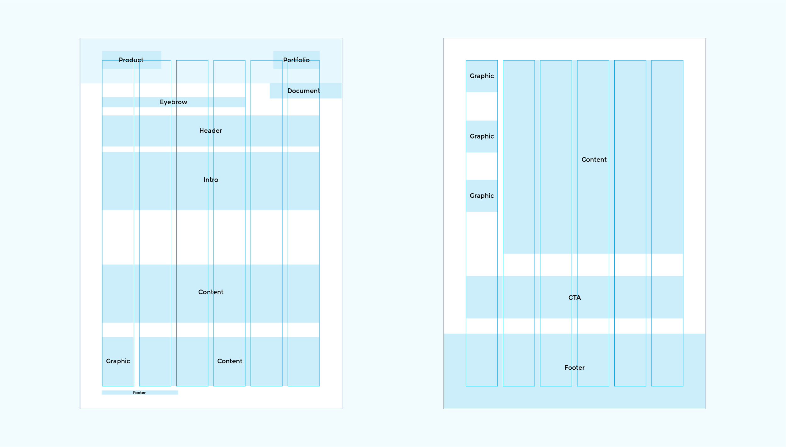
Front and back of template structure
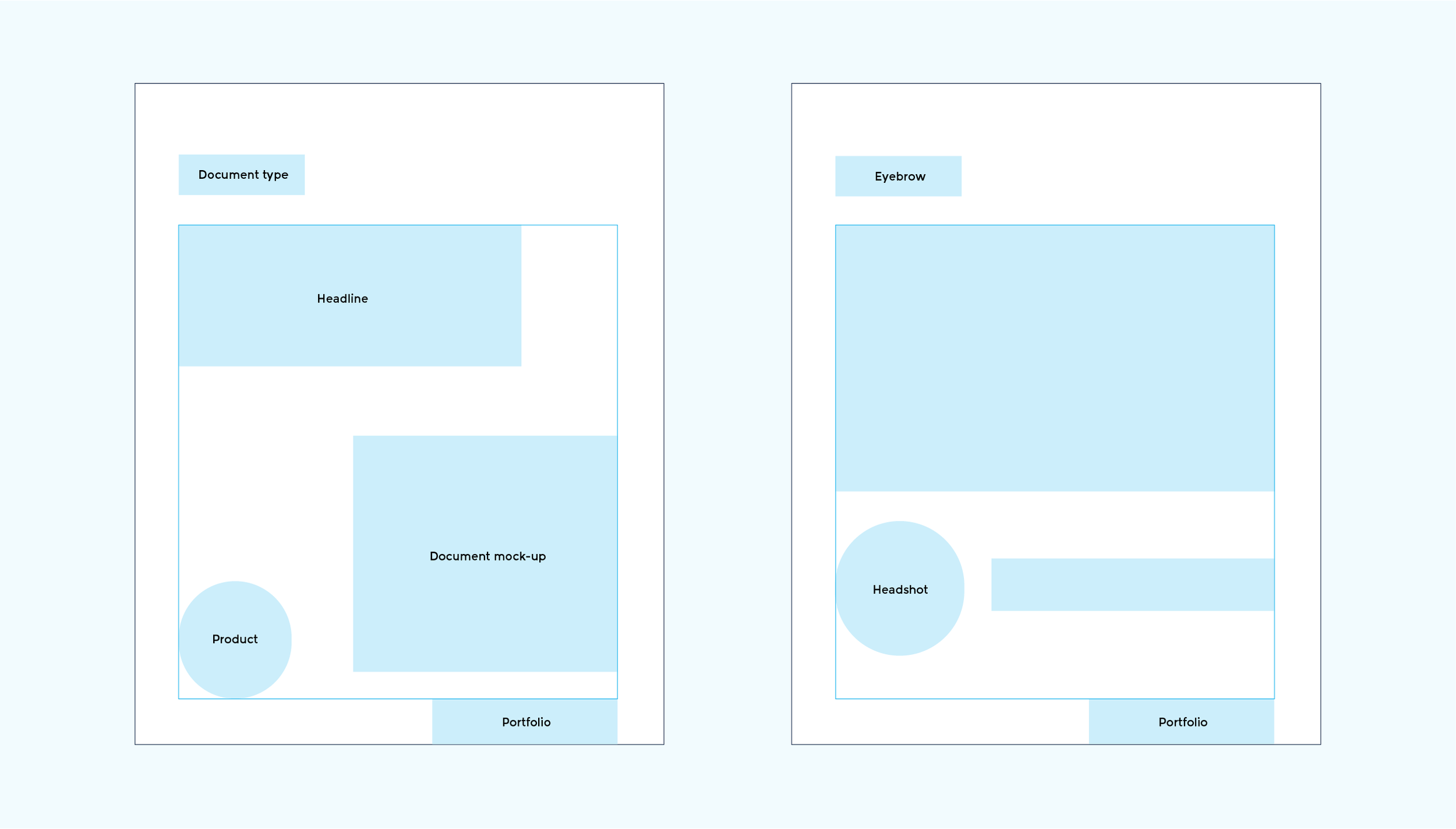
Document release (left), Event speaker (right)
The Social Media Tile System
A series of social media tile templates were created following ION’s presence on LinkedIN and Twitter.
The system covered product updates, event communication (reminder, speakers), document releases (case studies, fact sheets), award announcements, among other posts.
Tradeshow Booth System
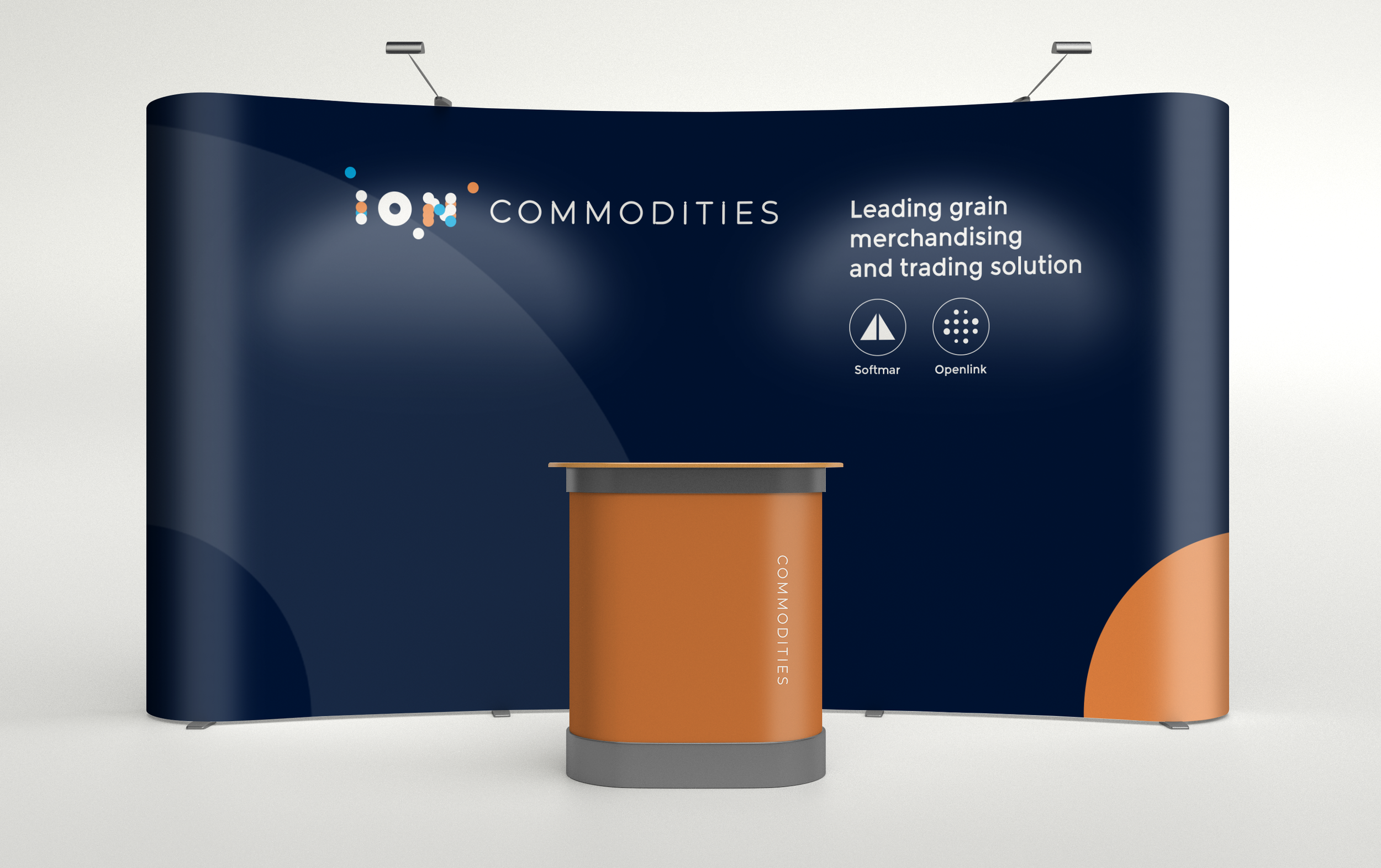
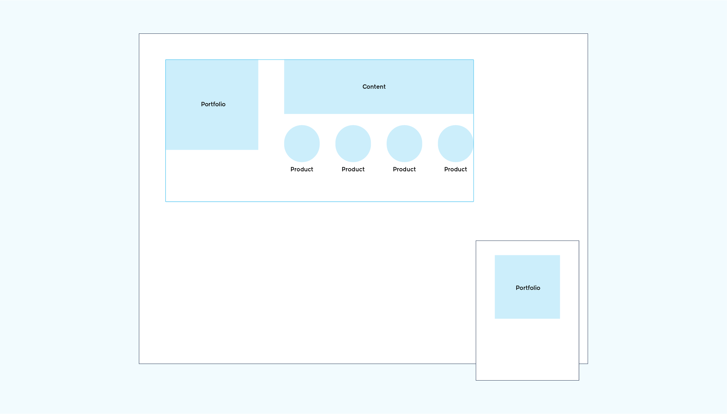
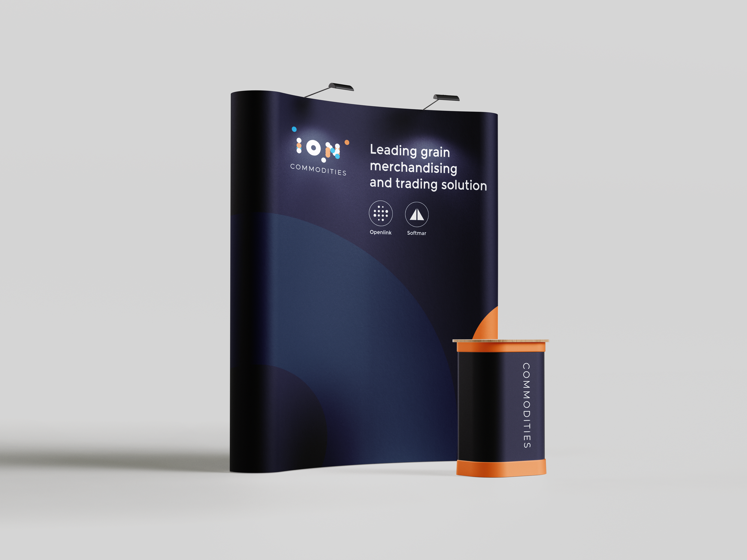
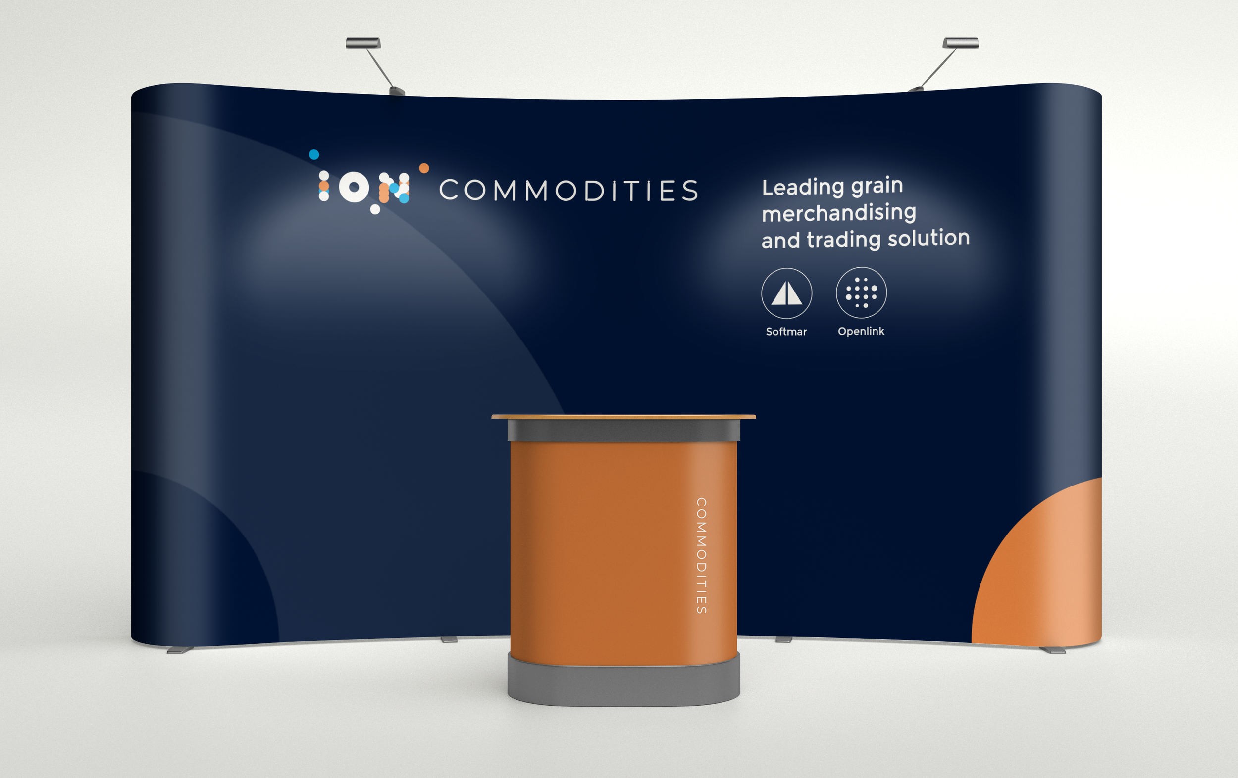
IONs high-volume event presence led to creating a general template serving as a way to speed production, providing a general framework for designers to structure designs.
These structures took into account legibility from a distance, and areas dictated for content that prevented blockage from attendees.

The Brand in Motion
With the foundation determined and built, what followed was implementing the new identity. Here’s how it turned out.
Outcome
A distinct debut and a foundation for future editions
The identity debuted at ION’s India-region hackathon, receiving positive feedback from participants and organizers.
The launch brought the system together across event communications and materials, establishing a distinct visual presence within the broader ION brand. Its modular structure and versioning approach provided a foundation for future editions to build on.
The project shows how I connect audience insight with brand development—using a relevant creative idea to shape an identity, its tone, and the ways people encounter it.