
Mock & Proper
Brand Strategy • Visual Identity • Art Direction
Mock & Proper is a concept brand offering low- and no-alcohol wines and fine spirits for people who want the ritual of drinking without the aftereffects. Built around the idea “Impeccably Improper,” the identity brings together refined imagery and bold graphic expression to challenge expectations of what drinking—and choosing not to drink—can look like.

Challenge
Make drinking differently feel just as desirable.
Alcohol alternatives often feel like a compromise. The opportunity was to create a brand that feels desirable on its own terms, with the confidence and character to belong in the same social spaces as traditional wines and spirits.
The identity needed to balance sophistication with irreverence, appealing to a design-conscious audience that values both the experience of a drink and the freedom to make different choices.
Approach
Challenge the conventions. Keep the ritual.
I leaned into the tension within the brand’s name, pairing the sophistication of “proper” with the playful attitude of “mock.” That contrast guided the art direction, bringing a sense of occasion to the imagery while leaving room for personality and humor.
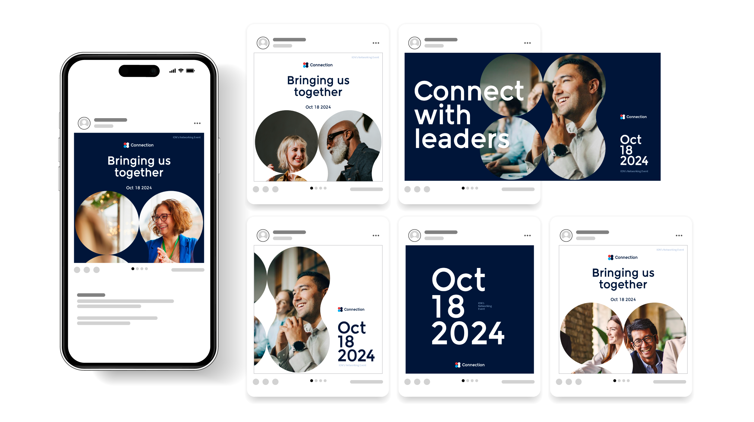
The compositions were developed for social placements, with deliberate negative space allowing the campaign copy and imagery to work together. Color variations explored different expressions of the same concept while maintaining a consistent visual direction.
The Visual Identity
Refined imagery. Rebellious graphics.
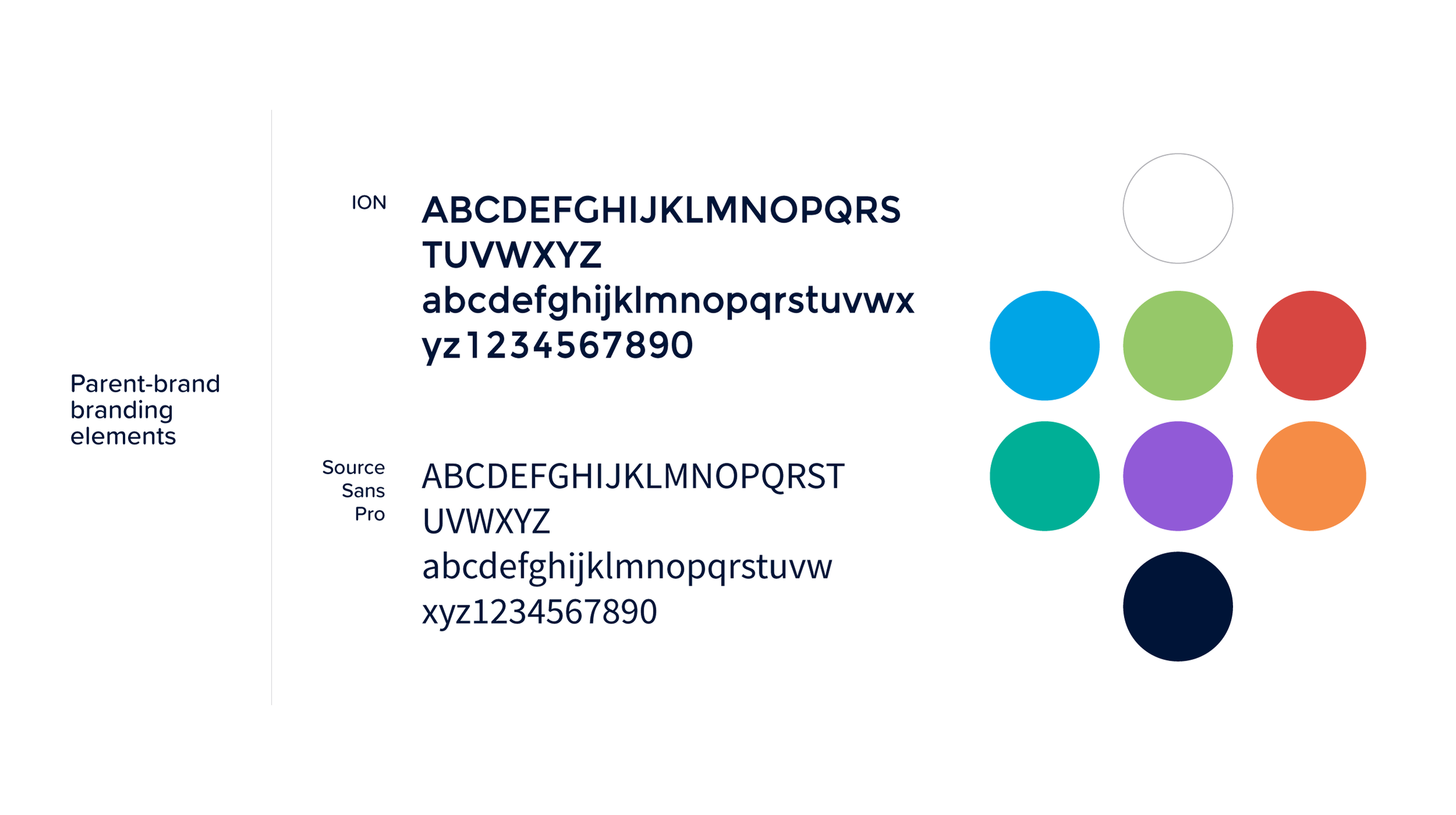
The bold logo gives the brand an assertive presence. Its visual weight brings an unexpected edge to refined photography, creating a deliberate tension between polish and disruption. The lock-up carries that same balance, bringing the name together as a distinct statement with enough presence to anchor the surrounding design.
Color reinforces the brand’s expressive character. Bold fields and contrasting combinations give the graphics room to interrupt the composition, while the photography adds depth, atmosphere, and sensory appeal.
Typography, scale, and placement extend this approach throughout the identity. Graphic elements introduce moments of surprise, while considered spacing preserves a sense of sophistication. The result is a system in which the rebellious attitude comes through the design itself.

The brand in action
Carry the attitude through every touchpoint
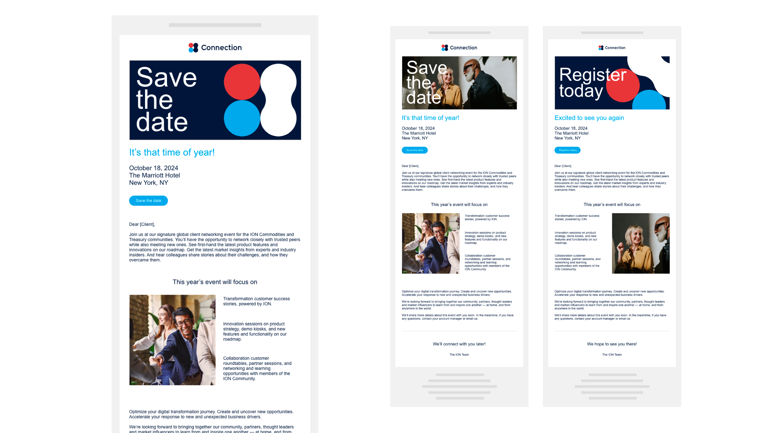
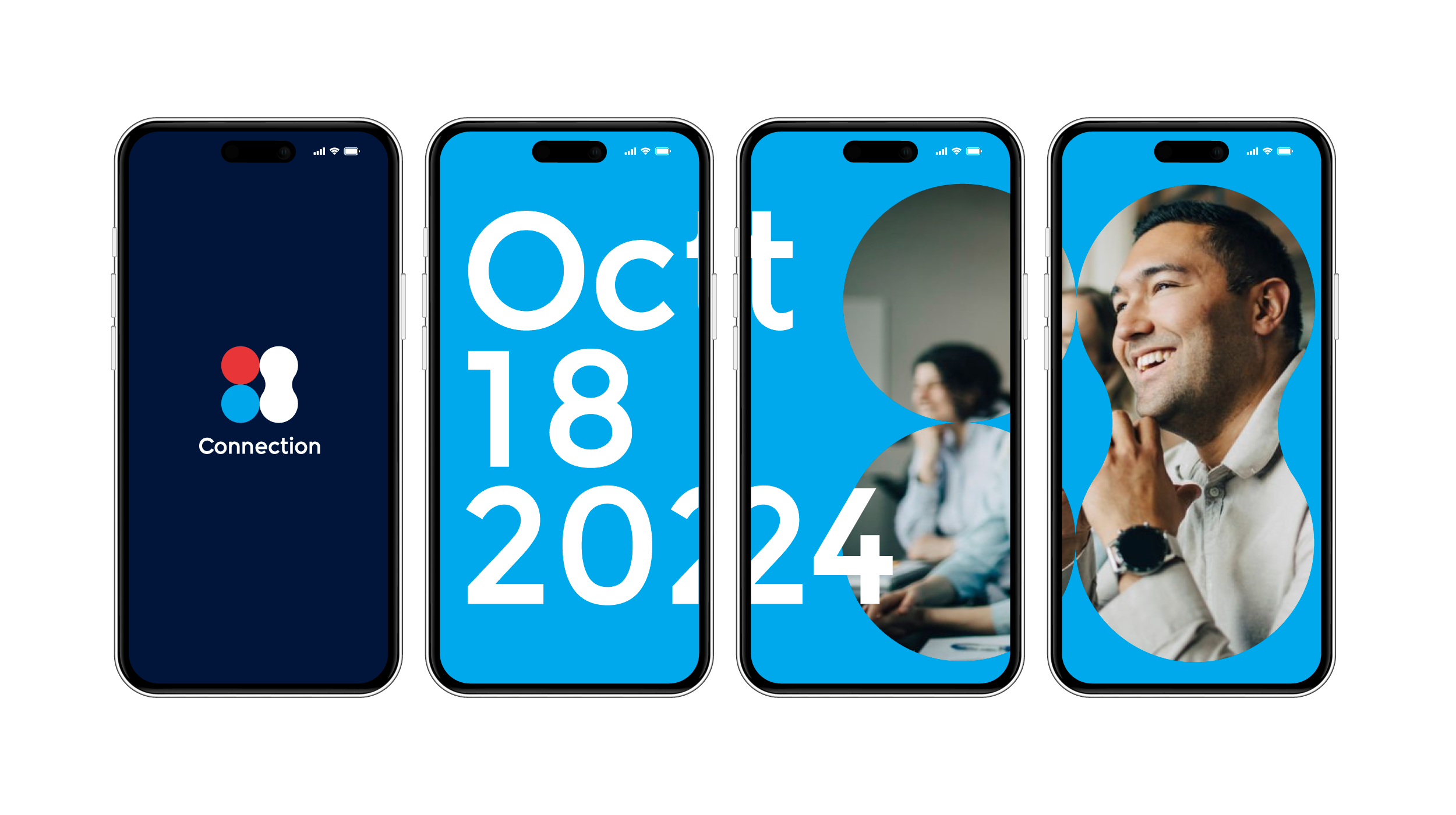
Across brand applications and campaign imagery, the same relationship remains central: refined photography paired with graphics that challenge its formality. The system creates consistency through attitude as well as appearance, allowing different compositions and color treatments to feel unmistakably part of Mock & Proper.


Outcome
A bold identity for a different drinking culture
A brand identity that makes drinking differently feel confident, desirable, and a little rebellious. By placing bold graphic expression within an elevated visual world, Mock & Proper turns its central belief into a recognizable presence: there is more than one way to enjoy the ritual.
Let’s keep the conversation going
If you’d like to know more about my work or discuss an opportunity, I’d be happy to connect.