Connection
Event Identity
ION’s Connection event series was created to bring clients together — a space for networking, conversation, and shared experience across industries. Originally launched as a virtual event, it evolved into a live, multi-format series, and with that the opportunity: to create a brand system that could embody the idea of connection while scaling across a complex and global organization.
Challenge
As Connection evolved into a live event series, the challenge shifted from geographic scale to brand architecture.
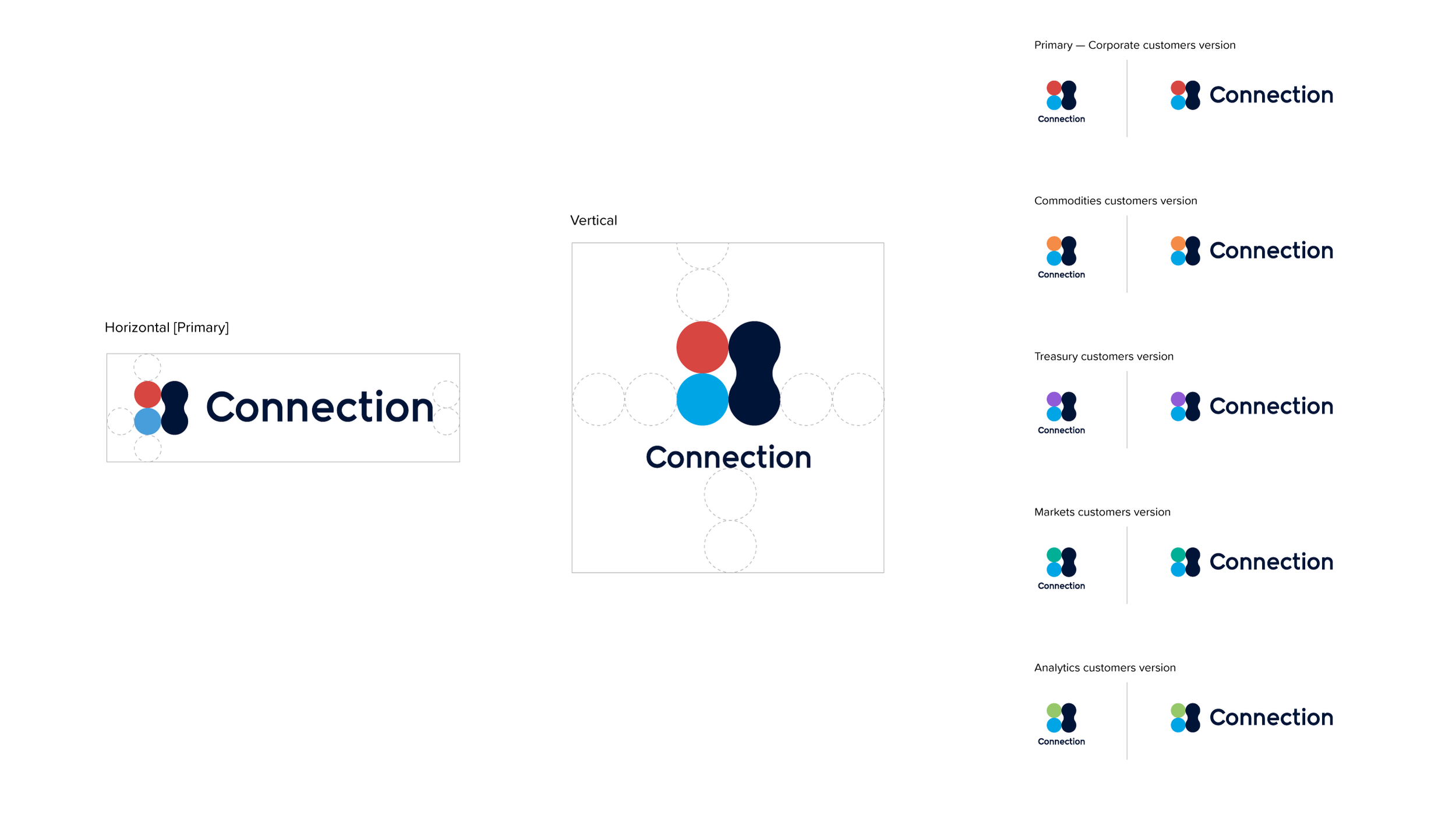
ION's ecosystem spans multiple portfolios—including ION Group, ION Treasury, ION Commodities, ION Markets, and ION Analytics—each with its own established identity, lock-up, and color system. The task was to create a unified event brand that could represent ION Group as a whole while adapting to the needs of individual portfolios and audiences.
The solution required a flexible visual system that could evolve through color and composition while maintaining a recognizable core identity.
Approach
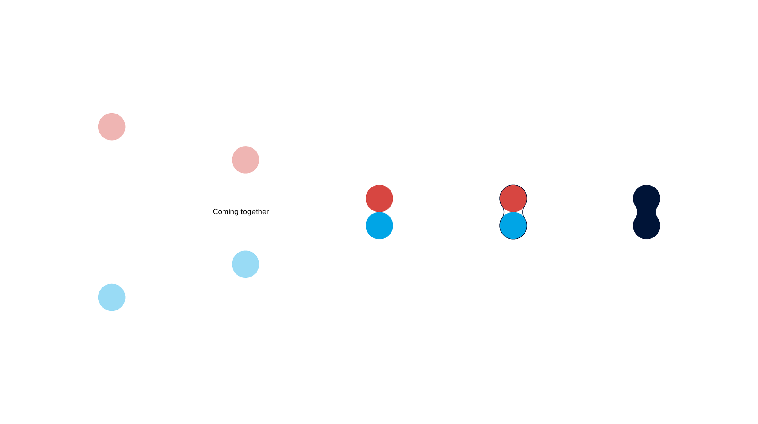
The foundation of the system was a simple idea: coming together.
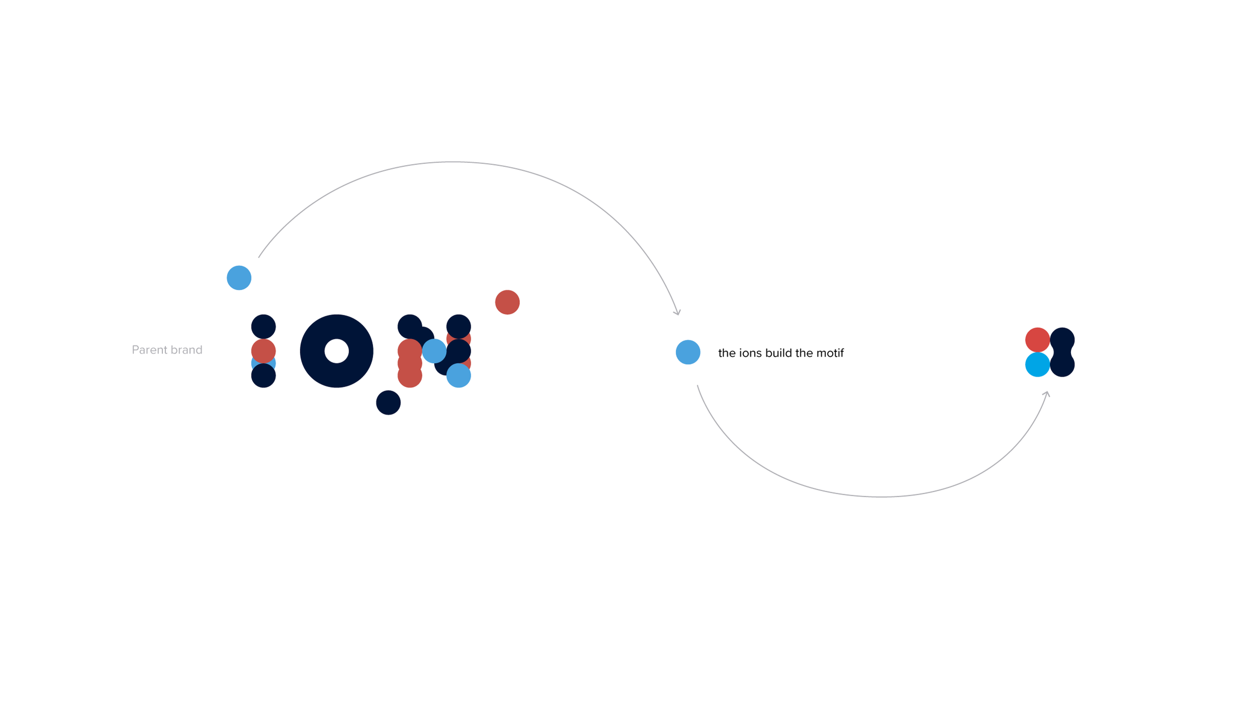
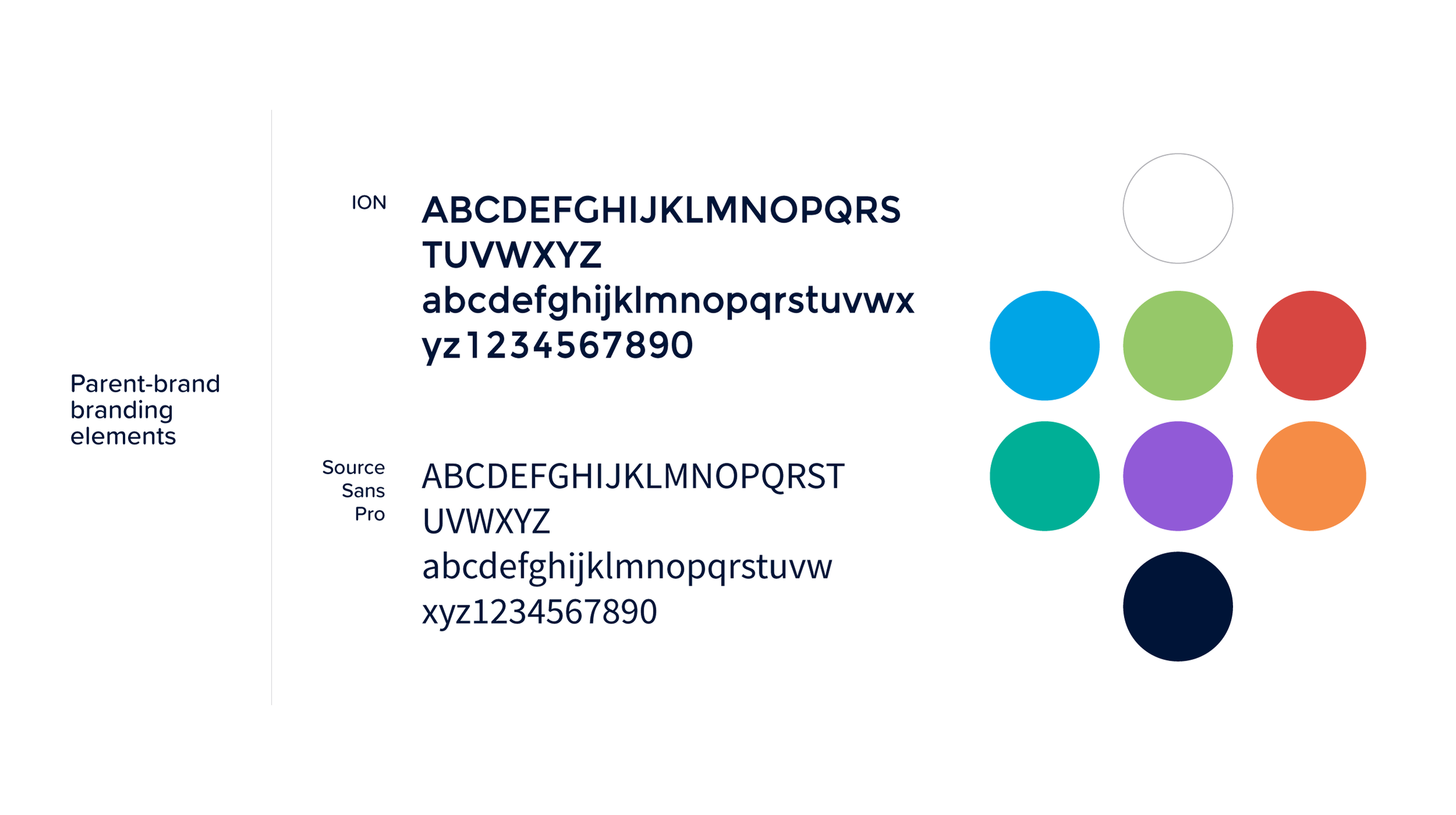
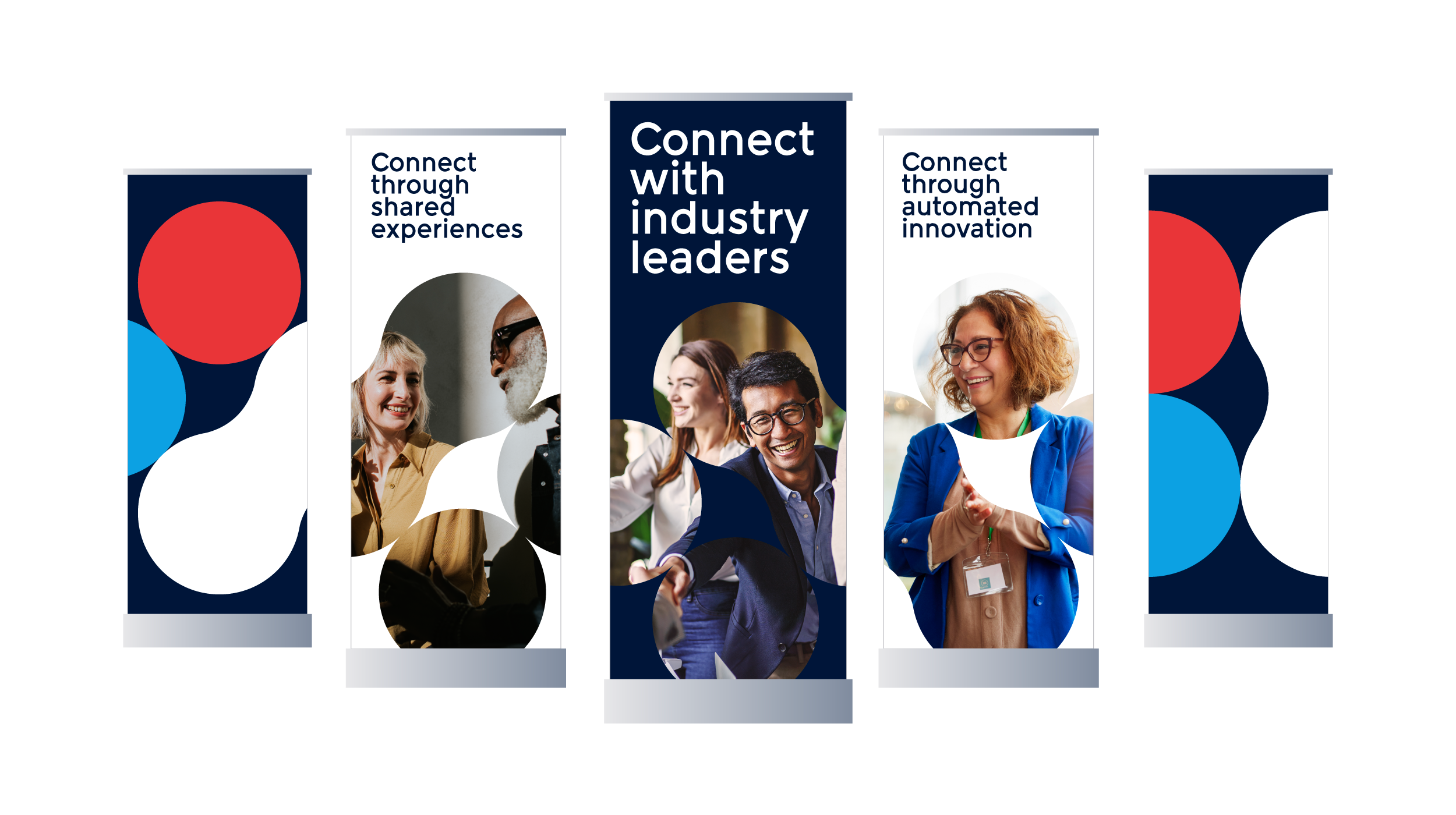
Drawing from ION's existing brand language, I explored the ions and nucleus forms that define the company's identity. These shapes naturally suggested movement, interaction, and convergence, which became the basis for a central visual motif.
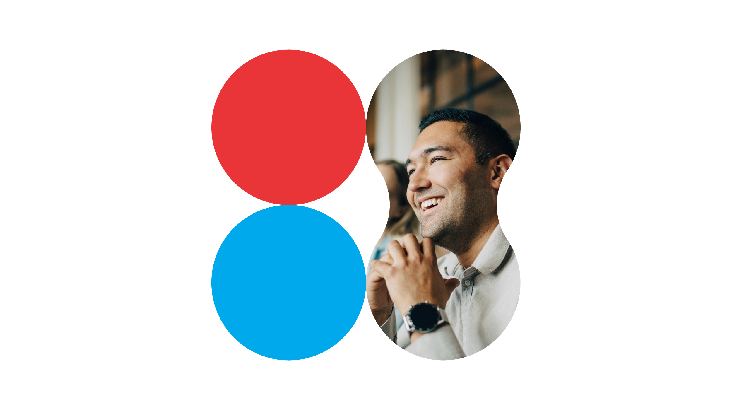
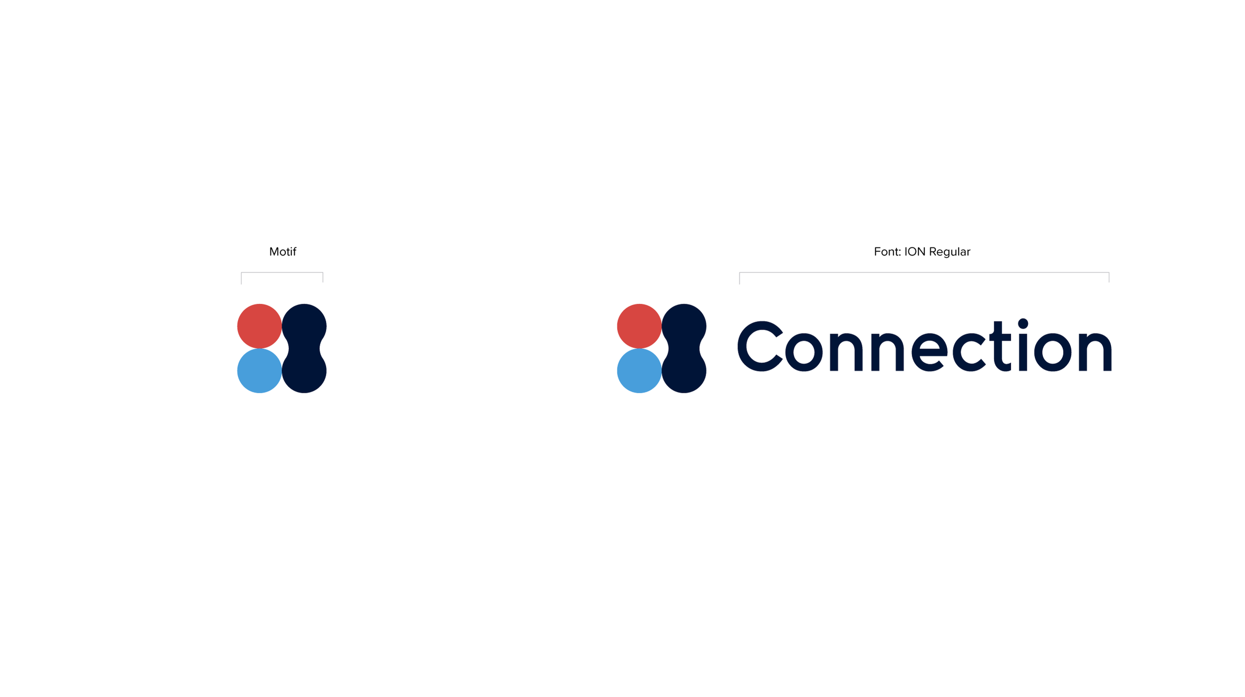
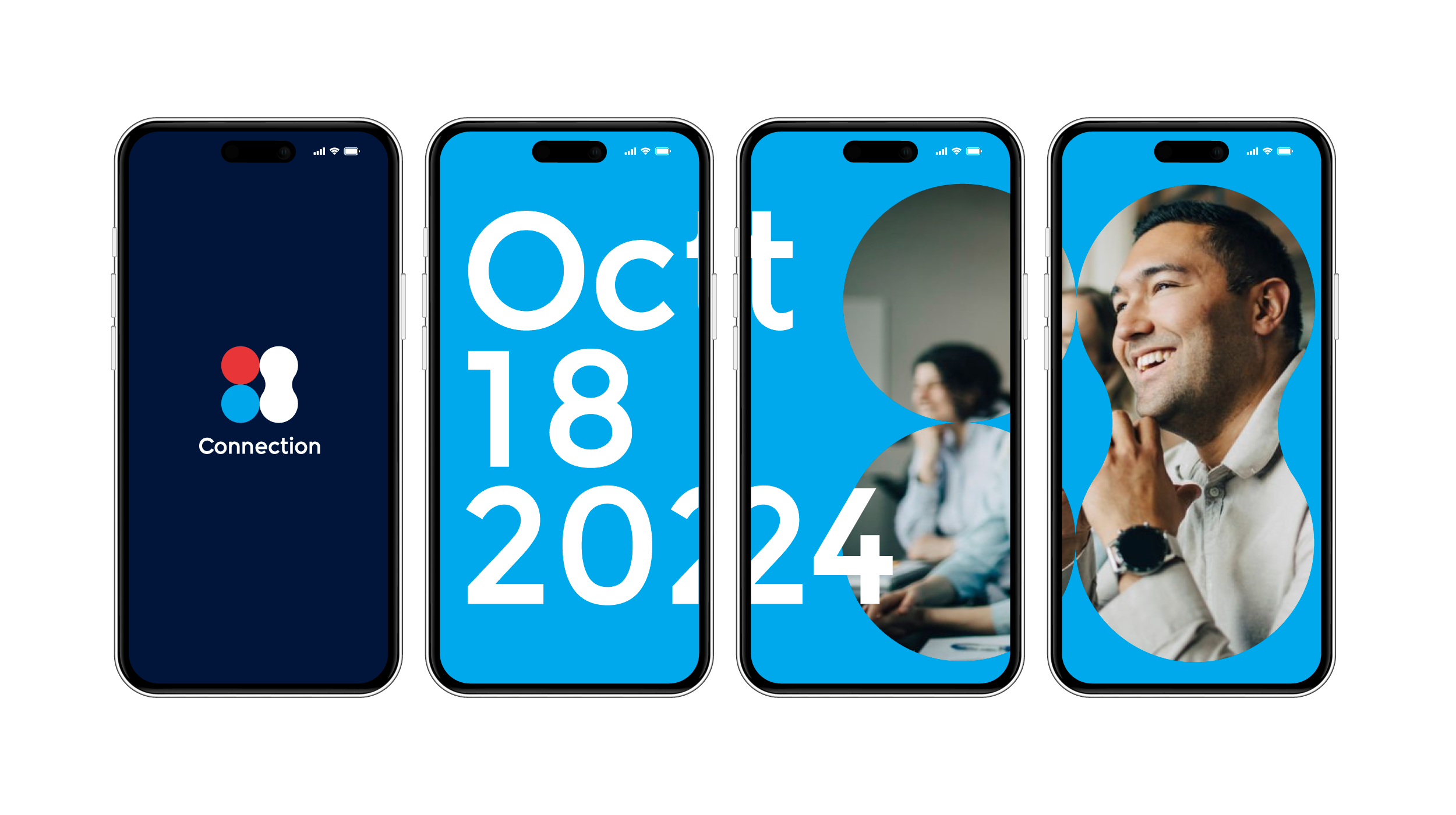
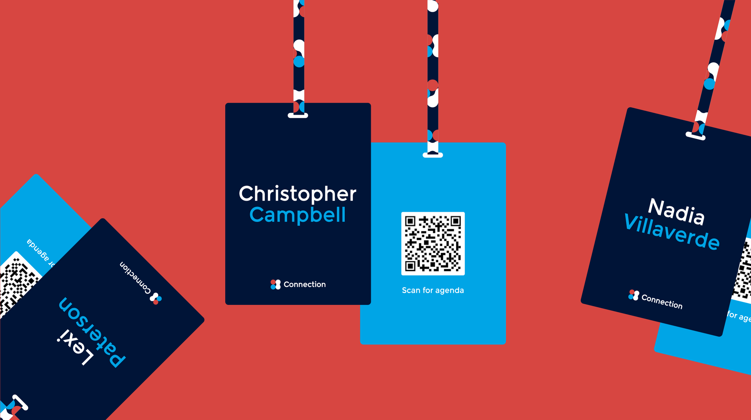
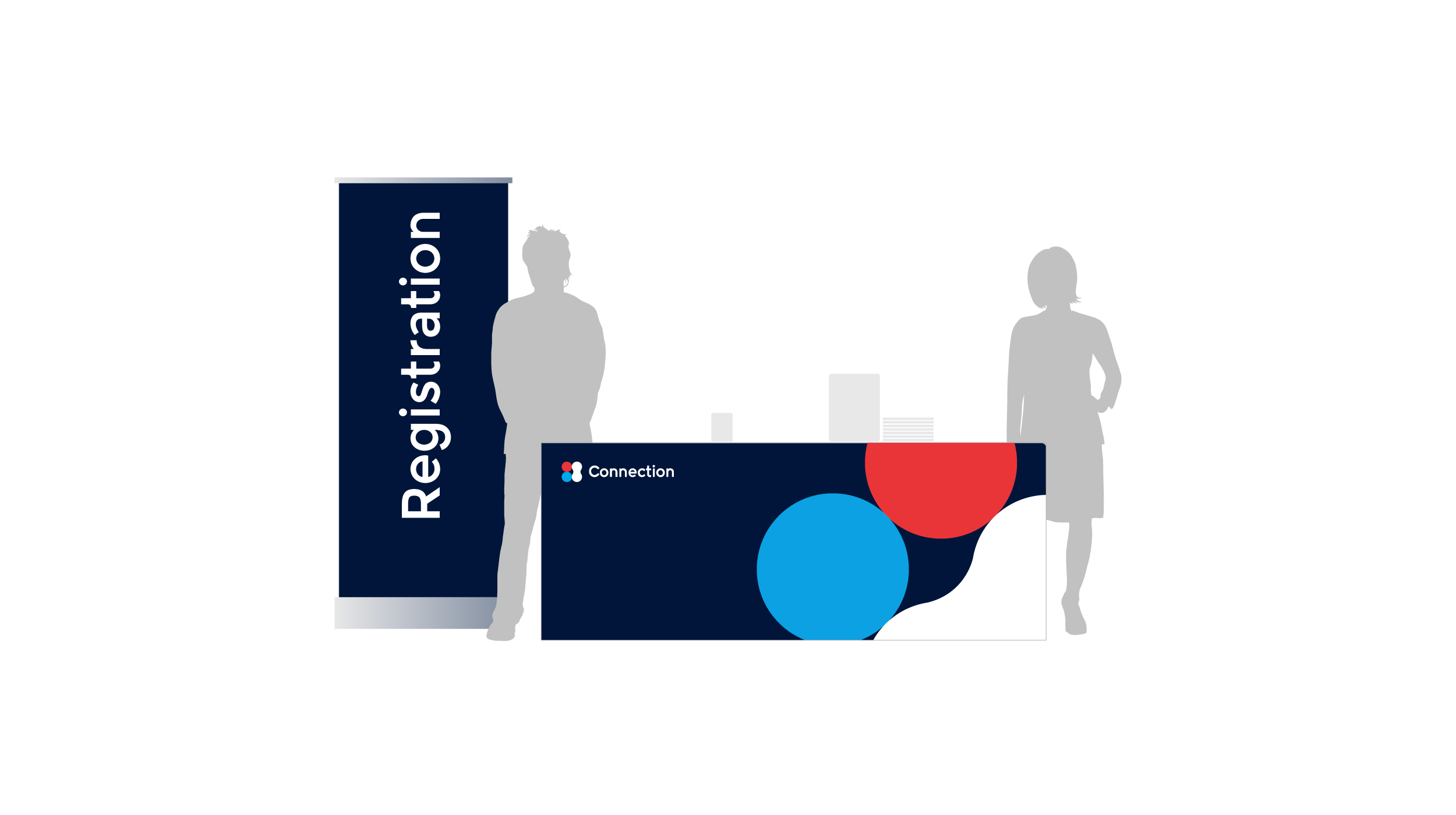
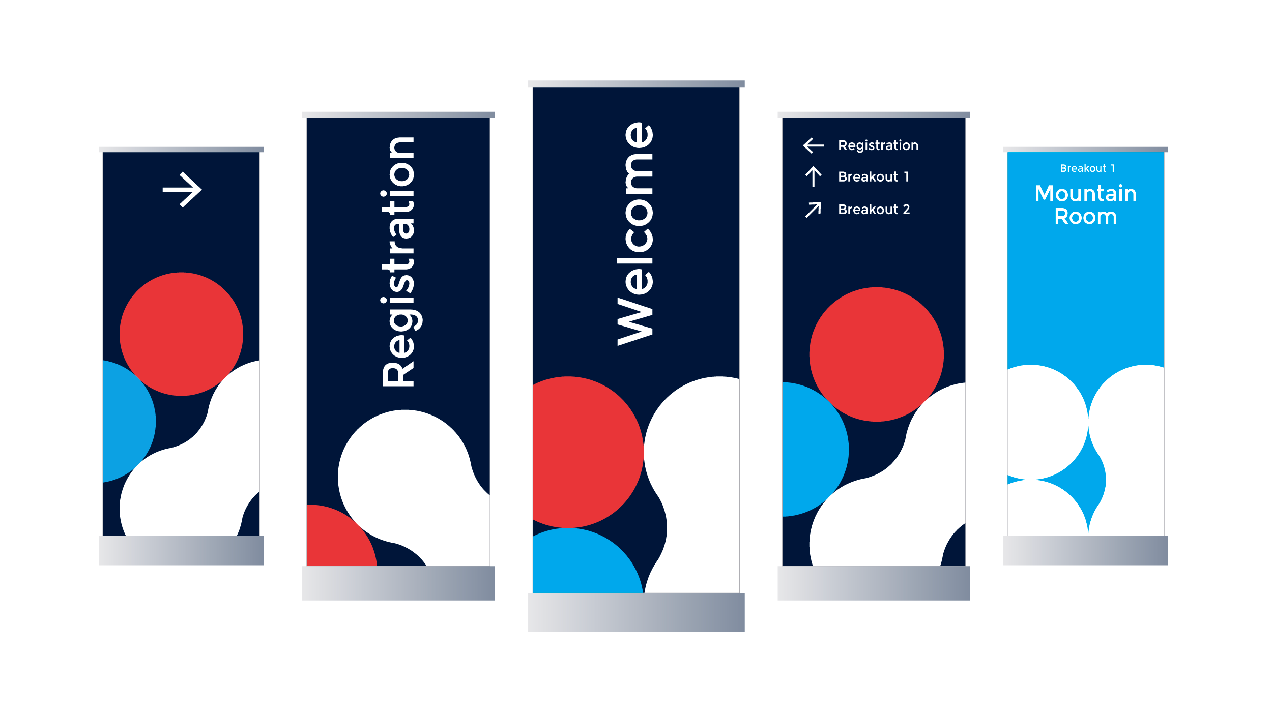
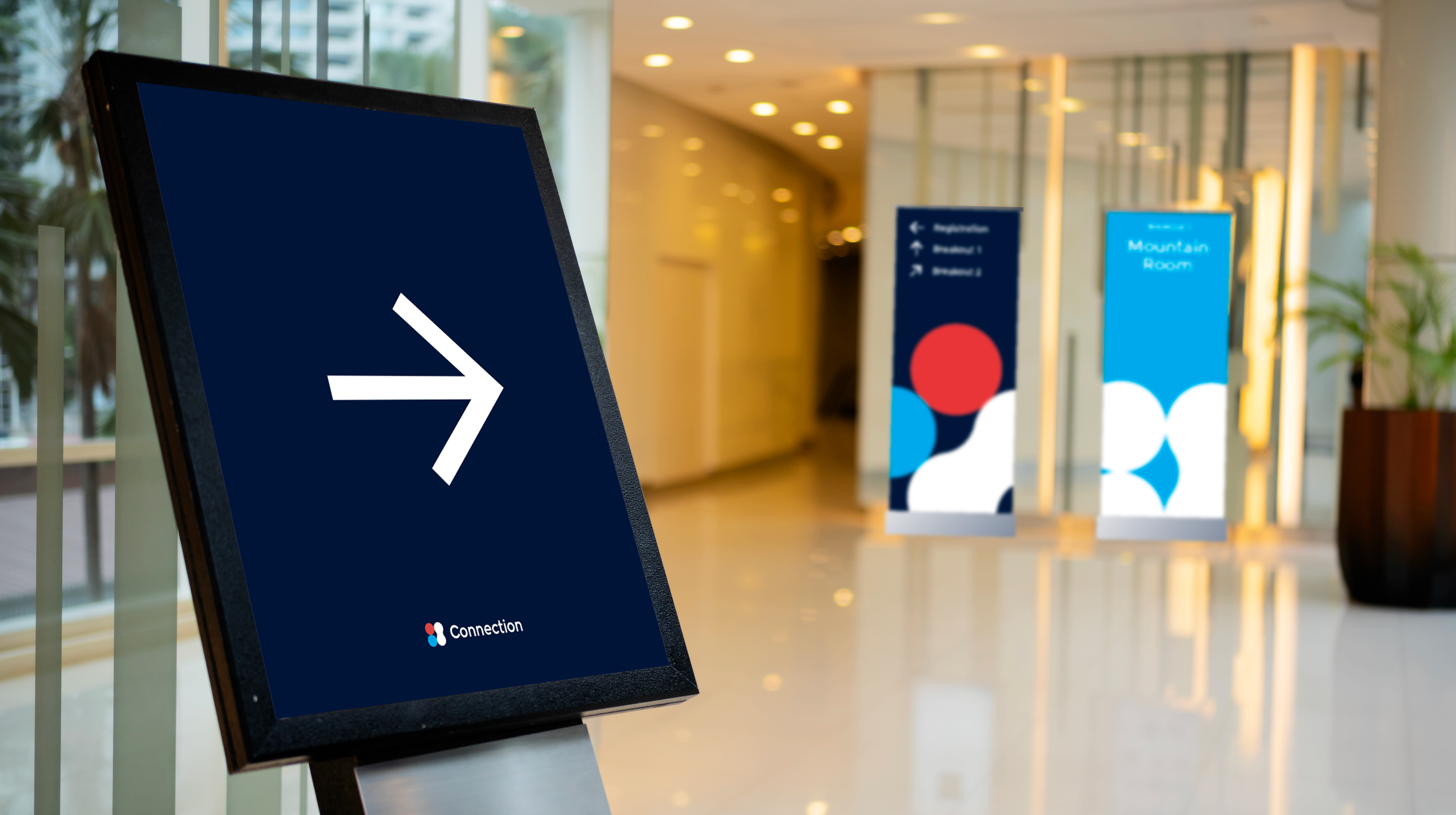
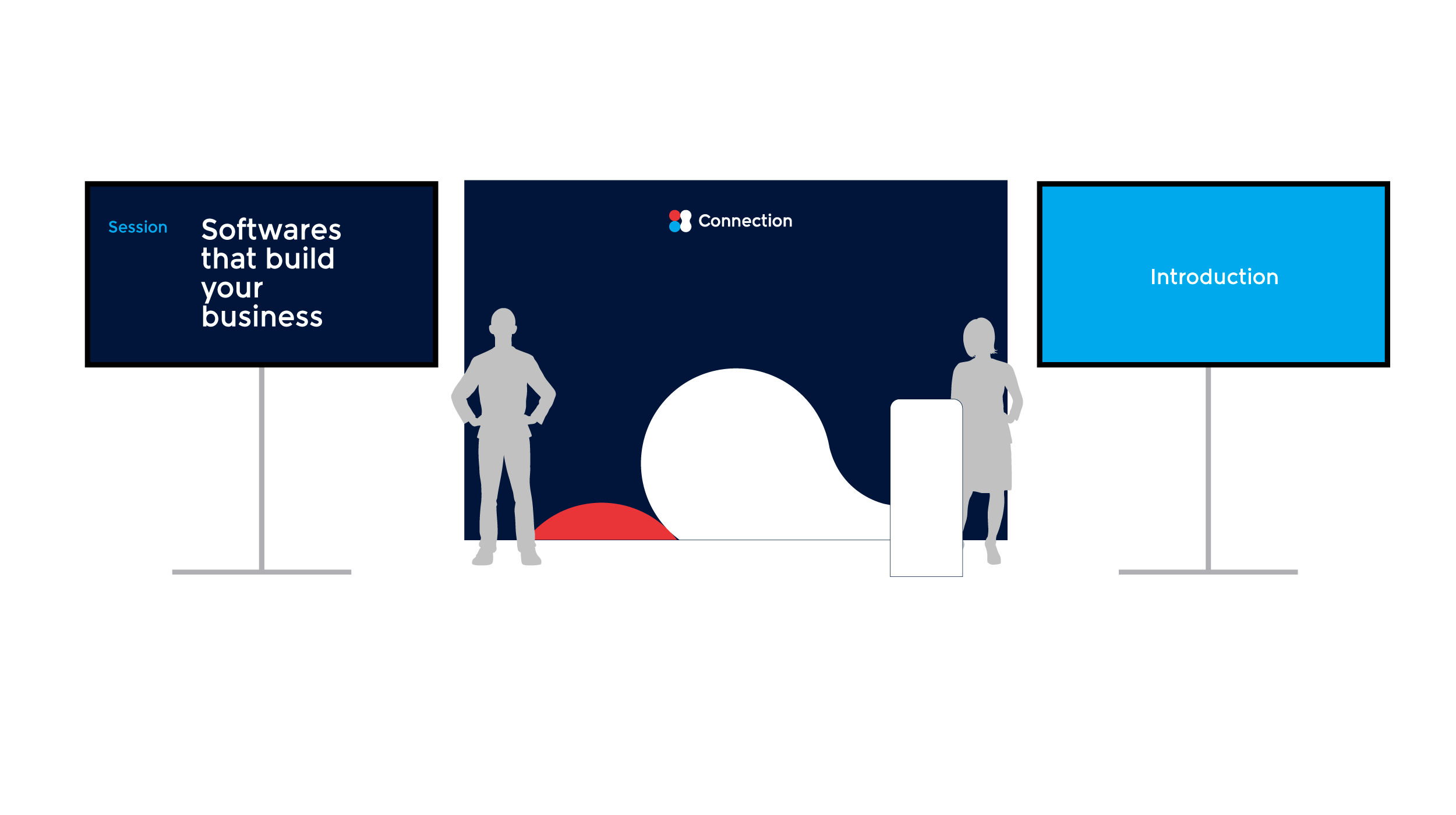
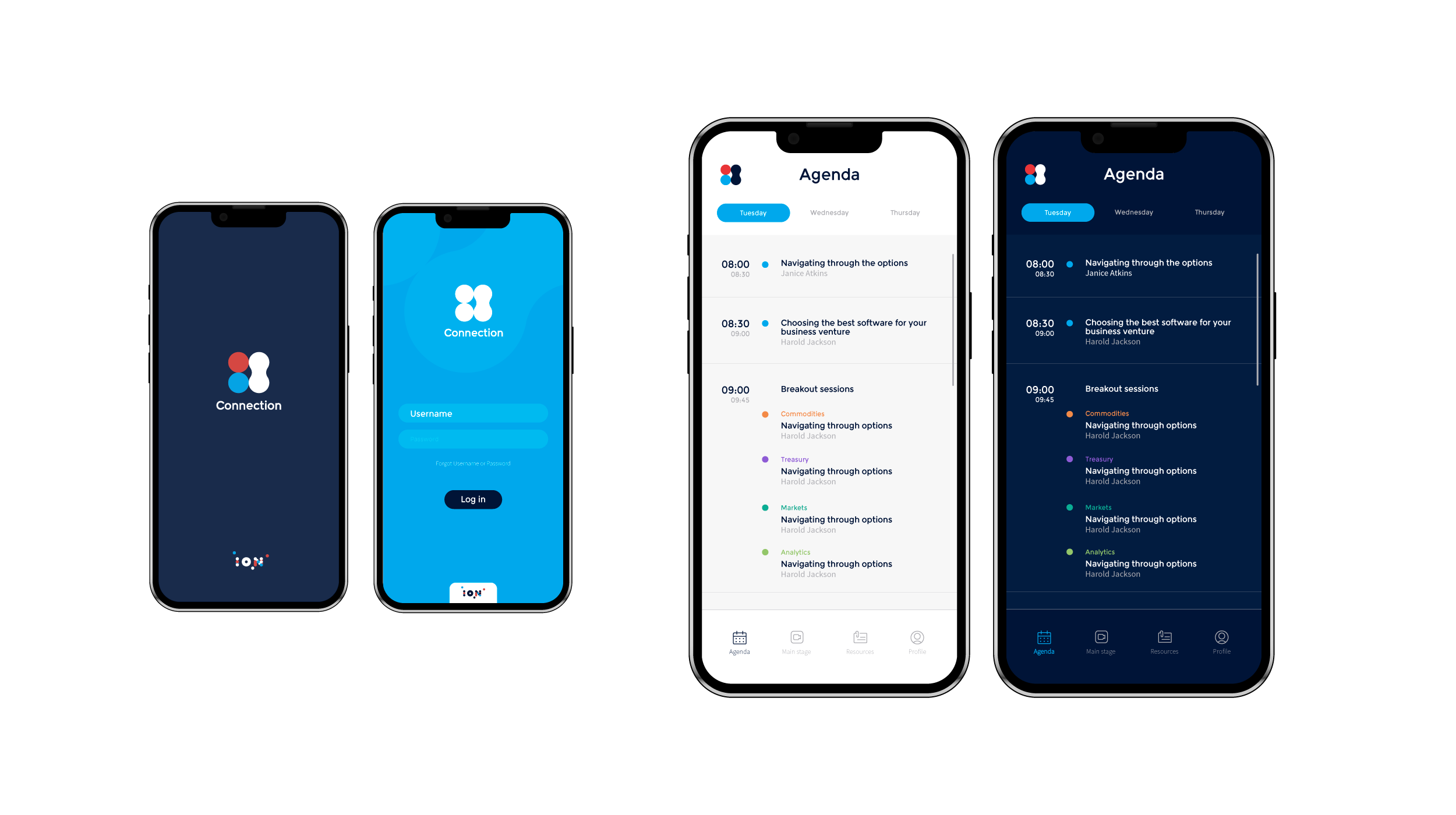
Rather than functioning as a static mark, the motif was designed as a versatile system element—serving as a mask, pattern, framing device, or compositional tool across applications.
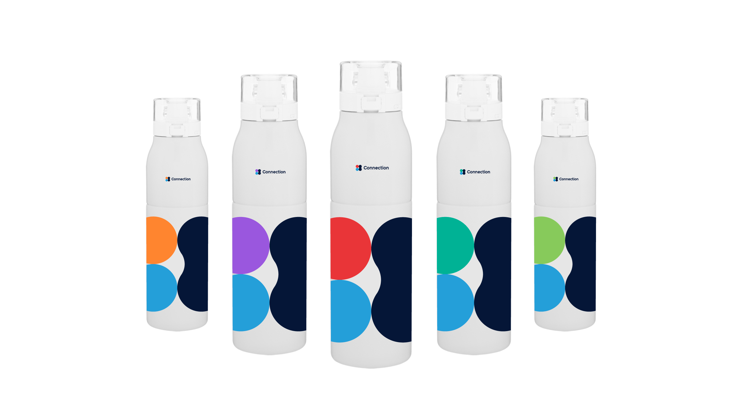
To support ION's portfolio structure, color became the primary variable. By pairing the motif with each portfolio's established palette and lock-up, the identity could flex between audiences while remaining cohesive, recognizable, and rooted in the broader ION brand.
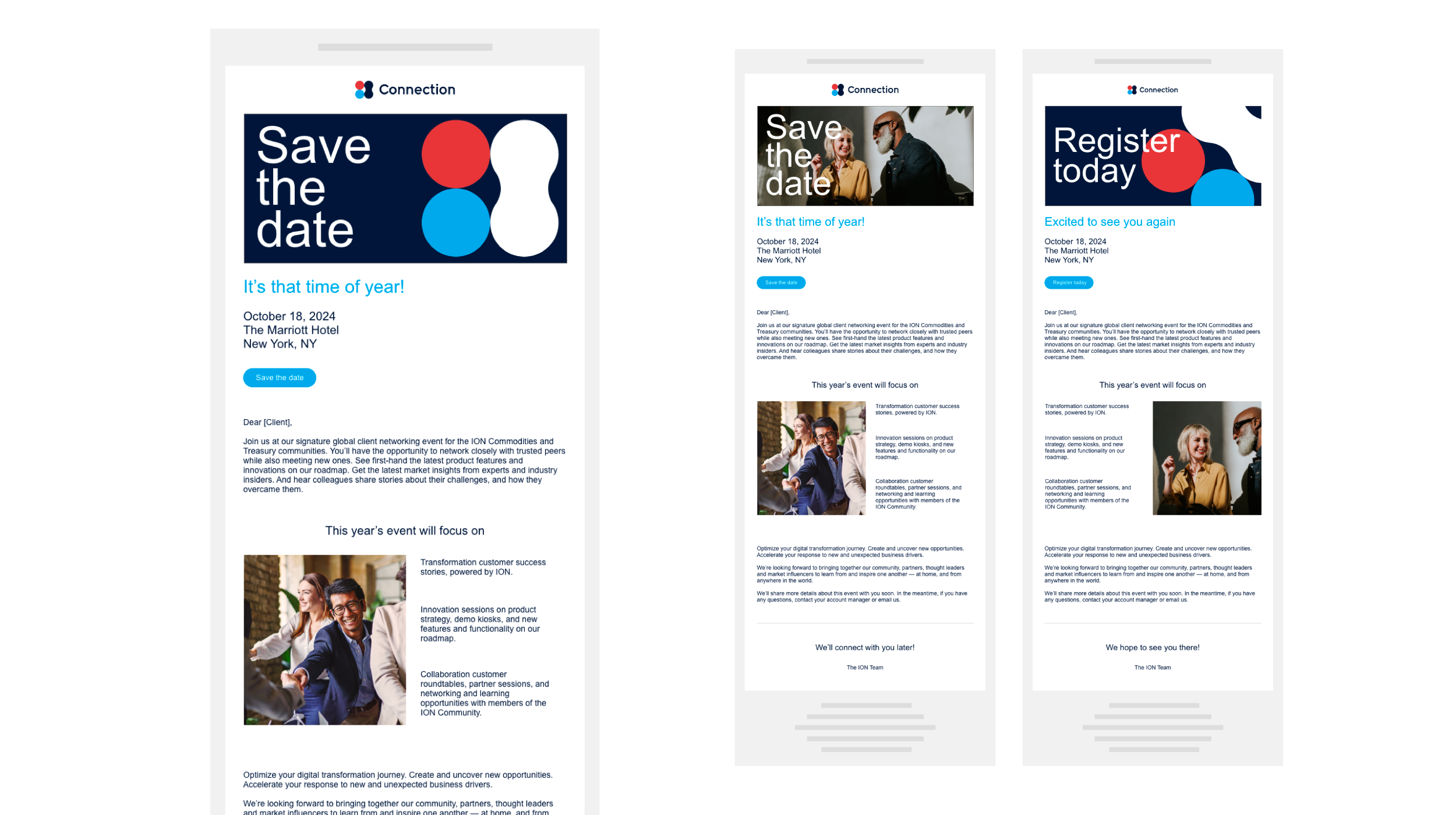
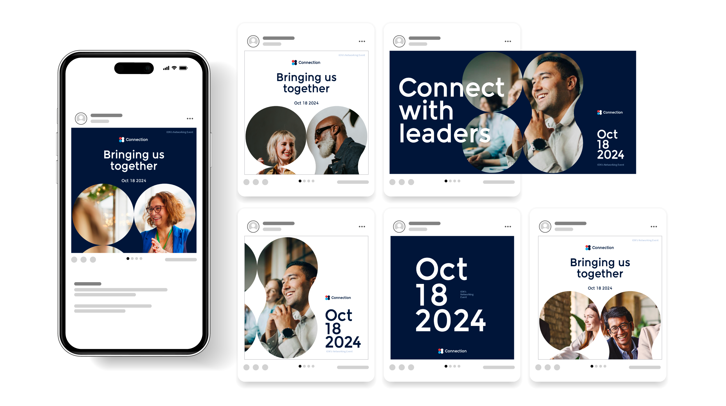
The result was a scalable event system that extended seamlessly from digital communications to immersive on-site experiences.
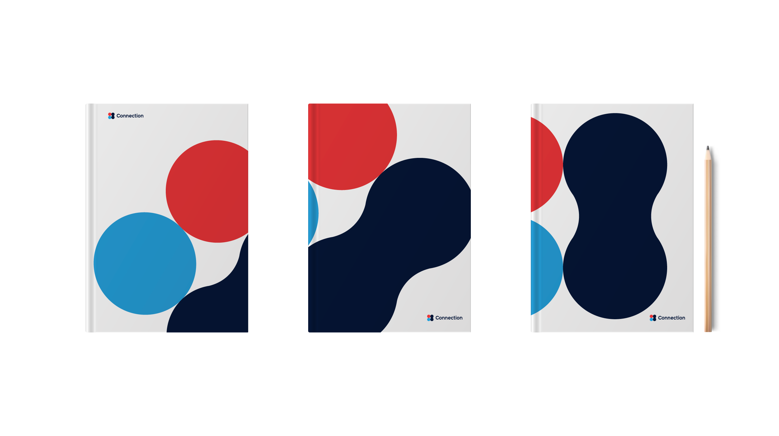
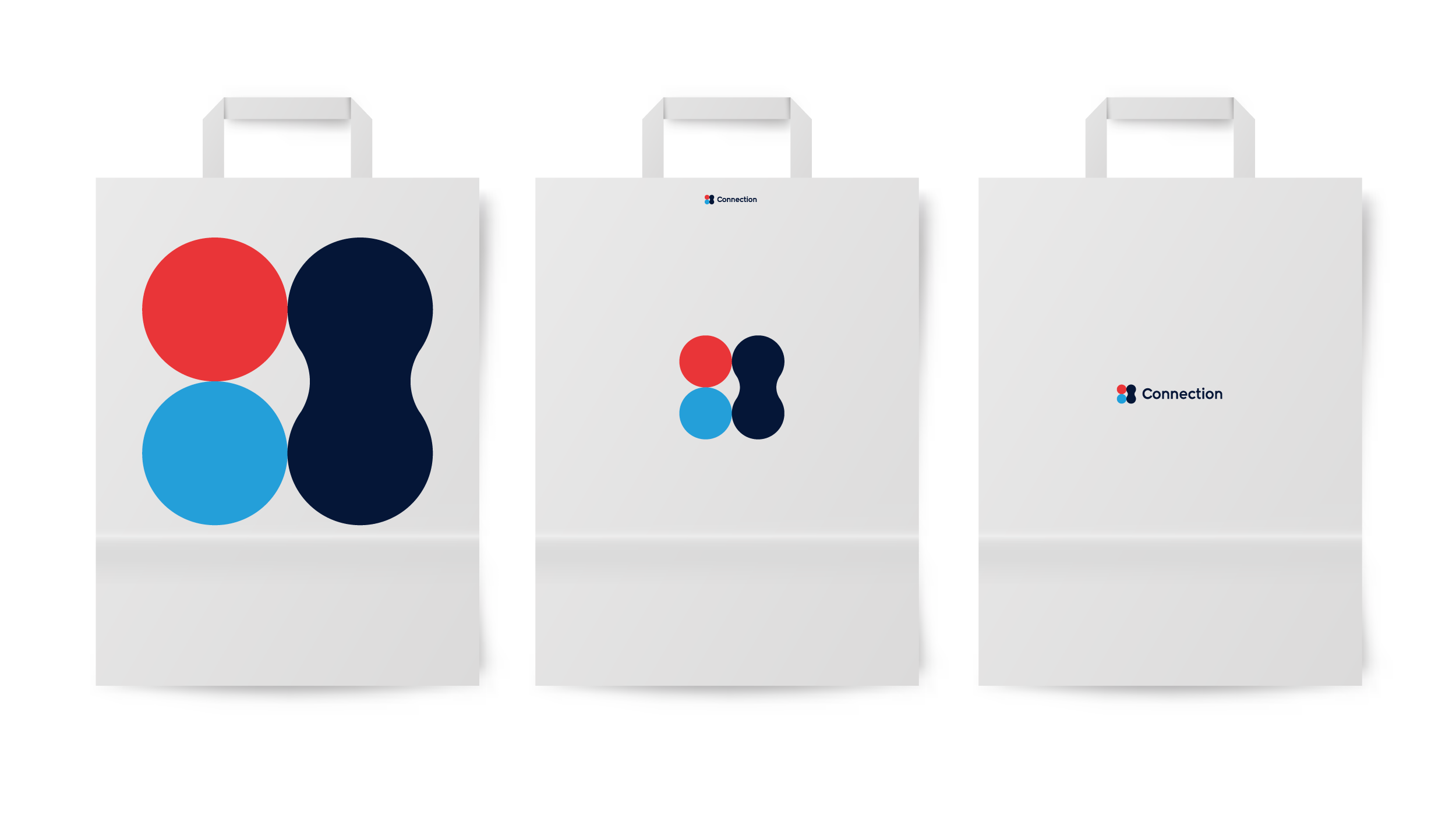
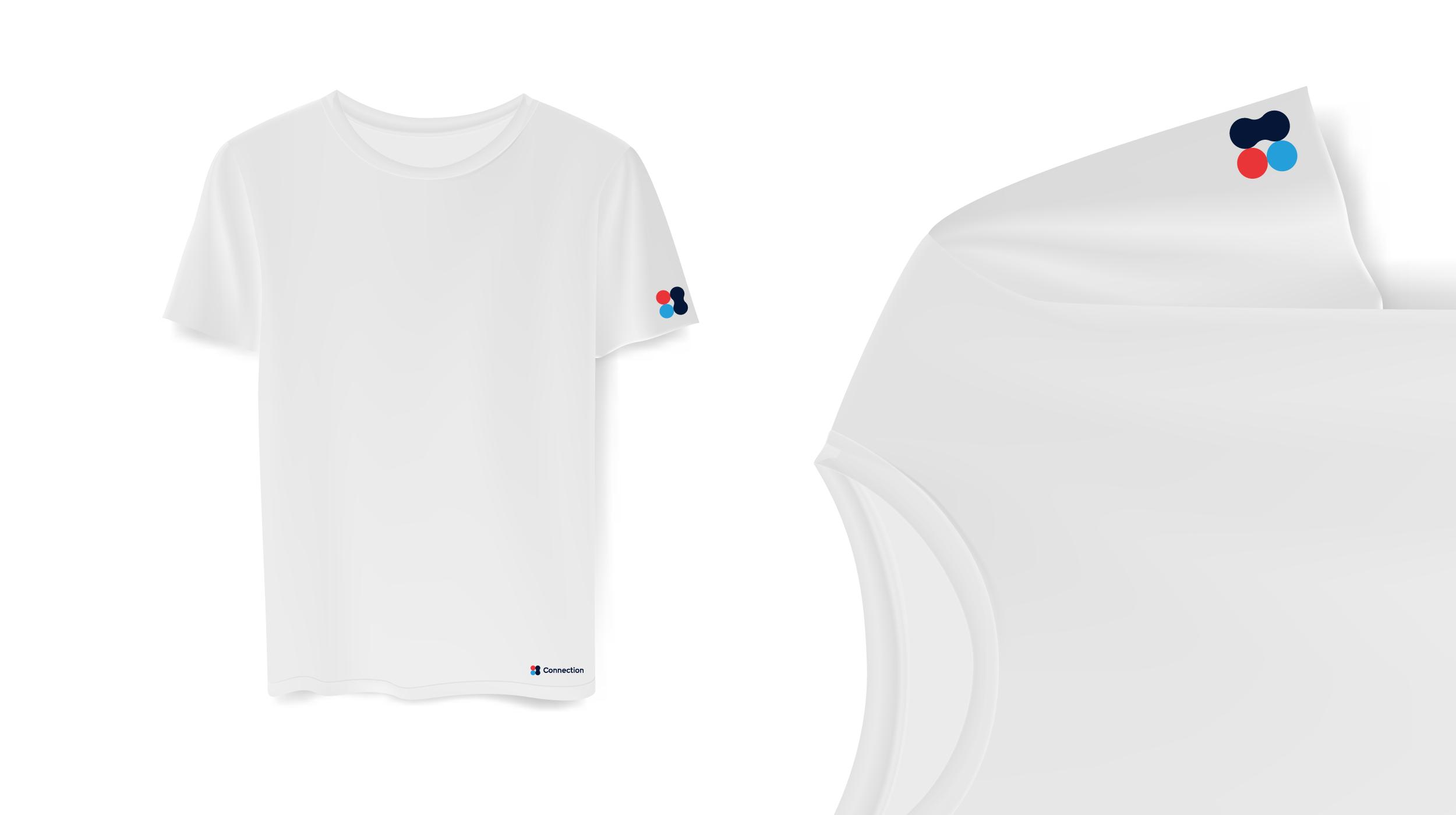
Graphical motif
This event motif carries a strong graphical presence throughout the entire brand system. It is bold, commanding attention and respect in every context—whether viewed, displayed, or applied. The idea of “coming together” continually resurfaced as I moved through the project, leading to the realization that unifying the ions into a single form could visually express that sense of convergence.
Three strong directions were explored and nearly finalized, but the selected option stood apart in its versatility. Its form allows it to function seamlessly as a mask, a die-cut, a pattern, and as an off-page element—bringing energy and visual interest to otherwise empty spaces.

Outcome
The Connection identity transformed the event into a cohesive and scalable brand experience, capable of operating across portfolios, audiences, and formats.
By grounding the system in ION’s existing visual language, the identity felt both unified and adaptable — allowing different business units to take ownership of the event while maintaining a consistent core. The flexibility of the motif and color system enabled the brand to evolve naturally across applications, supporting everything from global communications to portfolio-specific activations.
What began as a need for visual consistency ultimately became a system that reflected the very idea it was built on — connection — bringing together multiple identities into a single, adaptable experience.