
ION<athon>
Event Brand Strategy & Identity
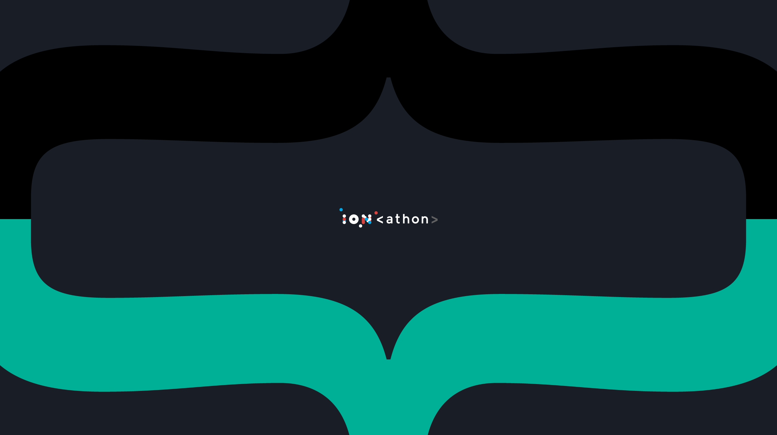
Building a recurring event brand around the people taking part. ION’s hackathon series needed an identity that could launch with its first event and develop across future editions. I created a modular brand system that combined ION’s visual language with references familiar to developers, giving the series a distinct personality and a consistent foundation for growth.
Challenge
Establishing recognition from the first edition
Planned to run multiple times a year, ION<athon> needed to feel connected to ION while establishing an identity participants could recognize across editions.
The challenge was to balance continuity with creative variety. The system needed to accommodate versions 1.0, 2.0, and beyond, support a range of event materials, and give organizers room to adapt it as the series developed.
It also needed to speak to its audience. This was an opportunity to bring the curiosity, experimentation, and humor of coding culture into the event’s identity.
Approach
Connecting the parent brand with coding culture
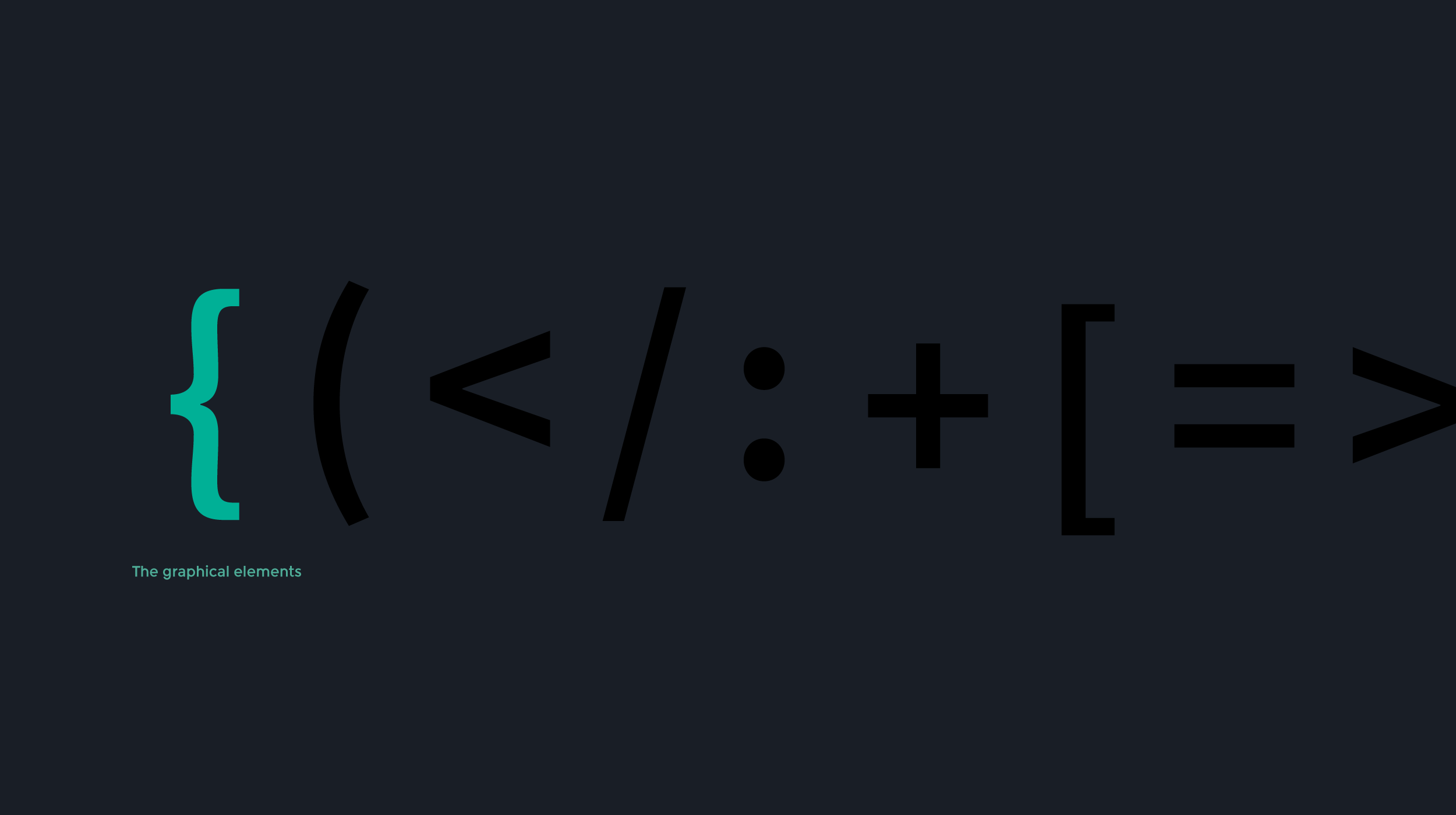
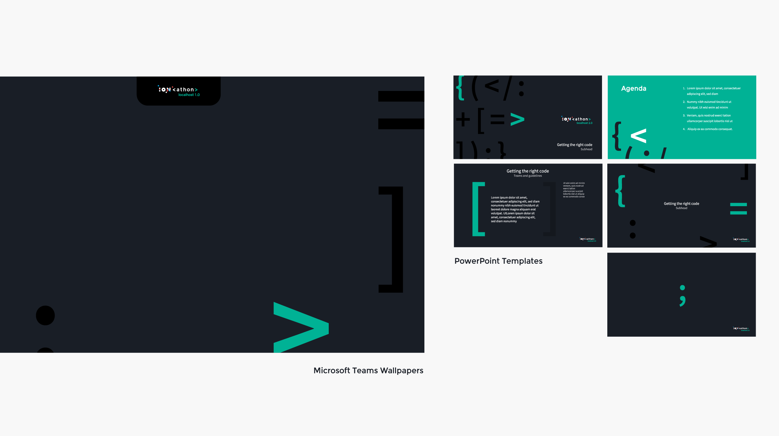
I built the identity around ION’s custom typeface and coding syntax, using elements such as < > and </> to connect the event’s name and graphic language with its technical context.
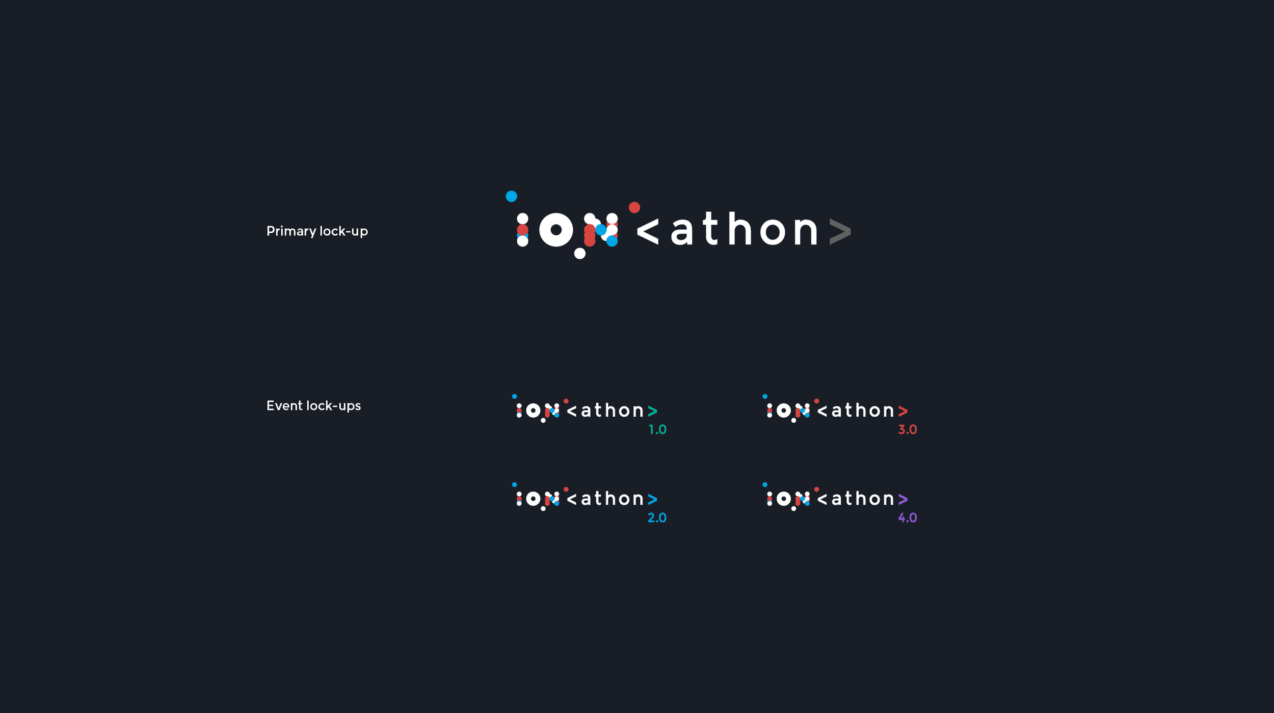
These references established a recognizable relationship between ION and the hackathon. Version numbering gave successive editions a place within the same identity, making recurrence part of the concept from the beginning.
Designing a system organizers could build on
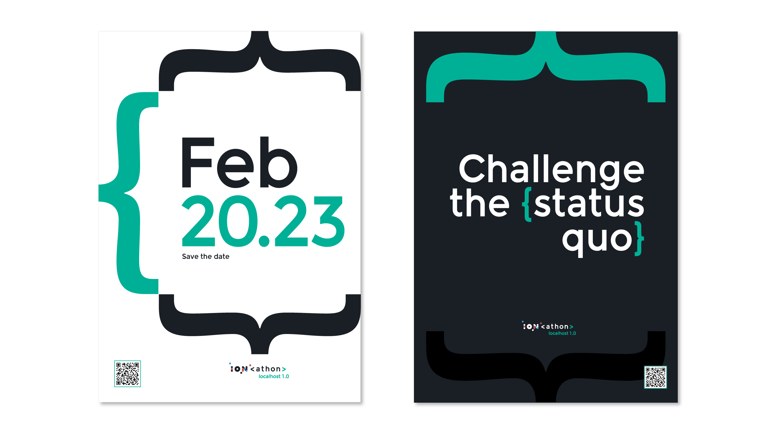
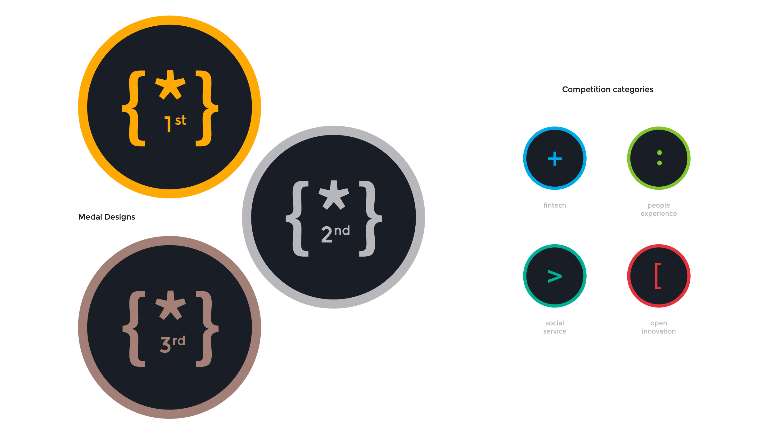
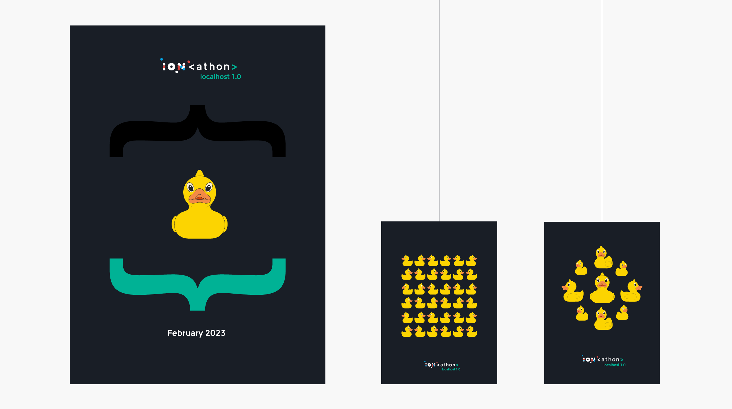
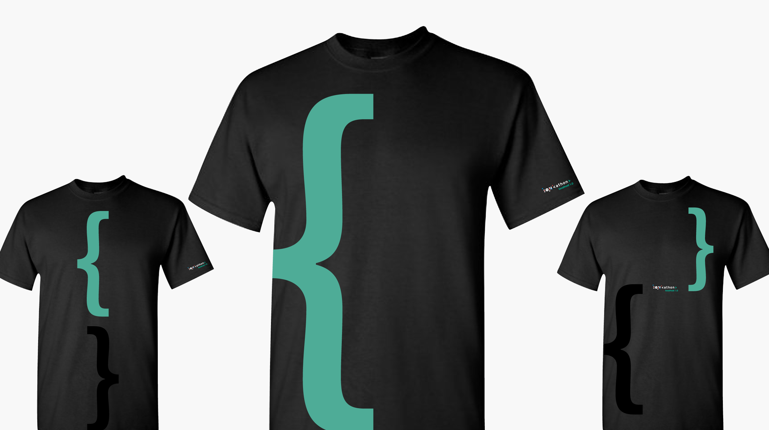
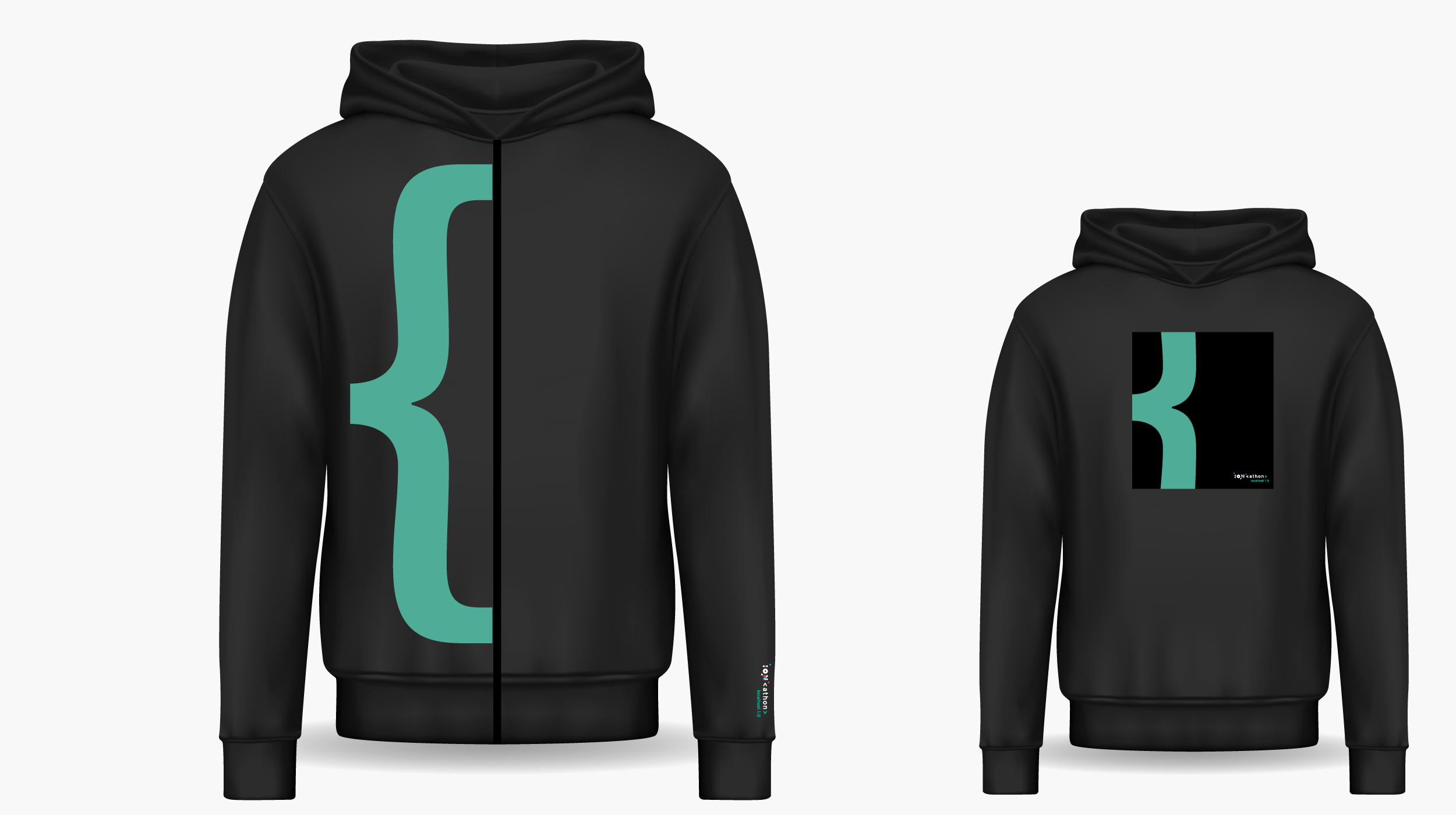
I developed logo lock-ups, posters, stickers, category icons, and event merchandise as parts of a shared visual system. Consistent typography and graphic elements held the identity together, while modular compositions allowed it to adapt across formats and editions.
Working with event organizers and stakeholders, I connected the design with the materials and communications the event needed. The framework supported both promotion and the participant experience, extending from announcements to instructions and items used during the event.
Giving the event a friendly voice
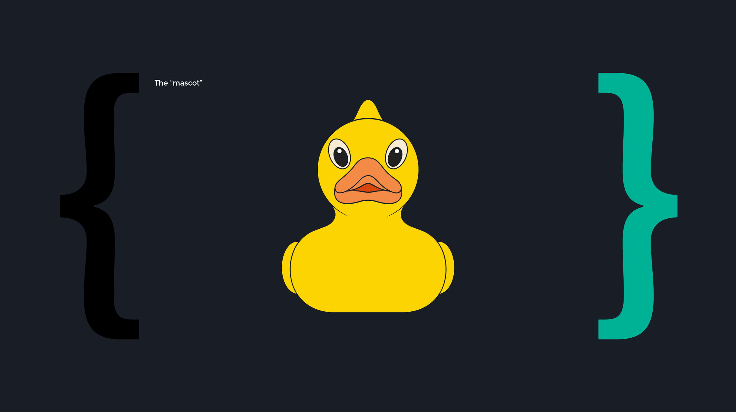
The rubber duck introduced a playful reference to a familiar debugging practice: talking through a problem aloud to work toward a solution.
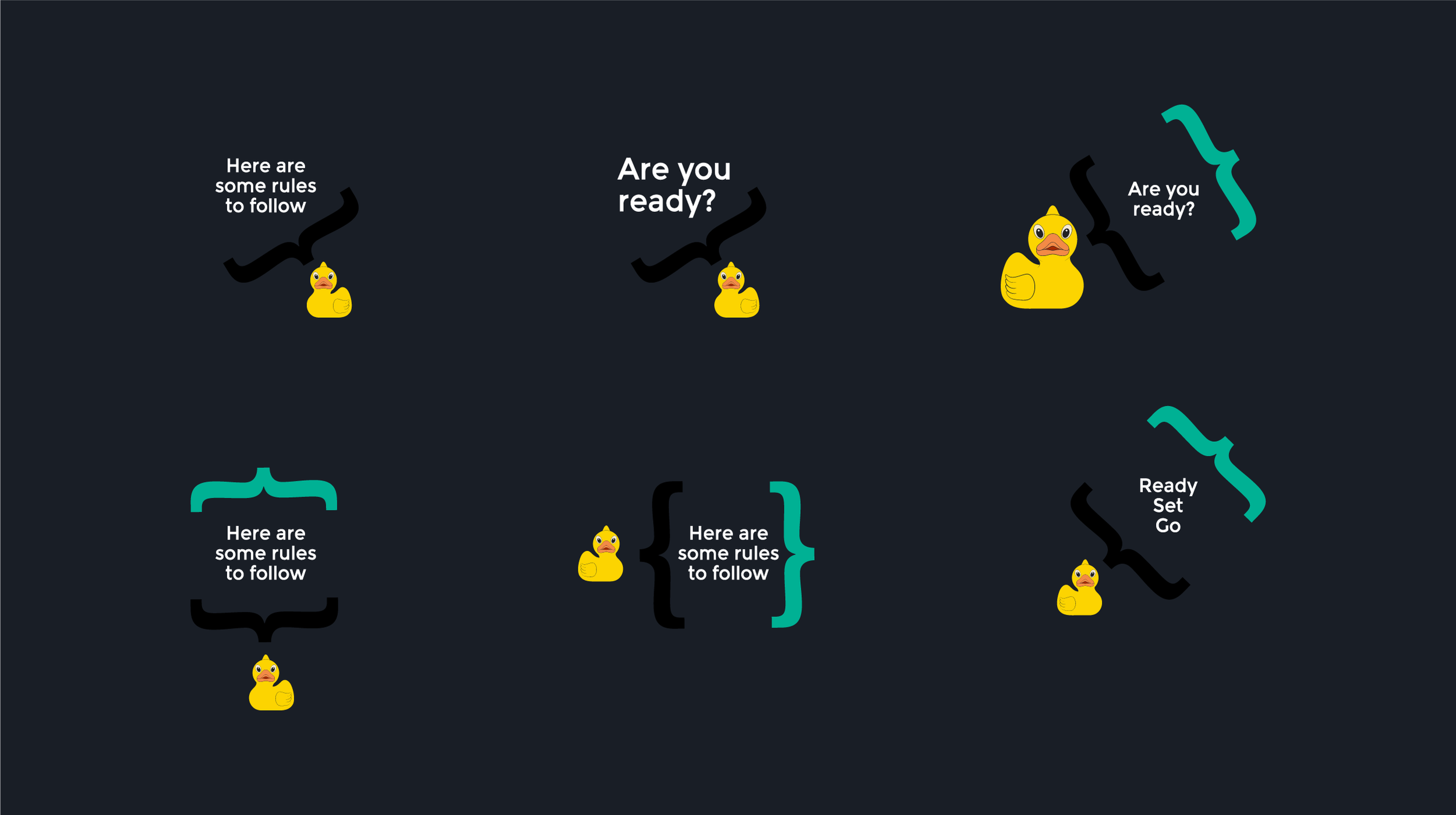
I brought that reference into the identity as a mascot, giving the event a character rooted in its audience’s culture. The duck appeared across promotional materials and delivered instructions, adding personality to practical communications.
It became a way to carry the event’s tone through the experience, pairing the technical language of the identity with a sense of humor.
Outcome
A distinct debut and a foundation for future editions
The identity debuted at ION’s India-region hackathon, receiving positive feedback from participants and organizers.
The launch brought the system together across event communications and materials, establishing a distinct visual presence within the broader ION brand. Its modular structure and versioning approach provided a foundation for future editions to build on.
The project shows how I connect audience insight with brand development—using a relevant creative idea to shape an identity, its tone, and the ways people encounter it.
Let’s keep the conversation going.
If you’d like to know more about my work or discuss an opportunity, I’d be happy to connect.