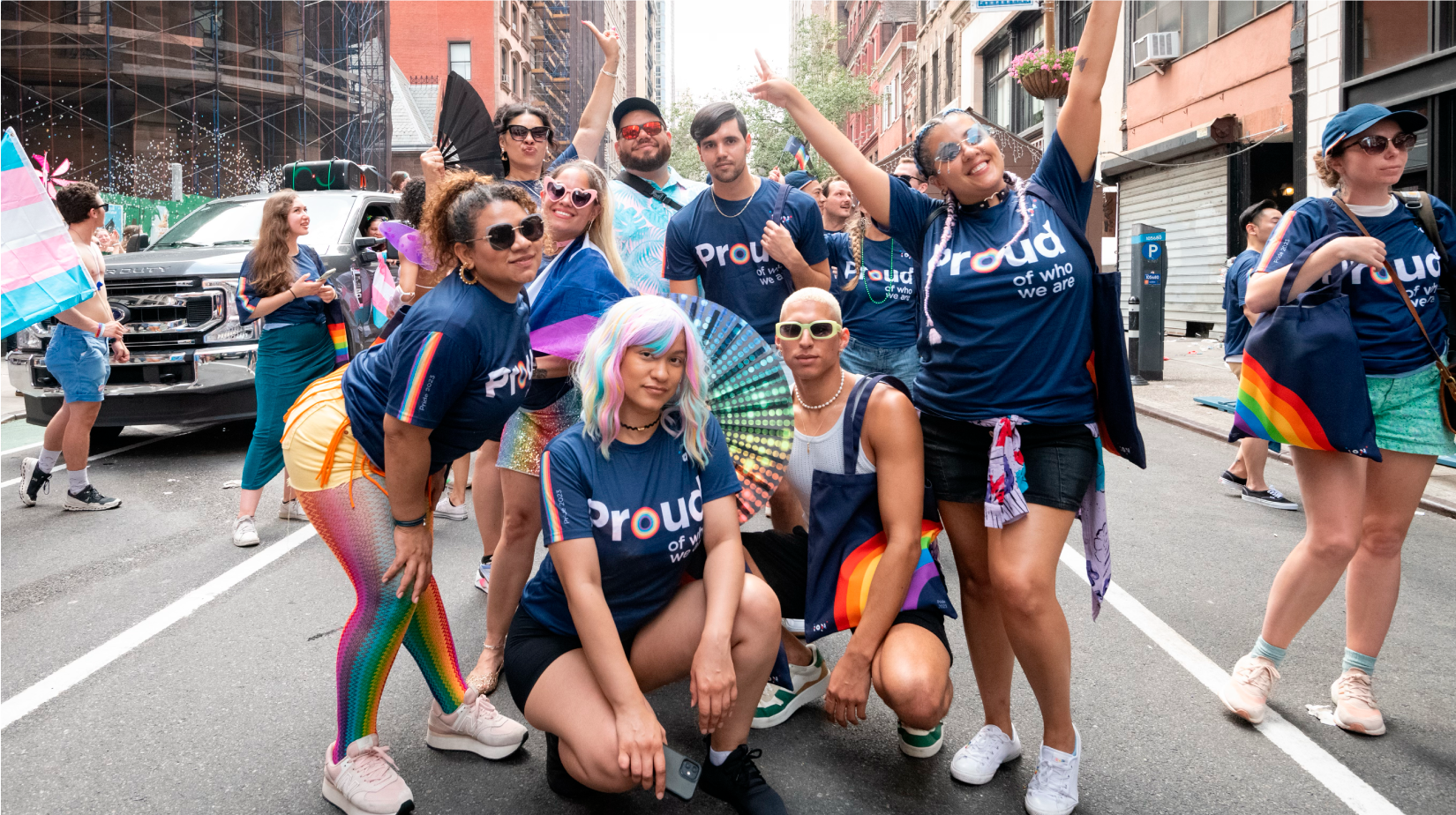
Pride
ION’s Pride Month Identity
A flexible identity system designed for ION’s annual Pride initiative—celebrating LGBTQ+ visibility while translating values of inclusion, expression, and community into a cohesive brand experience across internal and external touchpoints.
Challenge
Design a Pride identity that could exist authentically within a corporate brand system without diluting its cultural meaning. The work needed to balance expression and restraint—creating something celebratory and resonant, while remaining adaptable across digital, physical, and experiential environments.
Beyond aesthetics, the challenge was to approach Pride with cultural awareness and intentionality—ensuring the design honored the community it represents, rather than reducing it to a seasonal brand moment.
Approach
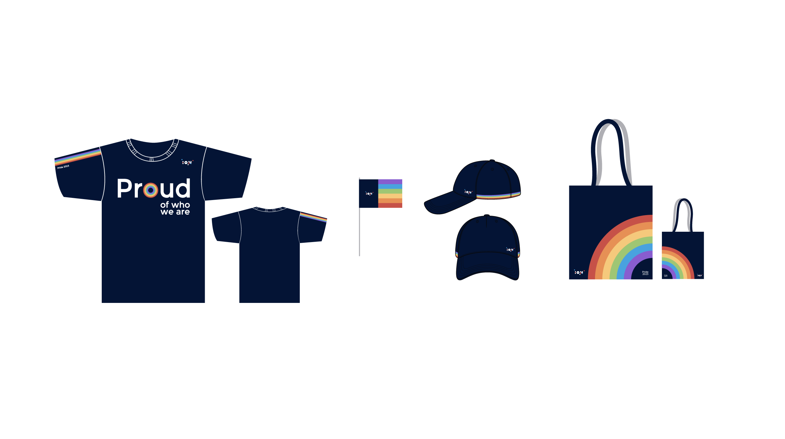
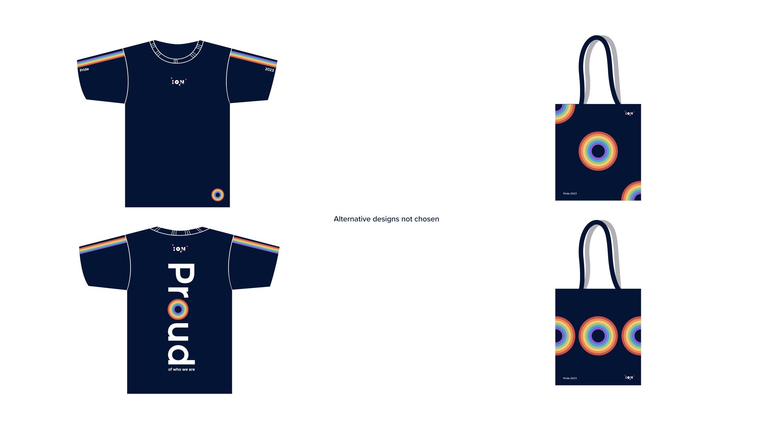
The identity was developed as a modular system rooted in bold color, geometric rhythm, and expressive typography—balancing vibrancy with alignment to ION’s broader brand language. Rather than a one-off execution, it was designed as a flexible framework that could scale seamlessly across signage, digital campaigns, internal communications, and event collateral.
Pride-related visual cues were integrated with intention and restraint, focusing on clarity and respect over surface-level symbolism.
Collaboration with People & Culture, Employee Resource Groups, and internal stakeholders ensured the work reflected both lived experiences and organizational values. The system was then translated into structured assets and guidelines, enabling consistent and thoughtful application across teams.
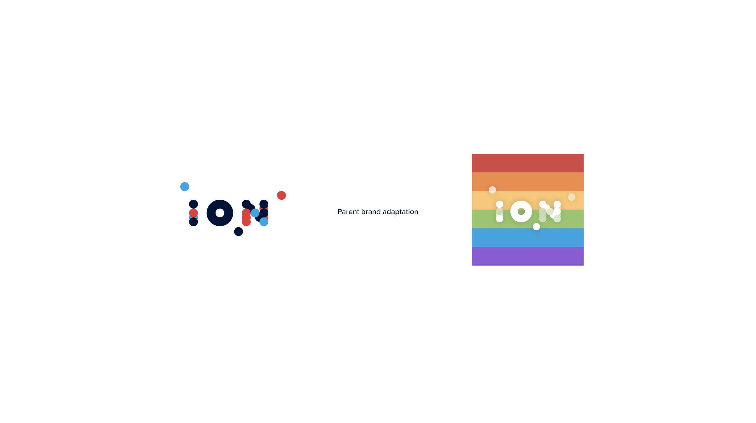
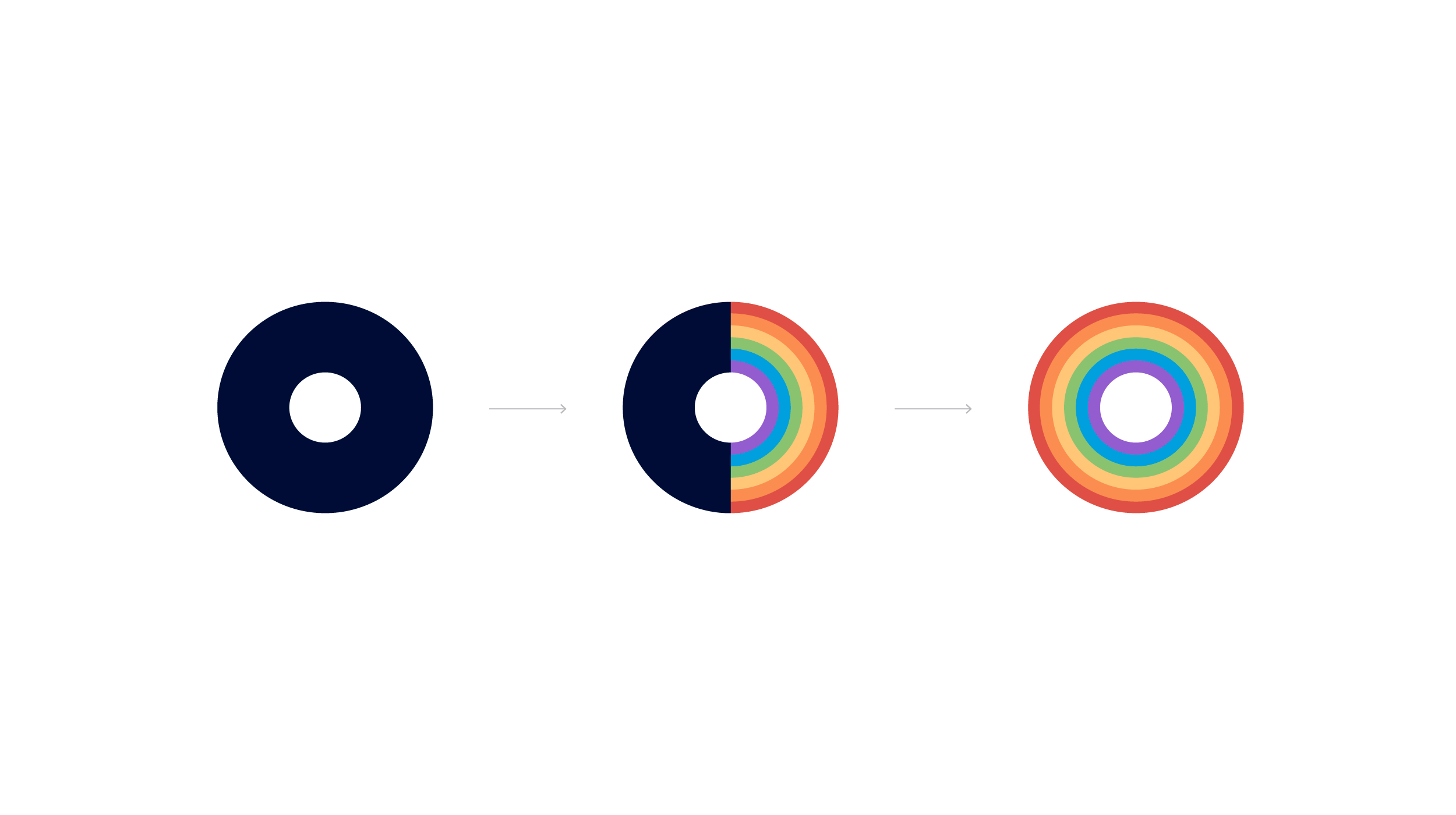
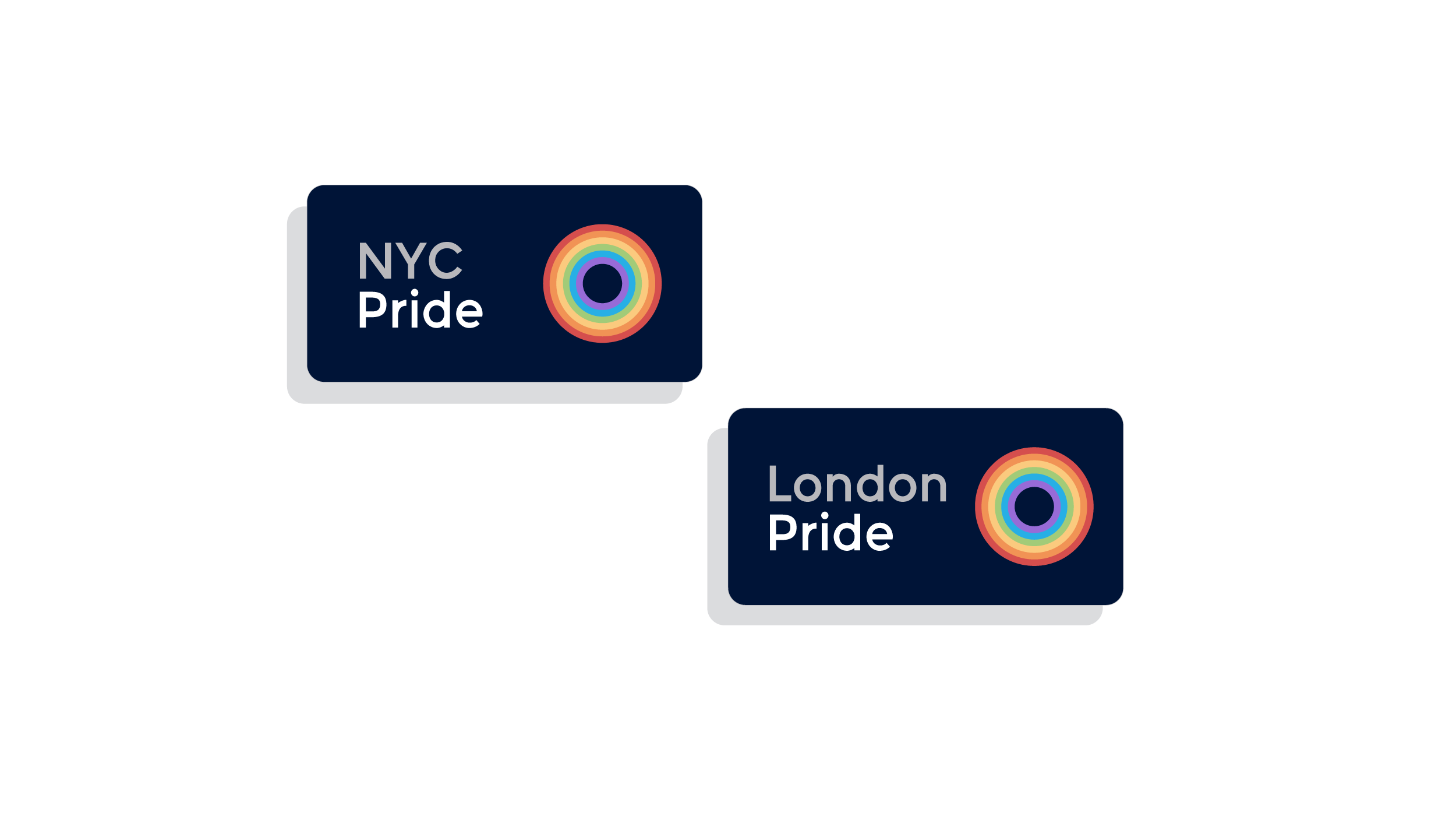
Graphical motif made from the parent brand’s graphical element—the nucleus.
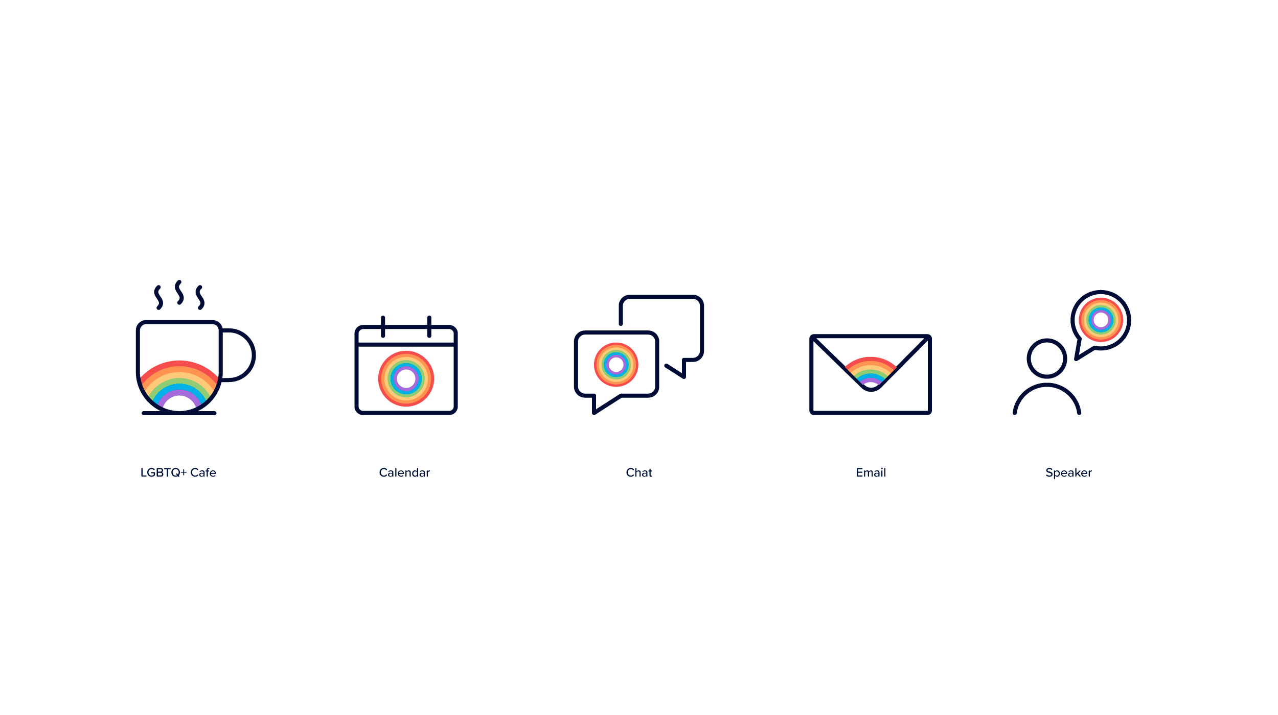
Custom iconography
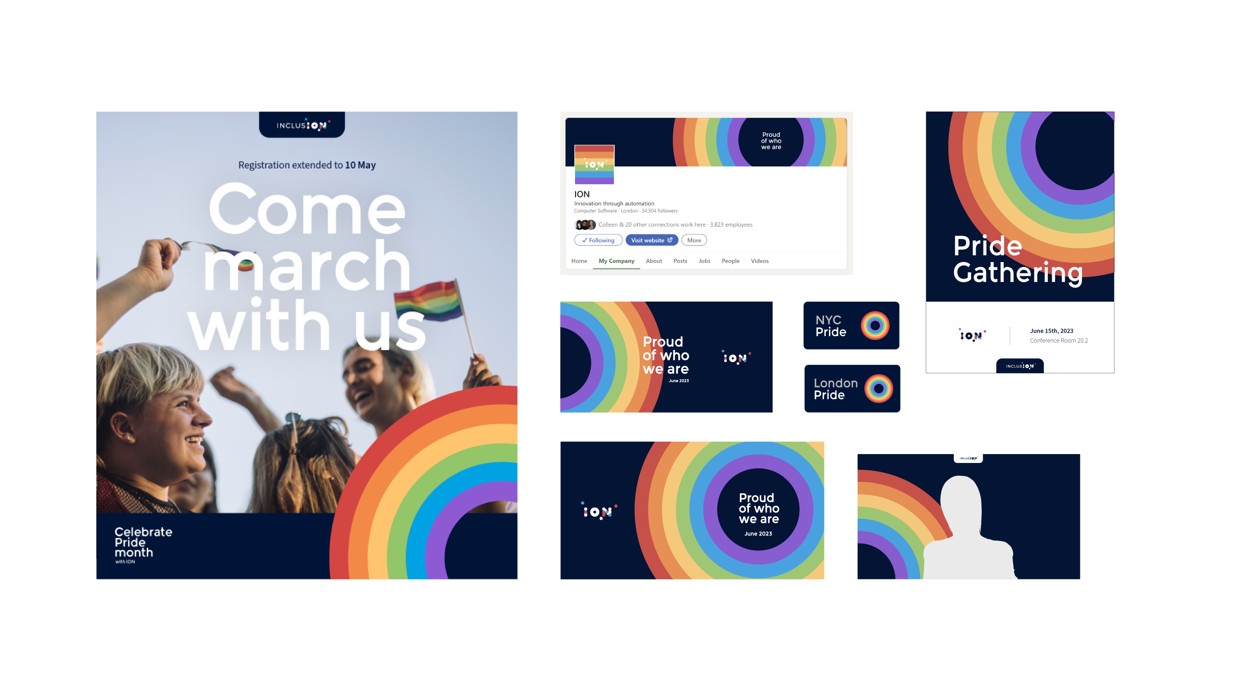
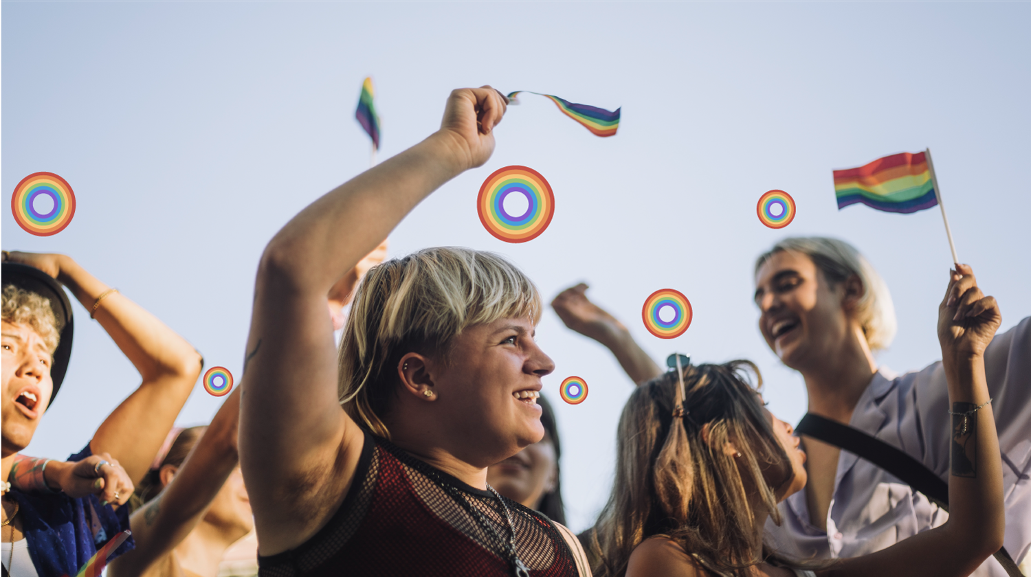
Brand in use from posters to webcam backgrounds
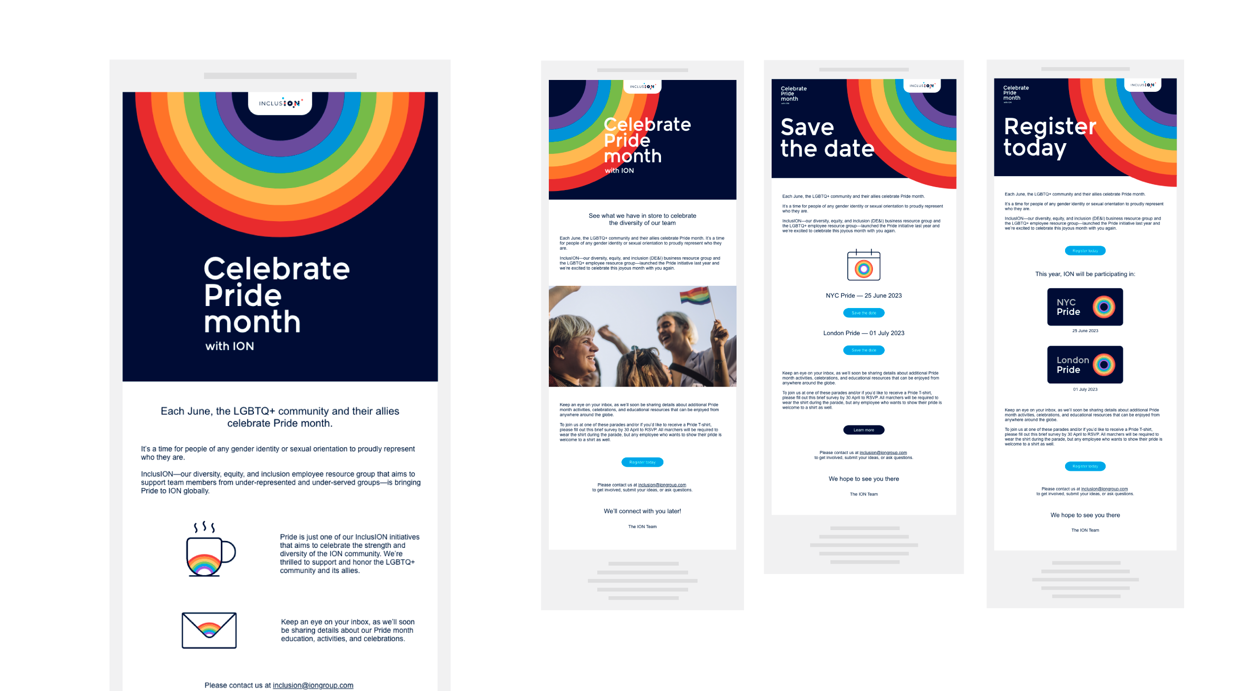
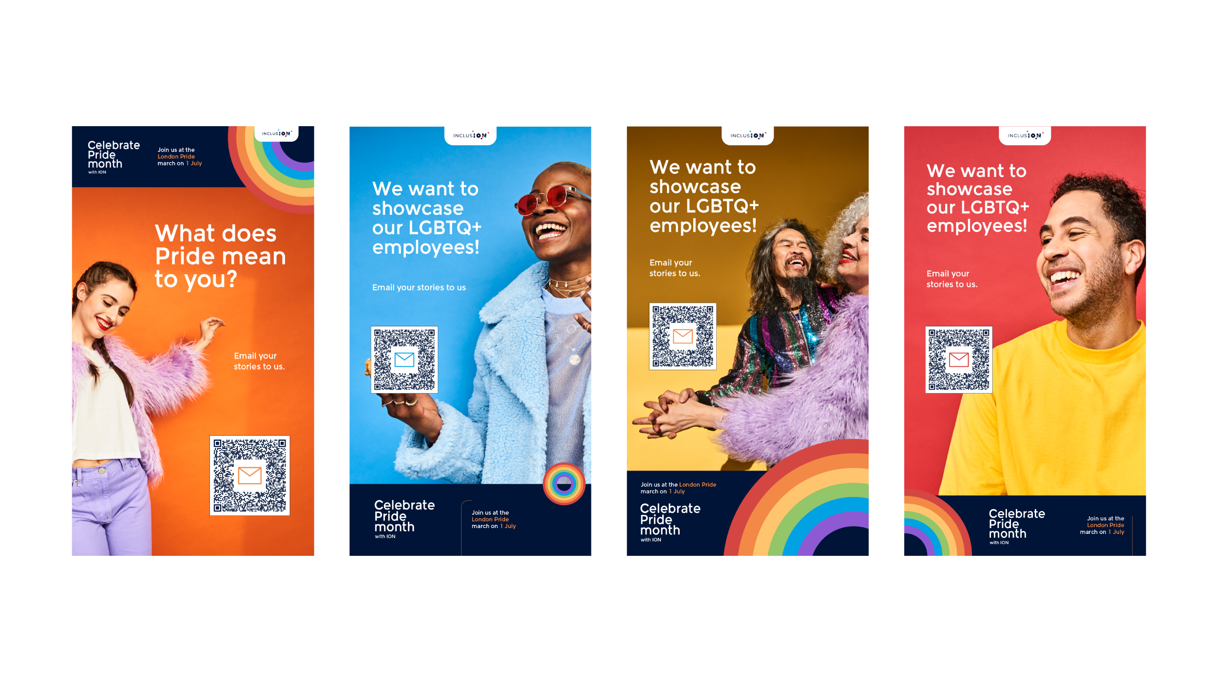
Pride month awareness and events email campaign
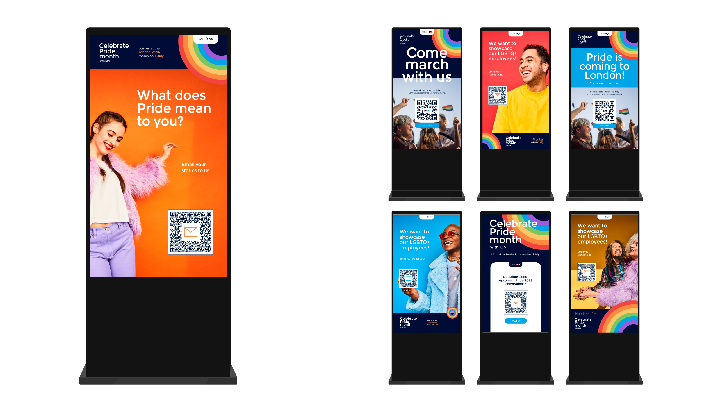
In-office totem poster ads
Outcome
The identity system increased engagement and visibility across Pride initiatives, supporting a wide range of applications—from internal communications to event environments—while maintaining a unified visual voice.
More importantly, it resonated with employees, reinforcing a sense of representation and belonging through thoughtful, intentional design.
This project underscored the role of design as both a strategic and cultural tool. By approaching Pride as a system rather than a campaign, the work moved beyond visual expression into something more enduring—an adaptable framework for visibility, participation, and community connection.