Separados
Short Film Identity
Separados is a short film by Melissa Rodriguez centered on the human reality behind the border crisis — a story about separation, tension, and the emotional weight carried by families caught between borders.
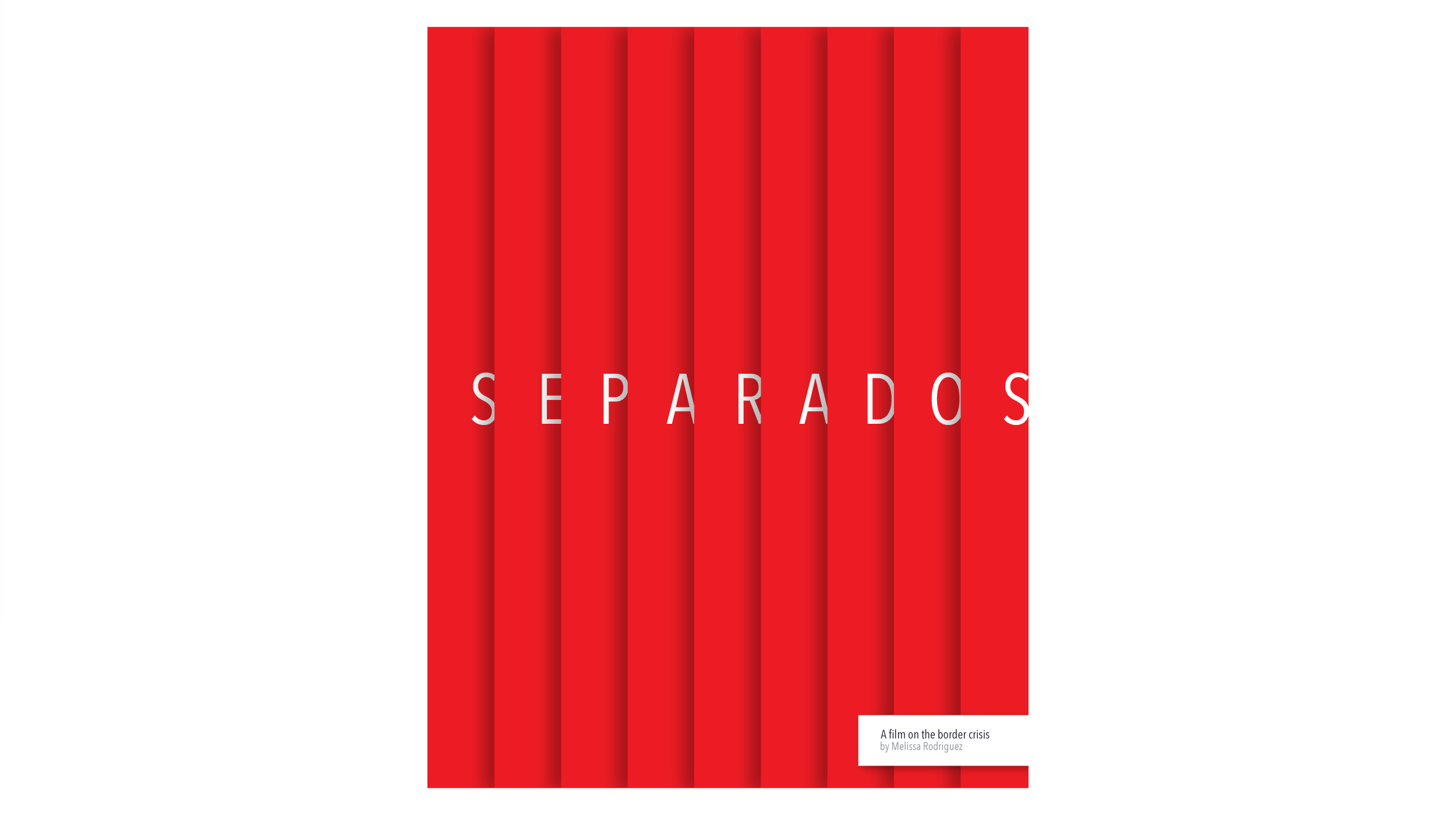
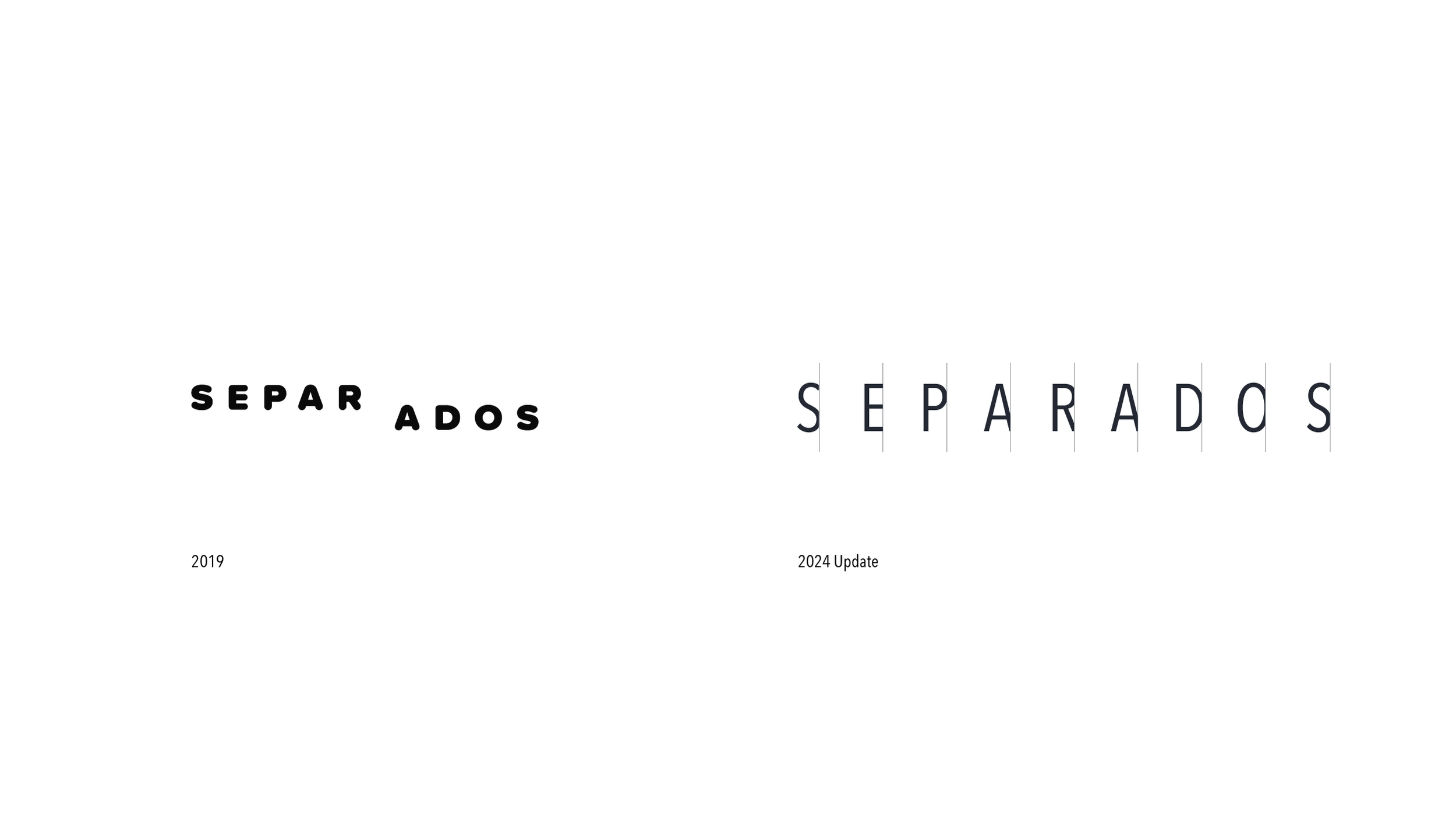
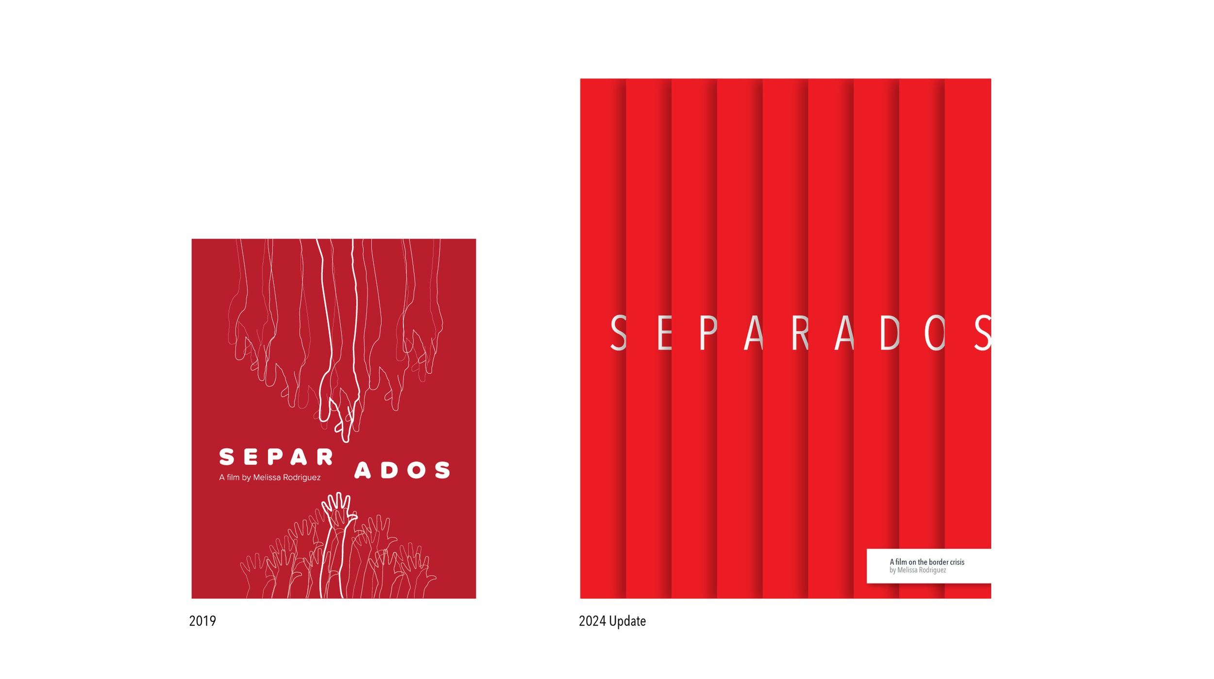
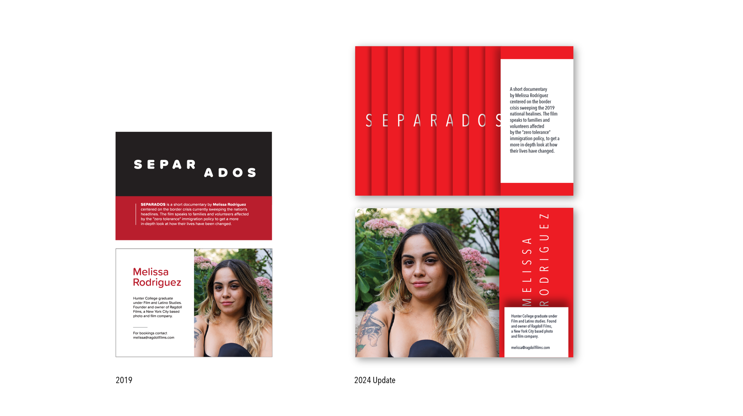
When I was first asked to design the promotional poster in 2019, the goal was to create a visual that could communicate the gravity of the topic while inviting audiences into the film’s narrative. Over time, however, both the story and my own approach to design evolved. In 2024, the poster was revisited and redesigned to reflect a more mature and restrained creative perspective.
Challenge
The design needed to communicate the emotional tension of the film without overwhelming the subject matter. Because the topic itself is deeply political and sensitive, the visual identity had to strike a balance — honoring the seriousness of the story while remaining respectful and thoughtful in its presentation.
Additionally, the design had to function not just as a poster for the film’s premiere event, but as the foundation for a small event identity supporting the screening.
Approach
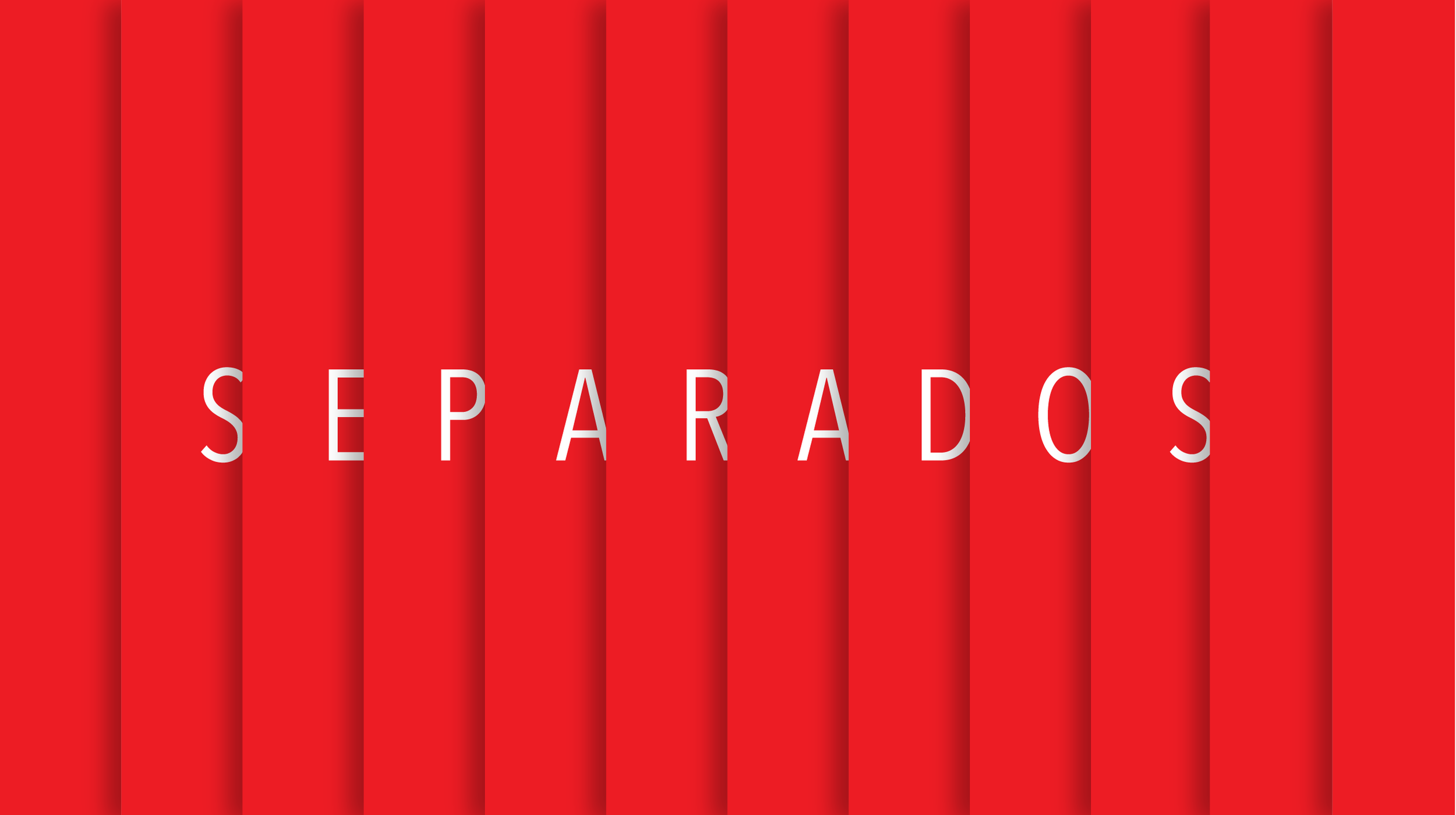
The original 2019 poster approached the story through illustration, using visual elements to symbolize the themes of separation and displacement. While this approach helped establish a narrative tone, revisiting the work years later revealed an opportunity to simplify and refine the message.
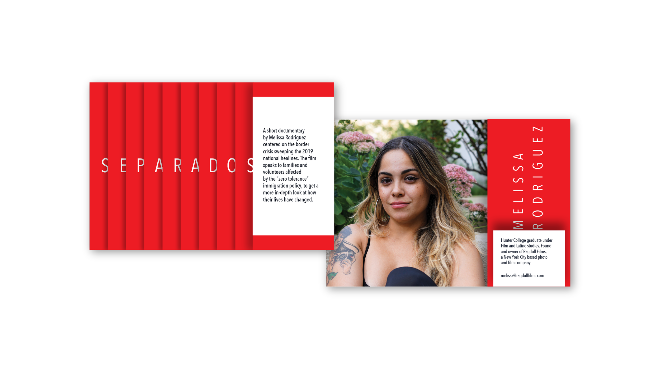
In the 2024 redesign, I removed the illustrative elements entirely and focused solely on typography. This shift toward a type-driven composition allowed the emotional weight of the title Separados to carry the message on its own. By embracing restraint and letting typography lead the visual narrative, the design created a more direct and mature expression of the film’s themes.
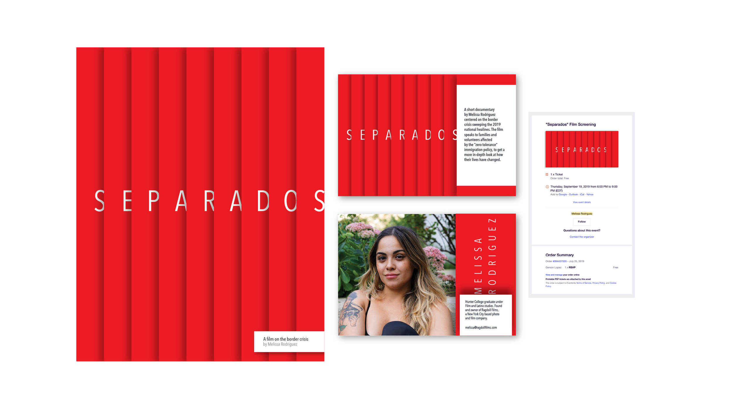
The poster also became the foundation for a small event identity for the film’s premiere. In addition to the main poster, I designed accompanying project cards featuring the creator’s headshot. These cards acted as both an introduction to the filmmaker and a takeaway piece for attendees, extending the visual language of the poster into the physical event experience.
Outcome
The redesigned poster brought a renewed sense of clarity and emotional focus to the film’s promotion. By stripping the design back to typography, the visual message became stronger and more intentional — allowing the theme of separation to resonate without distraction.
Together, the poster and accompanying project cards created a cohesive identity for the premiere event, supporting both the film and its creator while providing attendees with a memorable visual touchpoint tied to the story.