Pride Campaign
This project involved creating a vibrant, inclusive visual identity for ION’s annual Pride celebration, designed to celebrate diversity, reinforce community values, and visually reflect the spirit of inclusivity across internal and external touchpoints.
Challenge
ION wanted a Pride visual identity that both honored authentic Pride expression and aligned with the company’s broader brand system. The goal was to create a look and feel that felt celebratory, resonant, and unified across digital, physical, and event environments — while reinforcing ION’s commitment to inclusion, visibility, and cultural participation. Because Pride has deep cultural meaning beyond corporate branding, the design needed sensitivity, cultural awareness, and visual strength without appropriation.
Approach
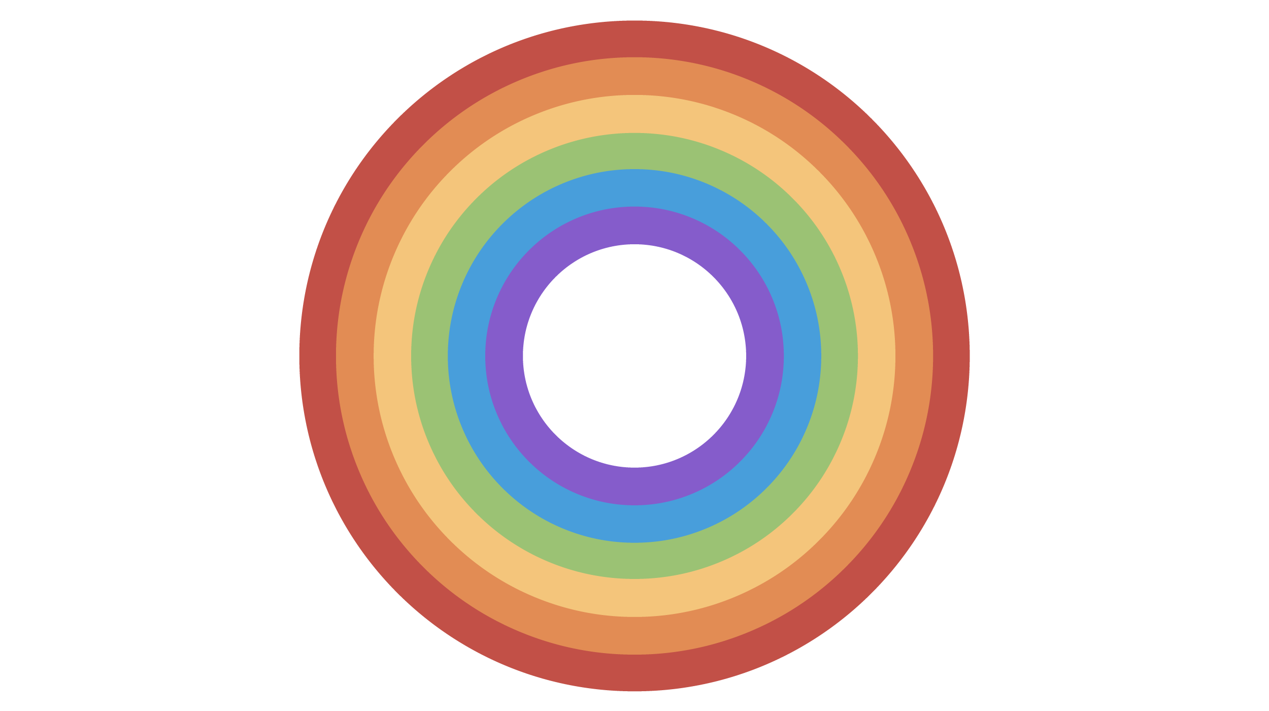
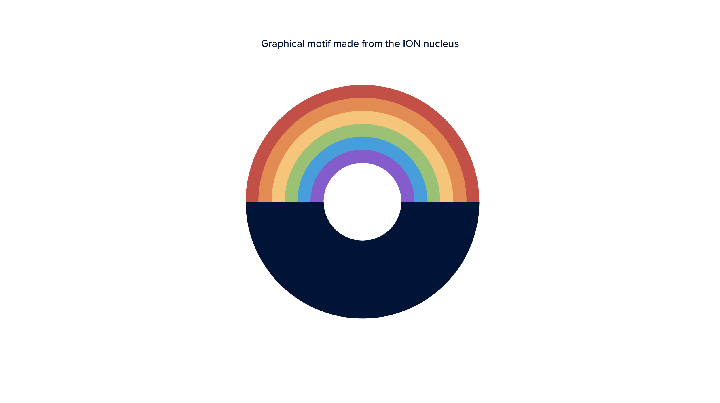
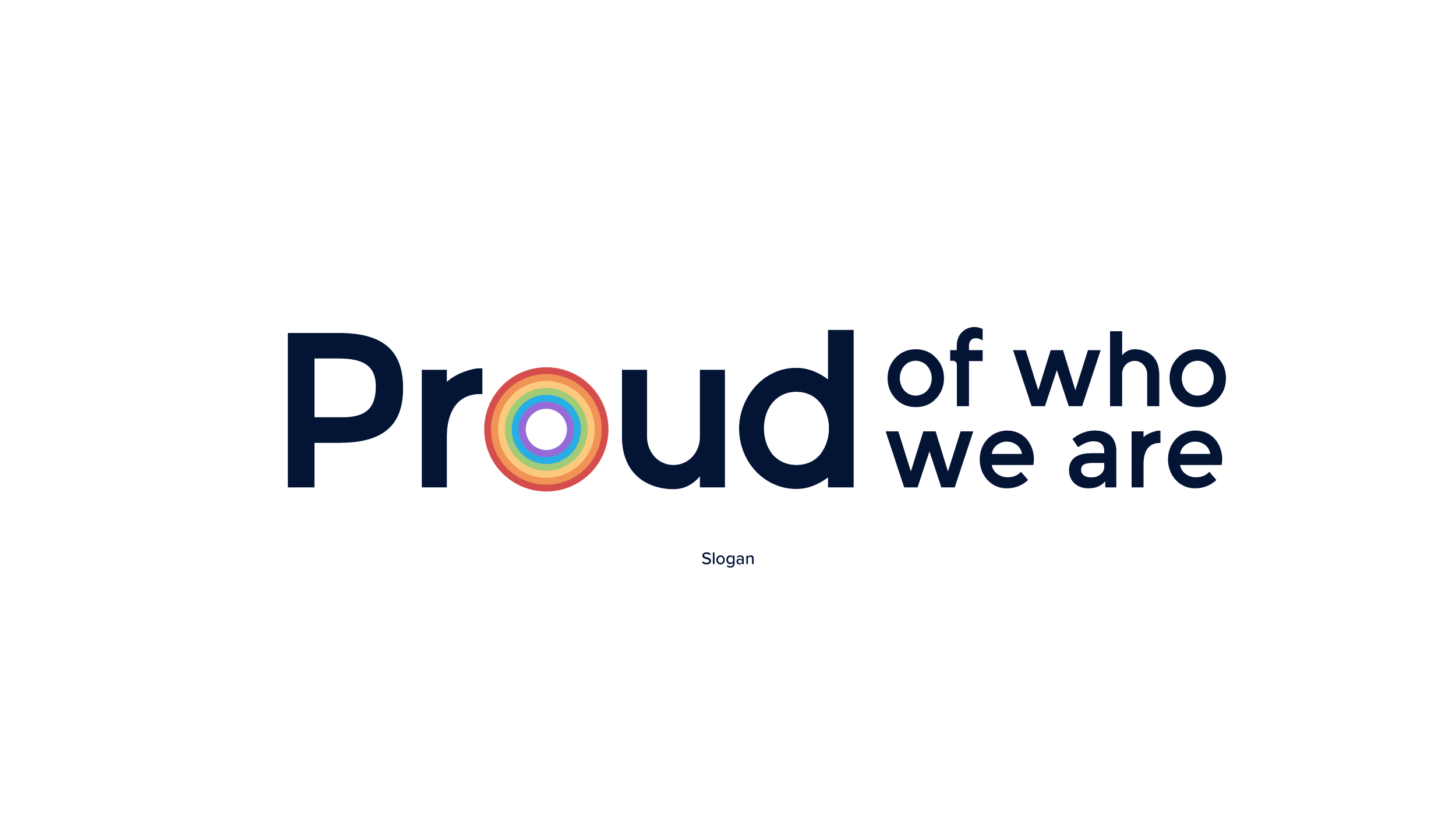
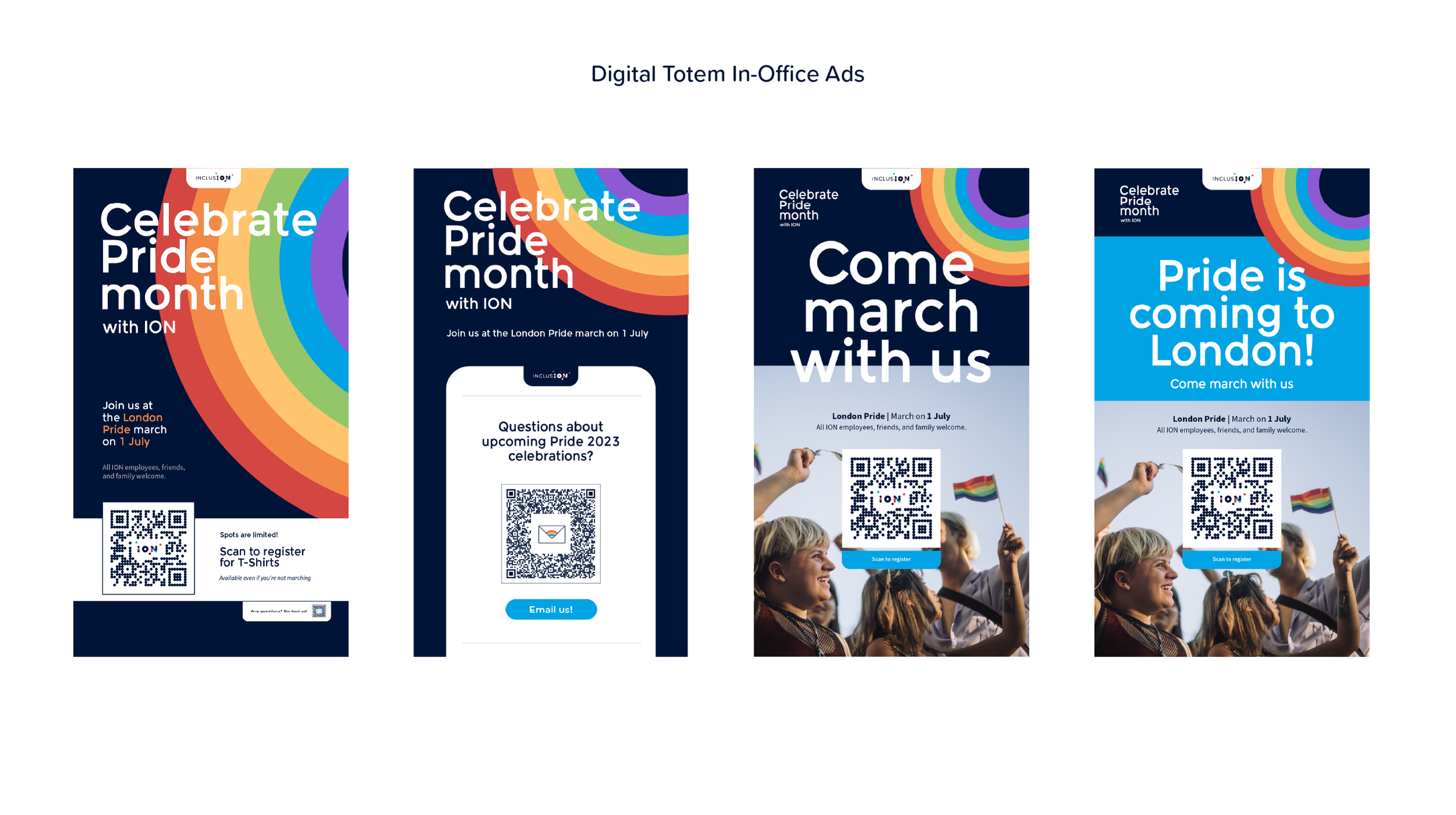
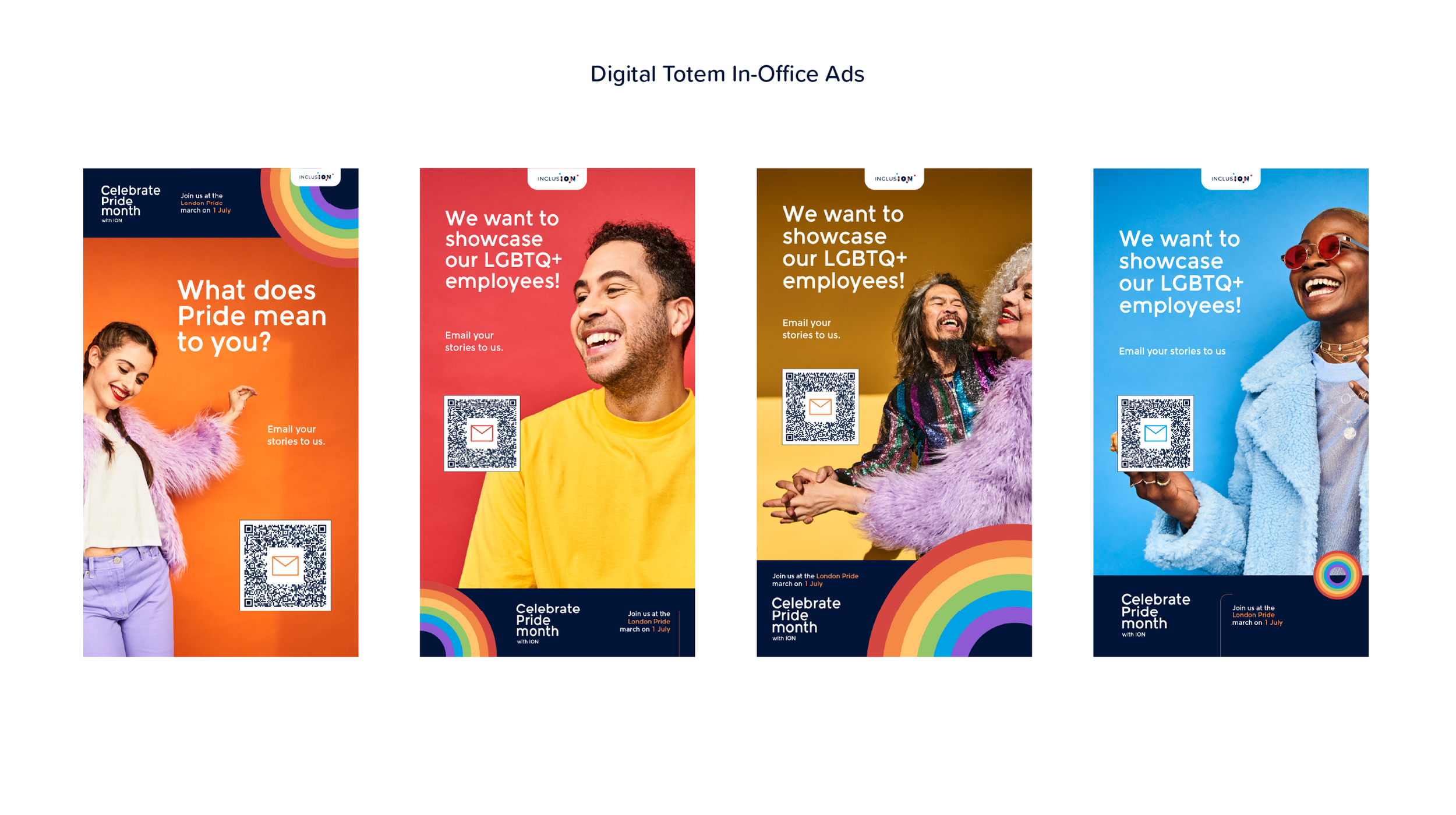
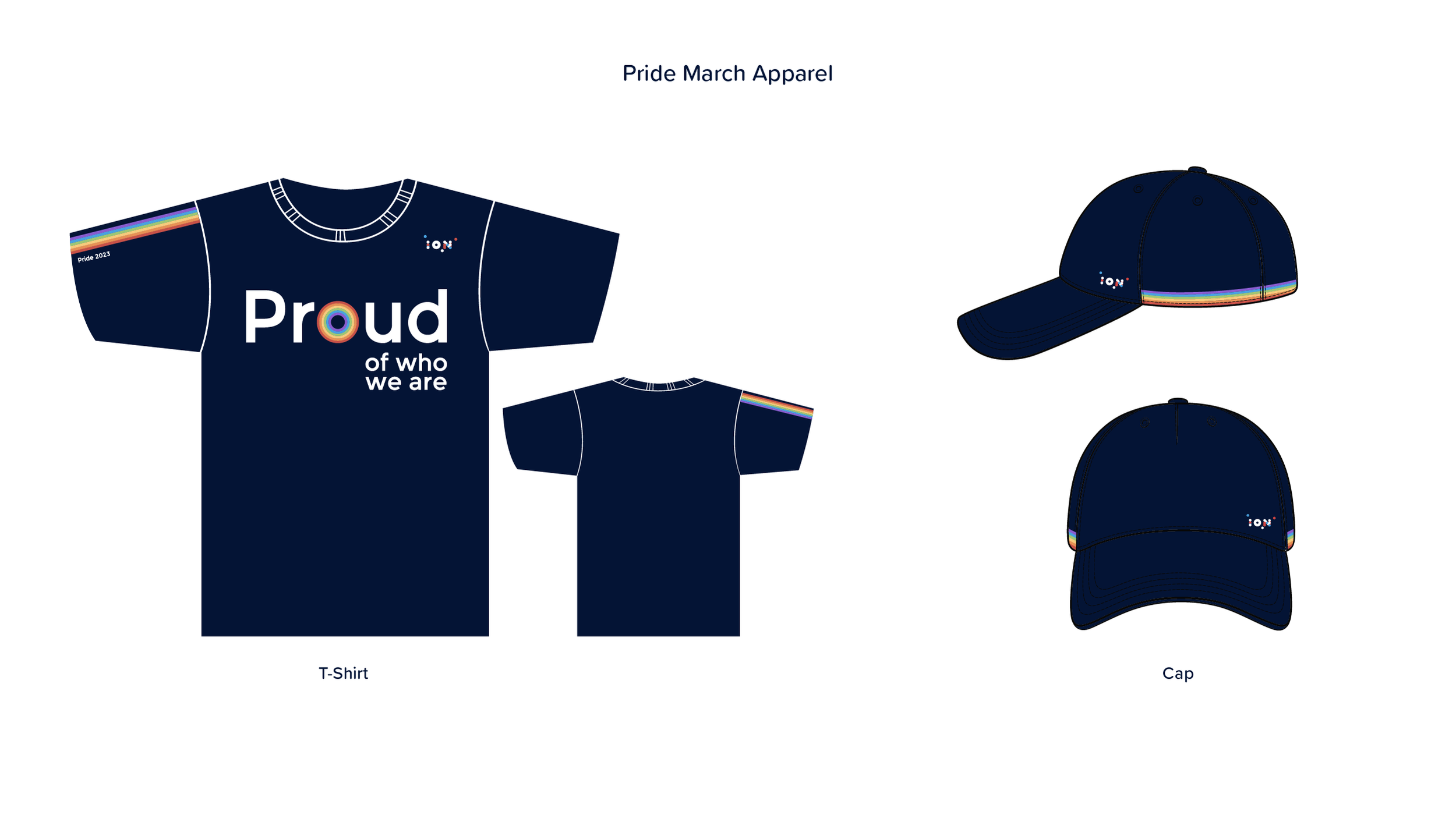
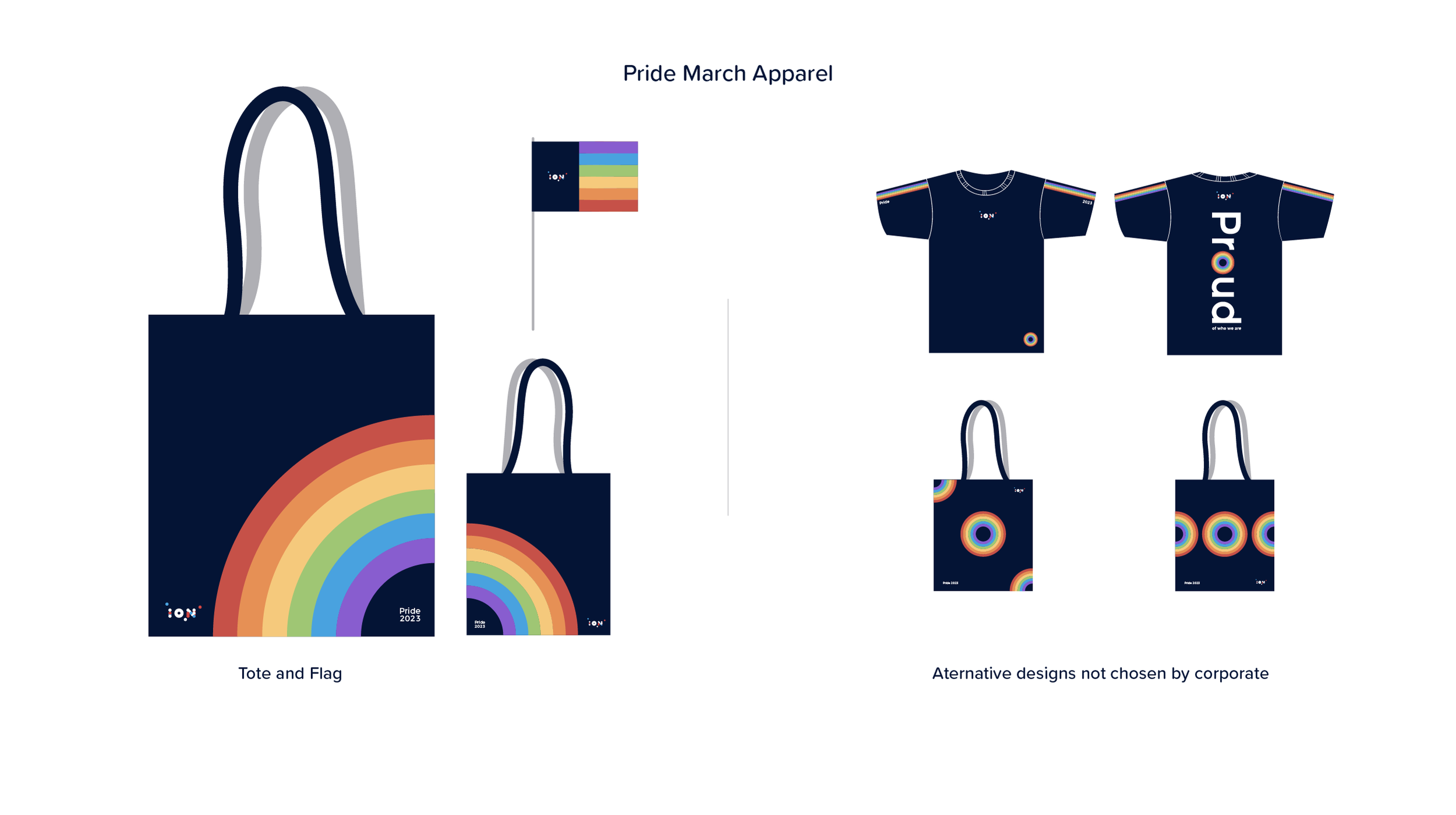
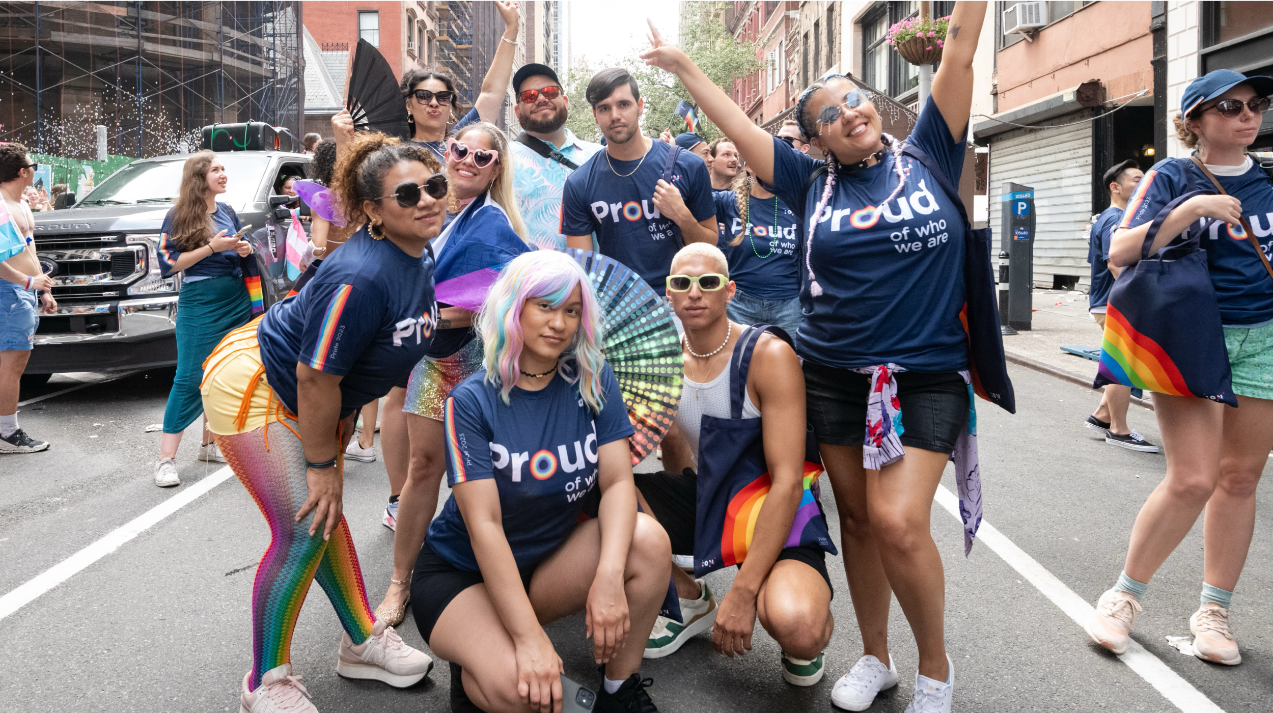
Developed a modular identity system rooted in vibrant color, bold geometry, and expressive typography to balance visibility with strategic consistency.
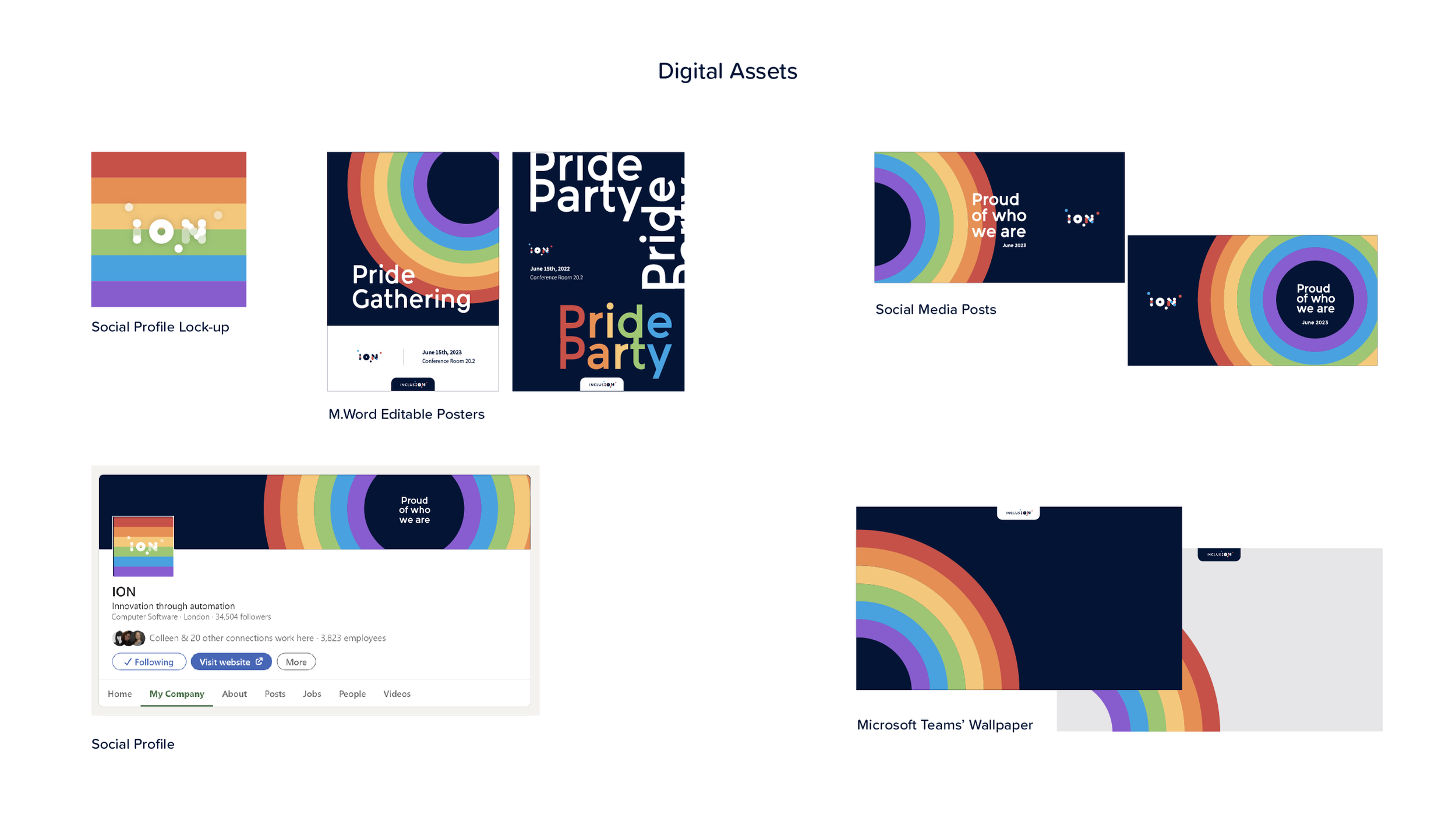
Created flexible design elements and color harmonies that could appear in event signage, digital campaigns, internal comms, and swag — ensuring adaptability across touchpoints.
Incorporated symbols and visual cues connected to Pride movements in ways that emphasized respect, celebration, and community empowerment.
Collaborated with cross-functional partners across People & Culture, Employee Resource Groups, and internal comms to ensure the design reflected both community voices and organizational goals.
Oversaw implementation and asset distribution to internal teams, ensuring designs were used with intentionality and cultural care.
Visual execution

Outcome
The Pride Campaign identity system successfully amplified participation, resonated with internal communities, and reinforced ION’s commitment to inclusion and celebration. Its flexibility enabled teams to adapt assets to varied contexts — from digital assets and internal newsletters to event signage and celebratory graphics — while maintaining a cohesive visual voice. The design not only elevated the visibility of Pride events within the company, but also generated positive feedback from employees who felt seen and represented in the visuals.