
ION
Brand Architecture • Brand Development
Originally created in 2016 by creative agency FutureBrand, the ION guidelines didn’t solve a gap with business structure, which made the brand difficult to understand.
Role: Brand Designer


Challenge & Approach
A house of brands.
Though vast and detailed, the delivered style guide didn’t capture the structure of ION. From mergers happening up to twice a year, to a library of products on the website, the brand needed a visual system that encased portfolios and their products. This system needed to work through all of branded touch-points, ensuring a consistency in visual language with intended order and clarity.
The focus.
With a clear understanding of the brand structure, the guidelines were reviewed to focus on the elements, like color and typography, that could support this growing system.

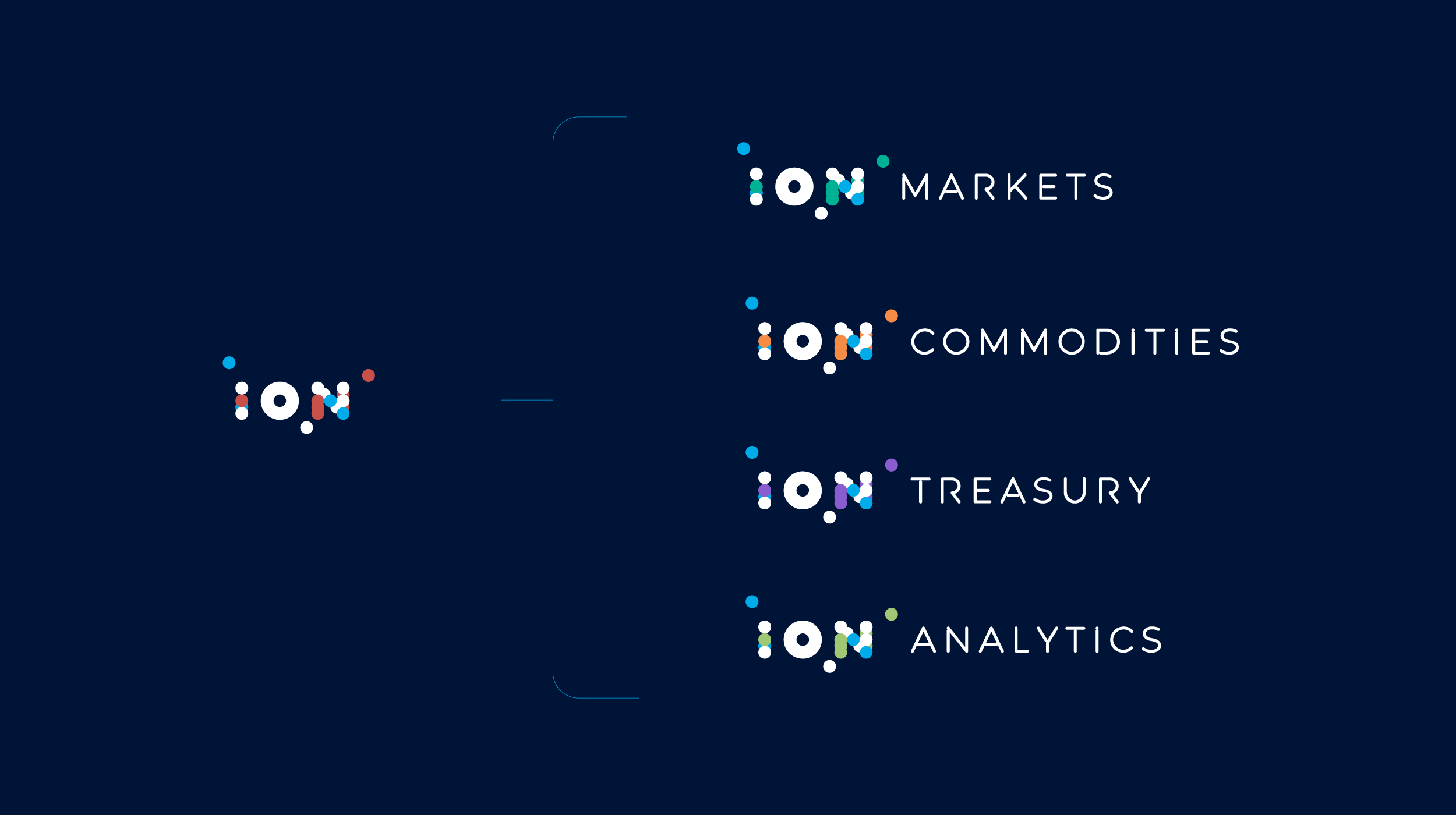
Lock-ups
A clear portfolio.
Creating distinction at this level was very important, because it helped viewers understand which portfolio of products they are looking for.
A color was assigned to each portfolio using ION’s vast color palette, followed by a lock-up using ION’s unique designed font “Expression”. Originally intended as a way to create visual flair on words like “Automat[ion]”, “Innovat[ion]”, there was a clear opportunity to leverage it on the lock-ups.

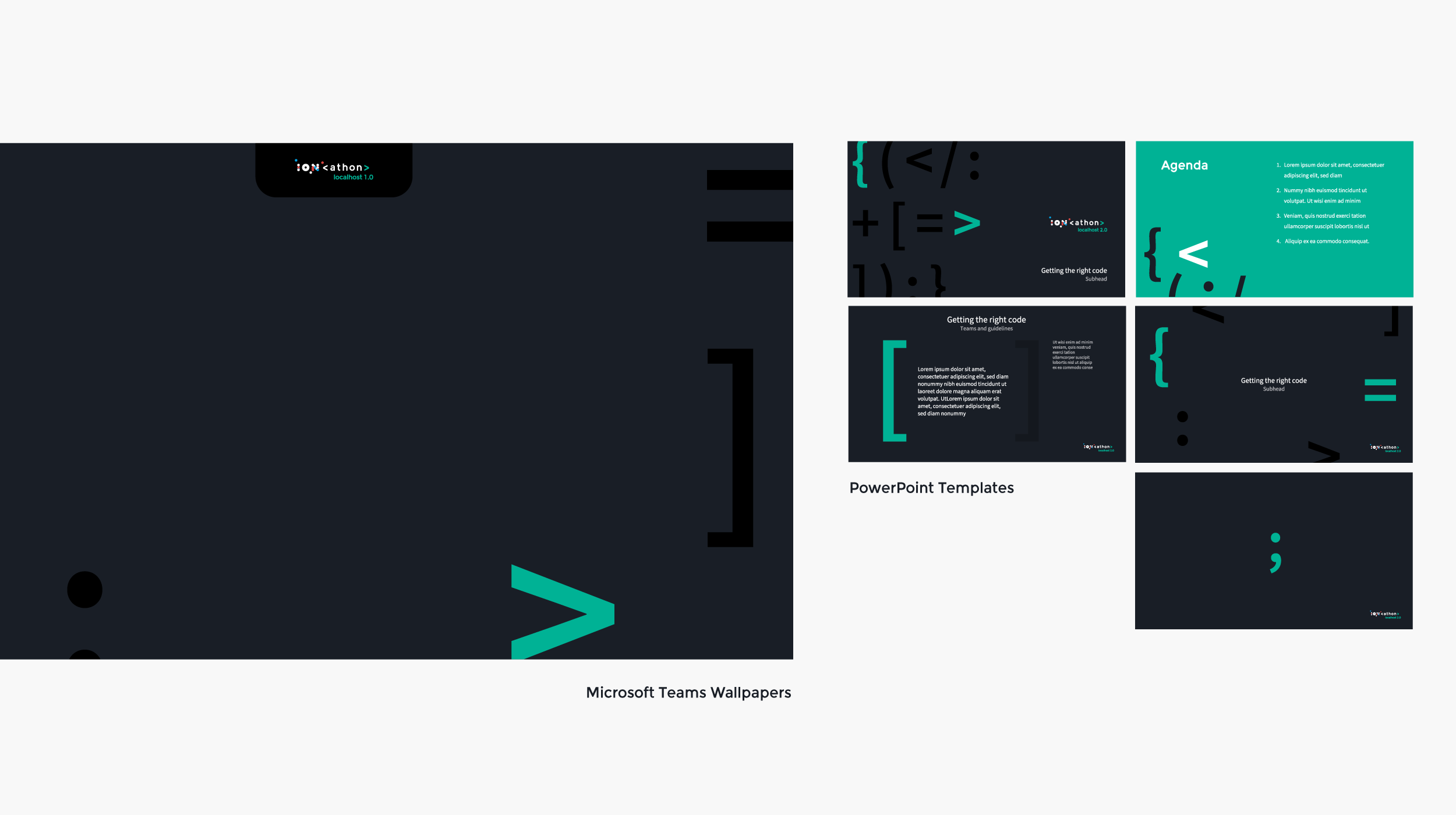
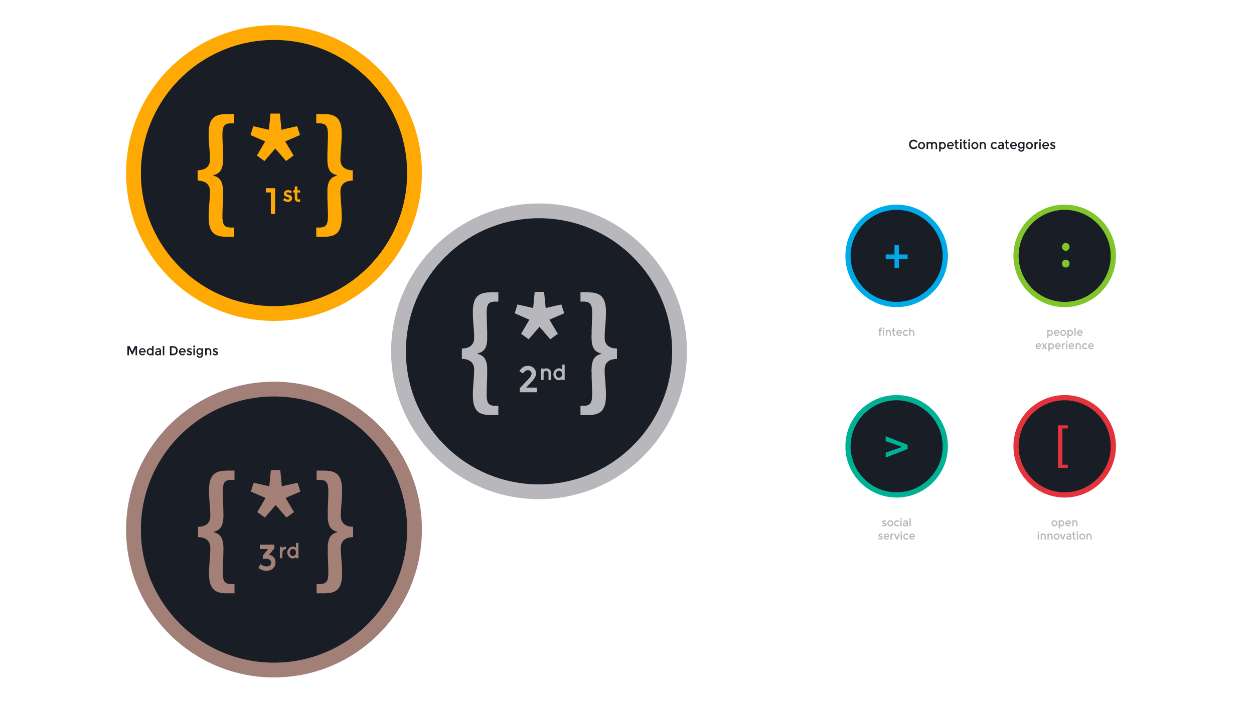
Giving the event a friendly voice
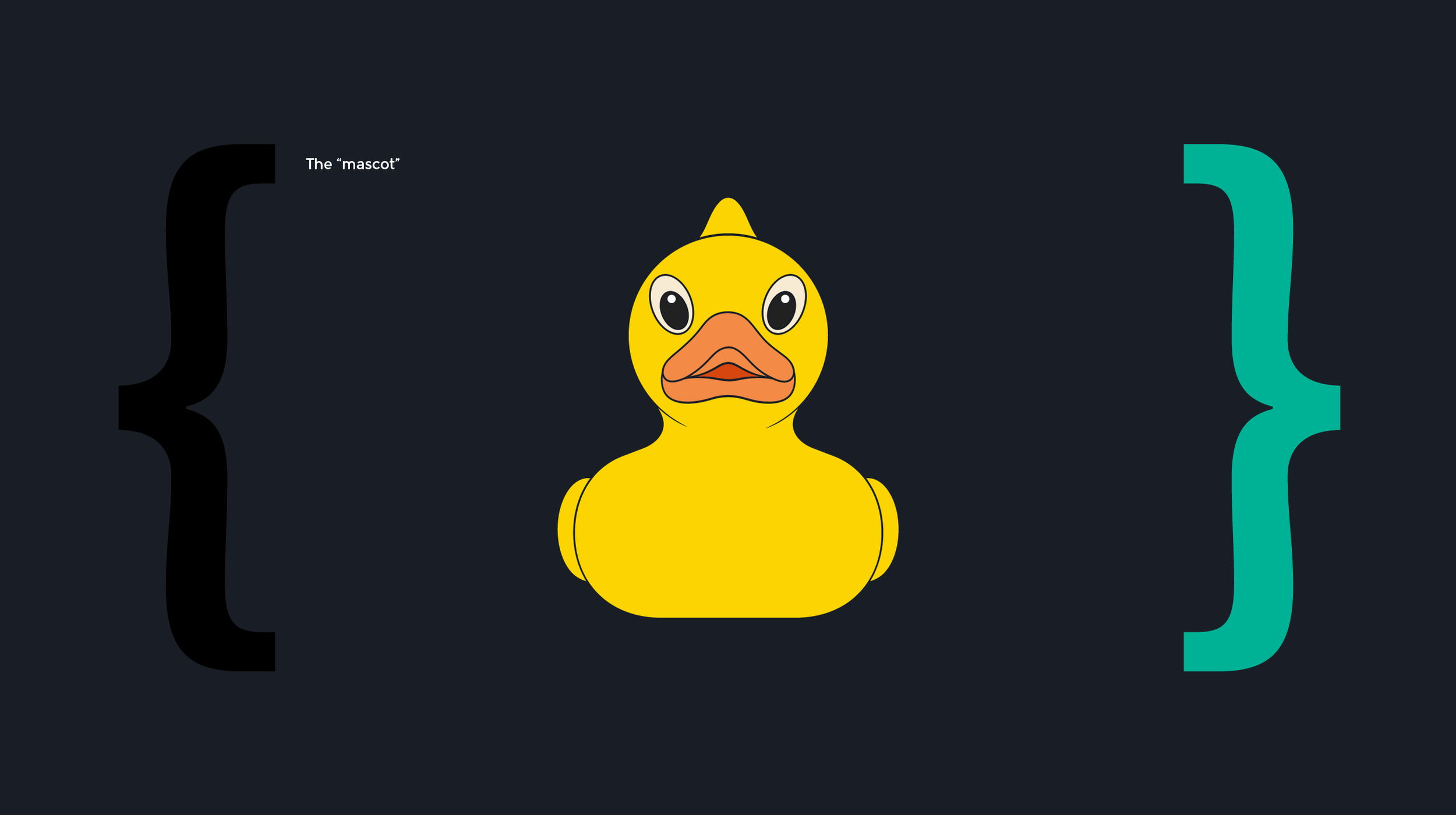
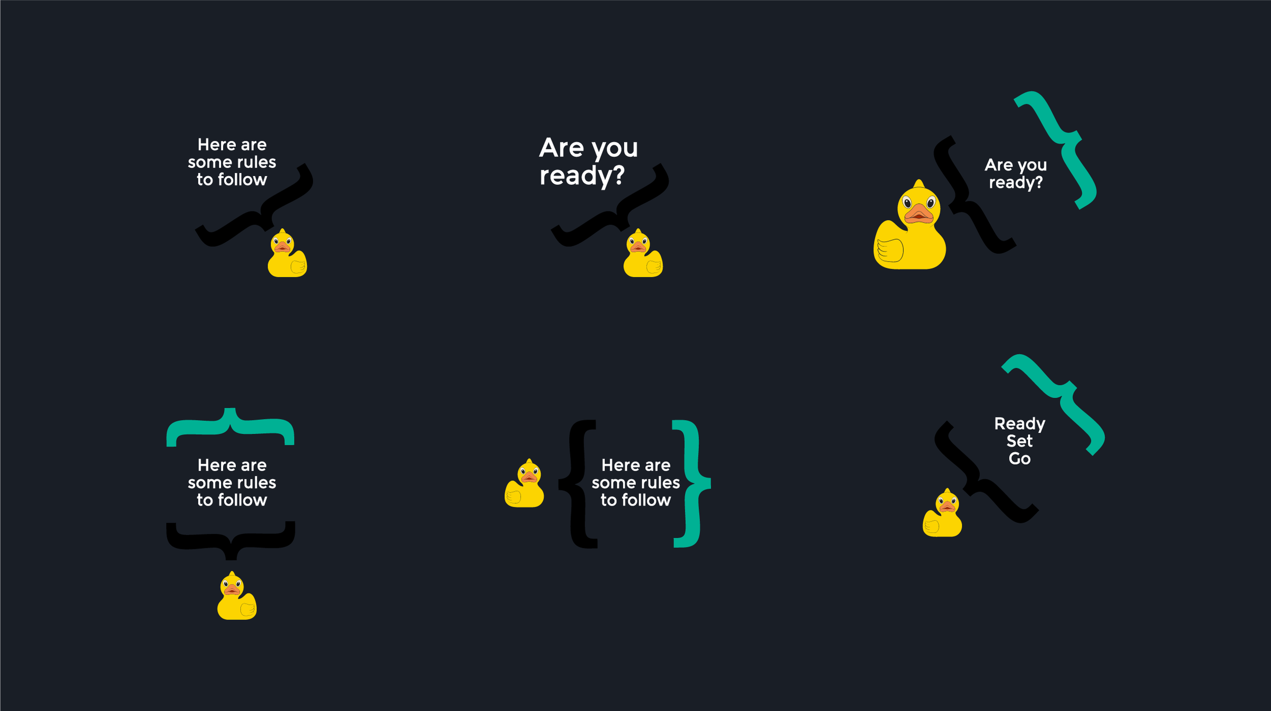
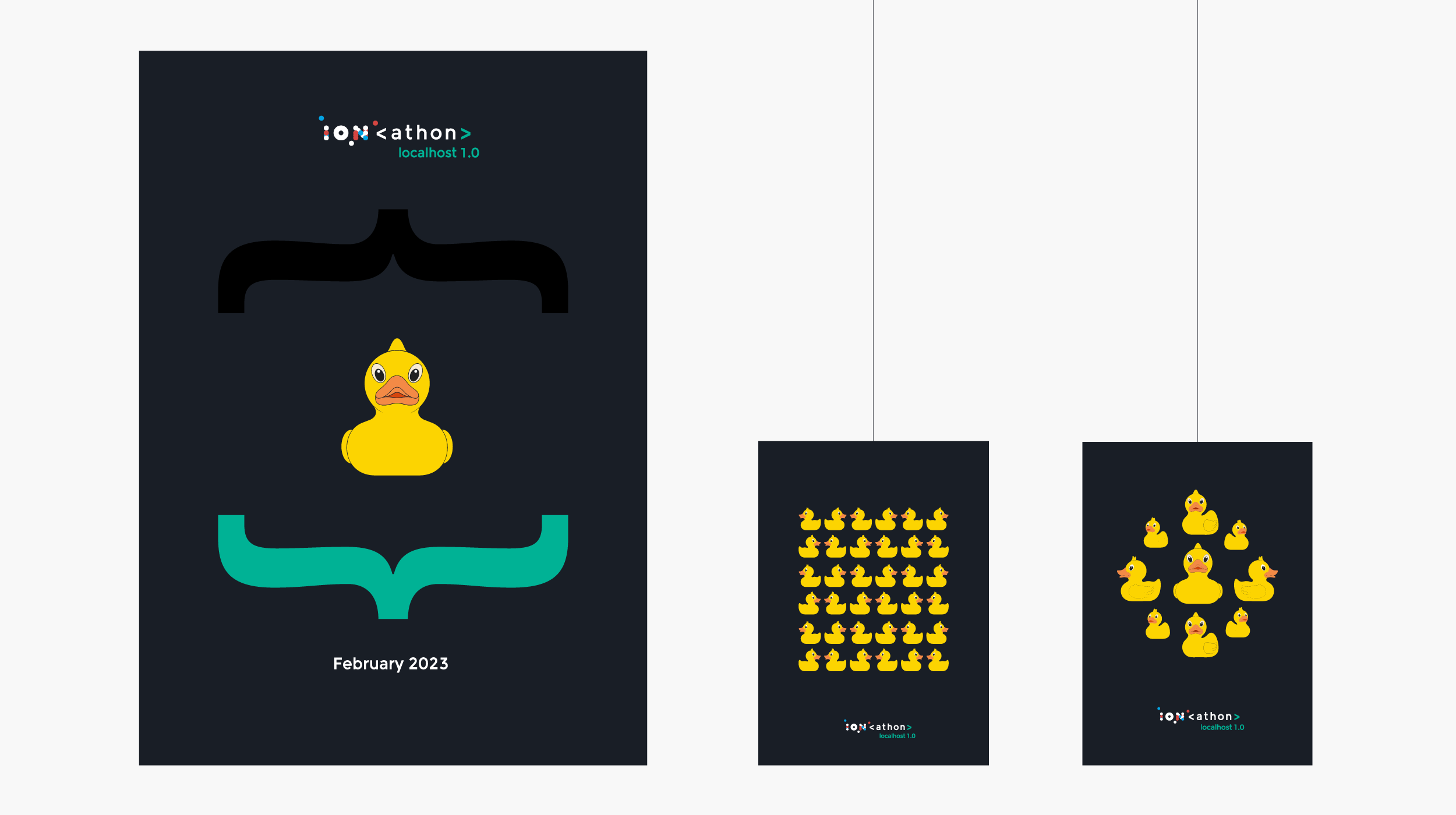
The rubber duck introduced a playful reference to a familiar debugging practice: talking through a problem aloud to work toward a solution.
I brought that reference into the identity as a mascot, giving the event a character rooted in its audience’s culture. The duck appeared across promotional materials and delivered instructions, adding personality to practical communications.
It became a way to carry the event’s tone through the experience, pairing the technical language of the identity with a sense of humor.
Outcome
A distinct debut and a foundation for future editions
The identity debuted at ION’s India-region hackathon, receiving positive feedback from participants and organizers.
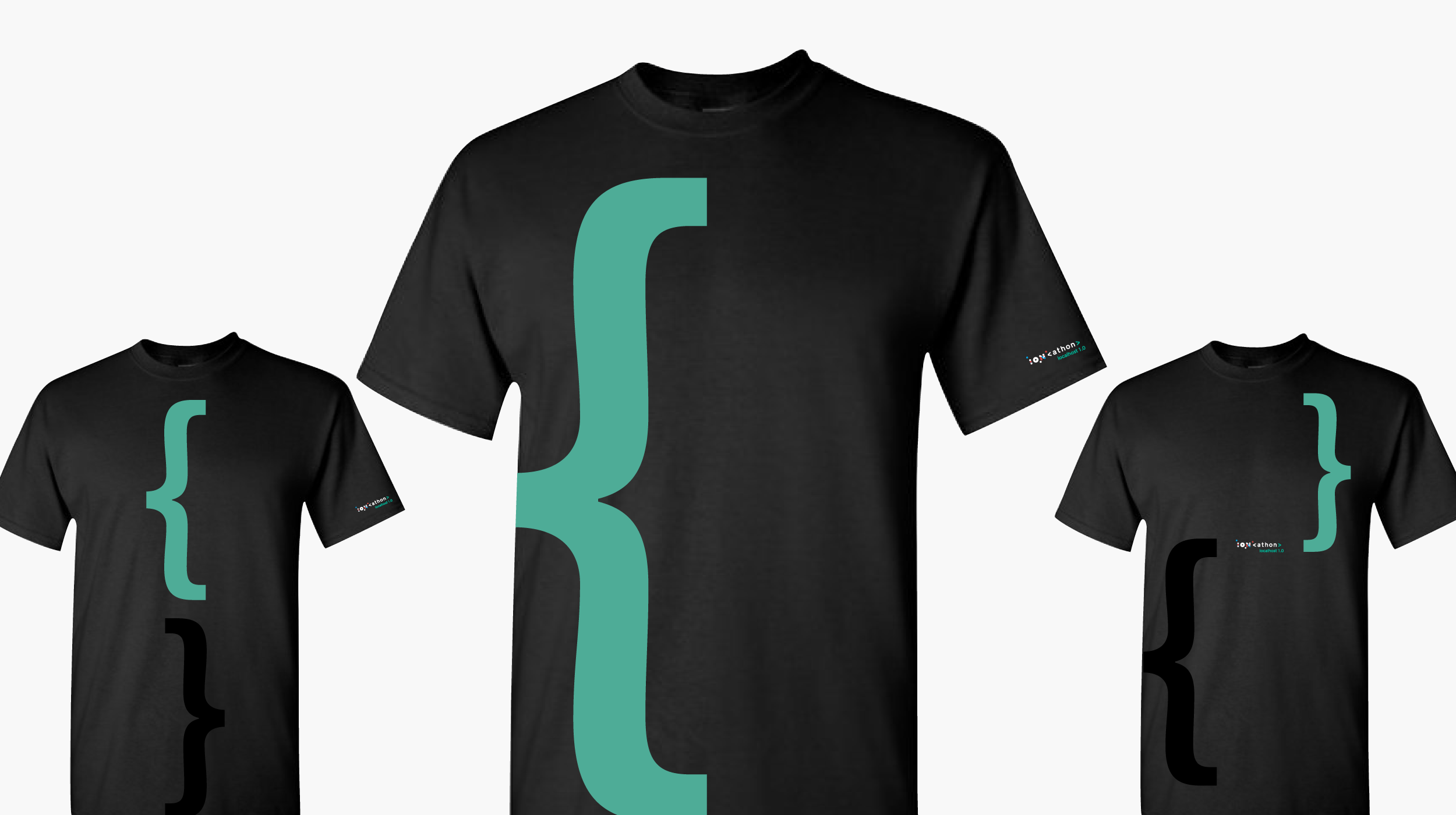
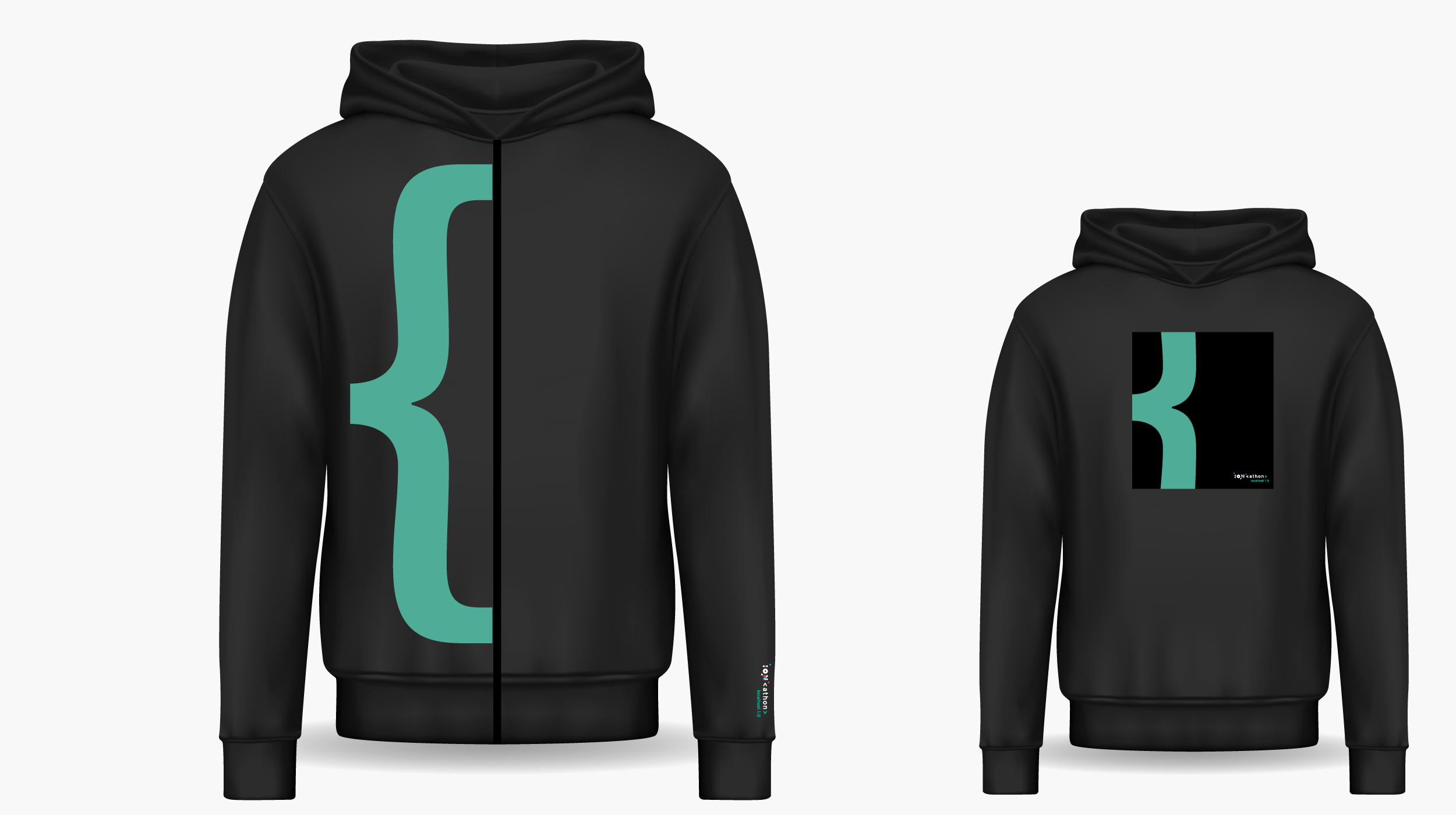
The launch brought the system together across event communications and materials, establishing a distinct visual presence within the broader ION brand. Its modular structure and versioning approach provided a foundation for future editions to build on.
The project shows how I connect audience insight with brand development—using a relevant creative idea to shape an identity, its tone, and the ways people encounter it.