
Mock & Proper
Brand Identity and Campaign
Mock & Proper brings people together over low- and no-alcohol drinks designed to complement a balanced lifestyle. It’s for people who want to enjoy the ritual of a drink and the connection of a night out while staying aligned with how they want to feel the next day.
The project began as a design assessment with a focused brief: create a logo and a four-slide Instagram ad carousel. I saw an opportunity to build beyond those deliverables and explore how the brand could look, speak, and connect with its audience.
Taking on the role of creative director and designer, I expanded the brief into a complete brand system spanning visual identity, messaging, photography direction, packaging, website design, and email campaigns. The result is a refined yet playful brand that makes mindful drinking feel like a choice worth celebrating.

Challenge
Make moderation feel like an invitation.
Mock & Proper’s brief called for a low- and no-alcohol wine and spirits brand that could feel sophisticated without the formality often associated with premium drinks. The audience was socially engaged, design-conscious adults who wanted the pleasure of the occasion with more choice in what they poured.
The challenge was to make that choice feel desirable in its own right. The identity needed to communicate taste, personality, and belonging while supporting a varied product range.
Approach
Refined with a rebellious streak.
I built the creative direction around the tension within the name. “Proper” suggested considered presentation, beautiful glassware, and familiar rituals. “Mock” introduced permission to reinterpret those conventions.
The campaign idea, “Impeccably Improper,” brought those qualities together. Refined photography established the setting, while assertive typography, unexpected arrangements, and playful language disrupted its formality. That balance became the foundation for decisions across the brand.
The Visual Identity
Refined in mood. Bold in expression.
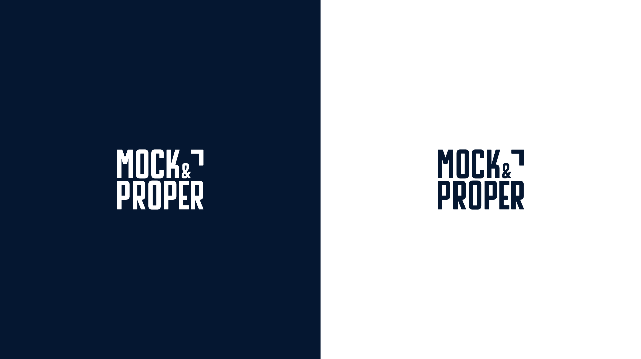
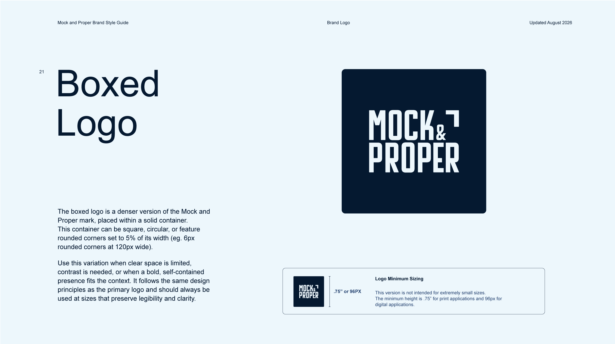
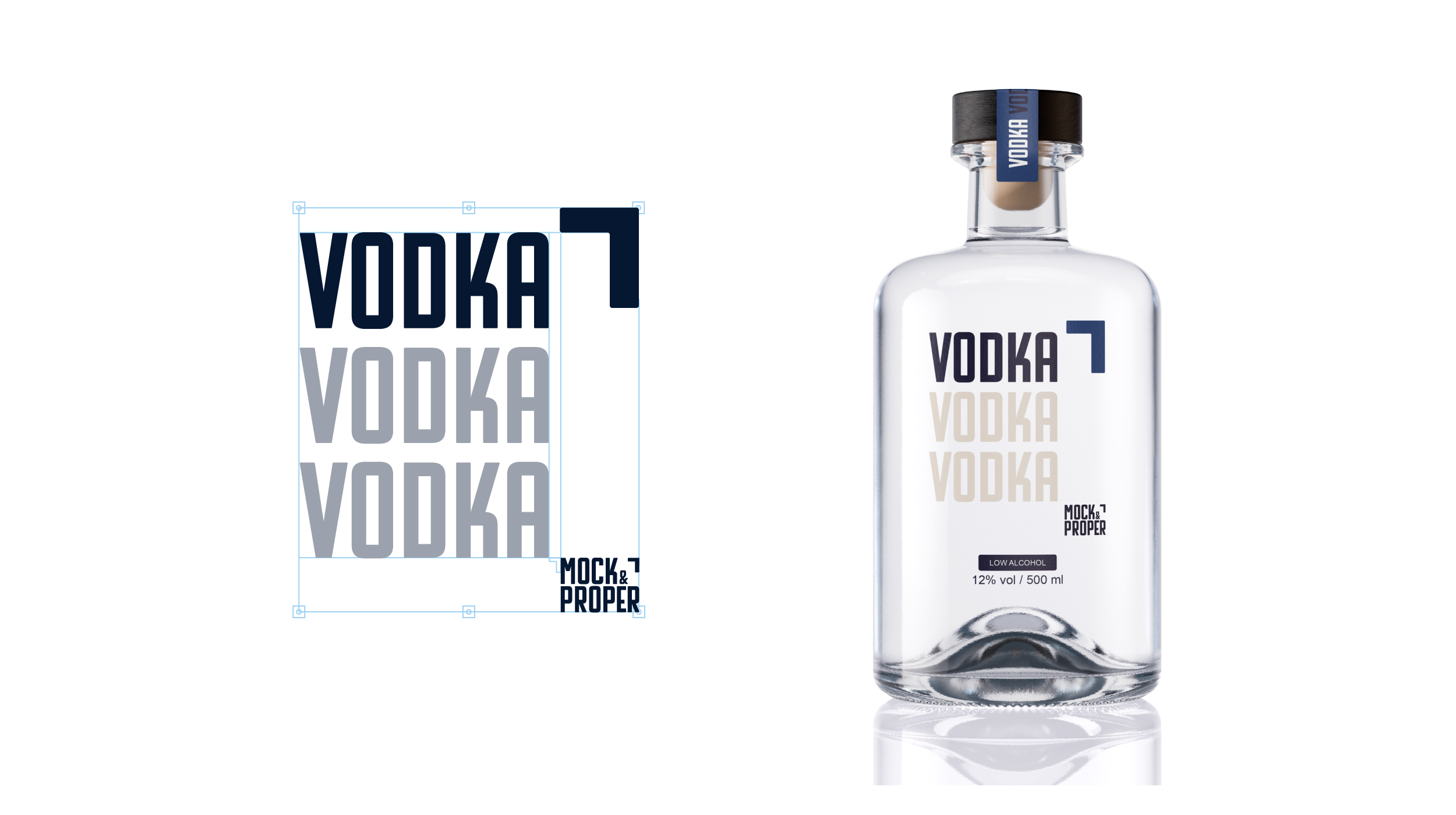
The condensed logotype gives Mock & Proper a compact, assertive presence. Its stacked arrangement creates a recognizable silhouette that works across bottle labels, campaign layouts, and digital headers. Supporting lockups accommodate different proportions while retaining the same character.
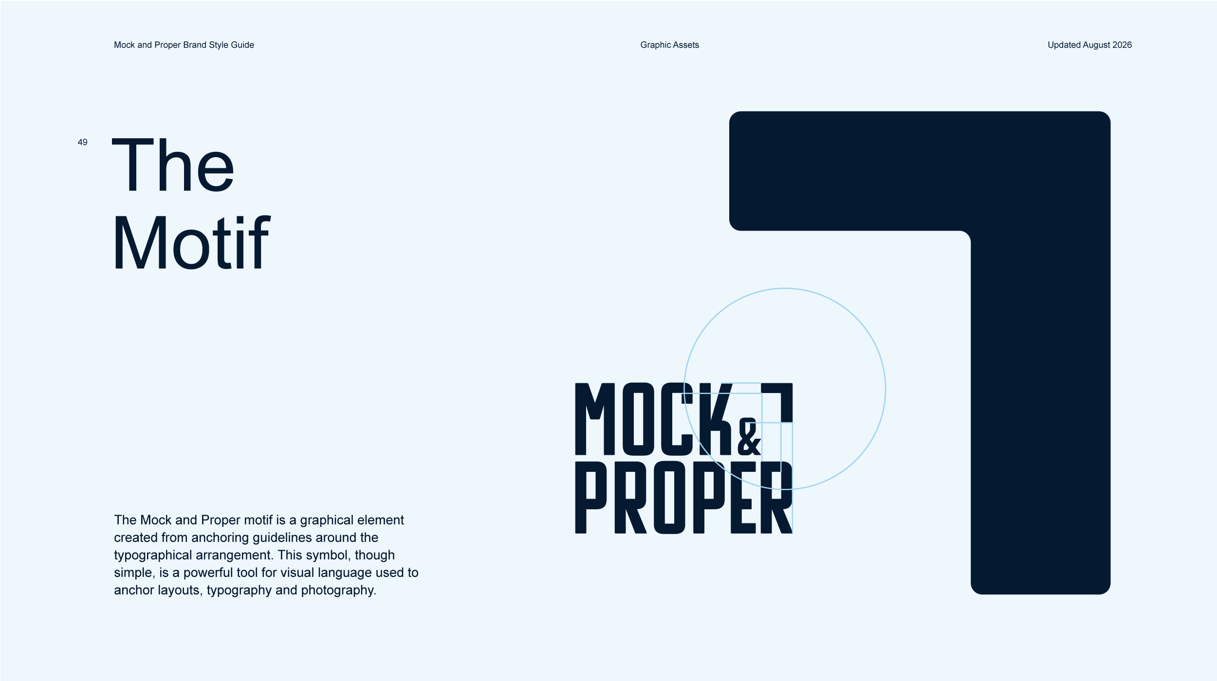
I developed the signature motif from the logo’s negative space, initially as an element to balance and anchor the wordmark. As the system evolved, it became a broader compositional device: anchoring typography, framing photographic focal points, and connecting layouts through the space it creates.
This gave the brand an ownable visual element beyond the logo itself. Used at different scales, the motif can act as a quiet accent or become the organizing structure of a composition.
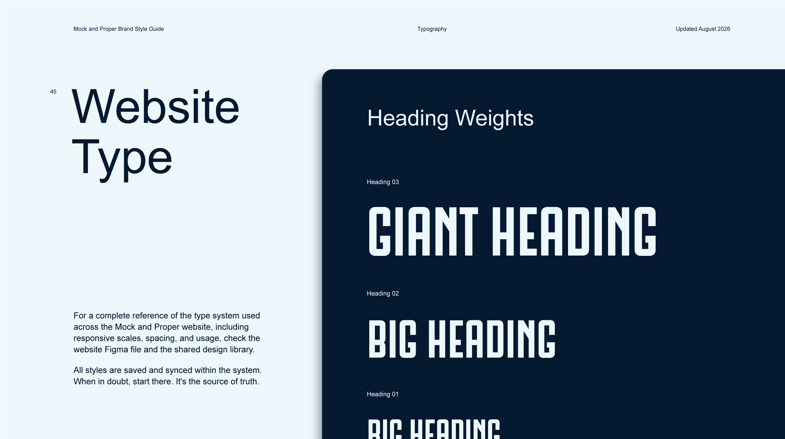
Condensed display typography carries the brand’s expressive voice, while a more restrained supporting typeface keeps longer copy and product information readable. Deep navy and warm cream establish the core palette, with additional colors distinguishing products and adding variety across applications.

Photography Direction
A proper setting. A playful spirit.
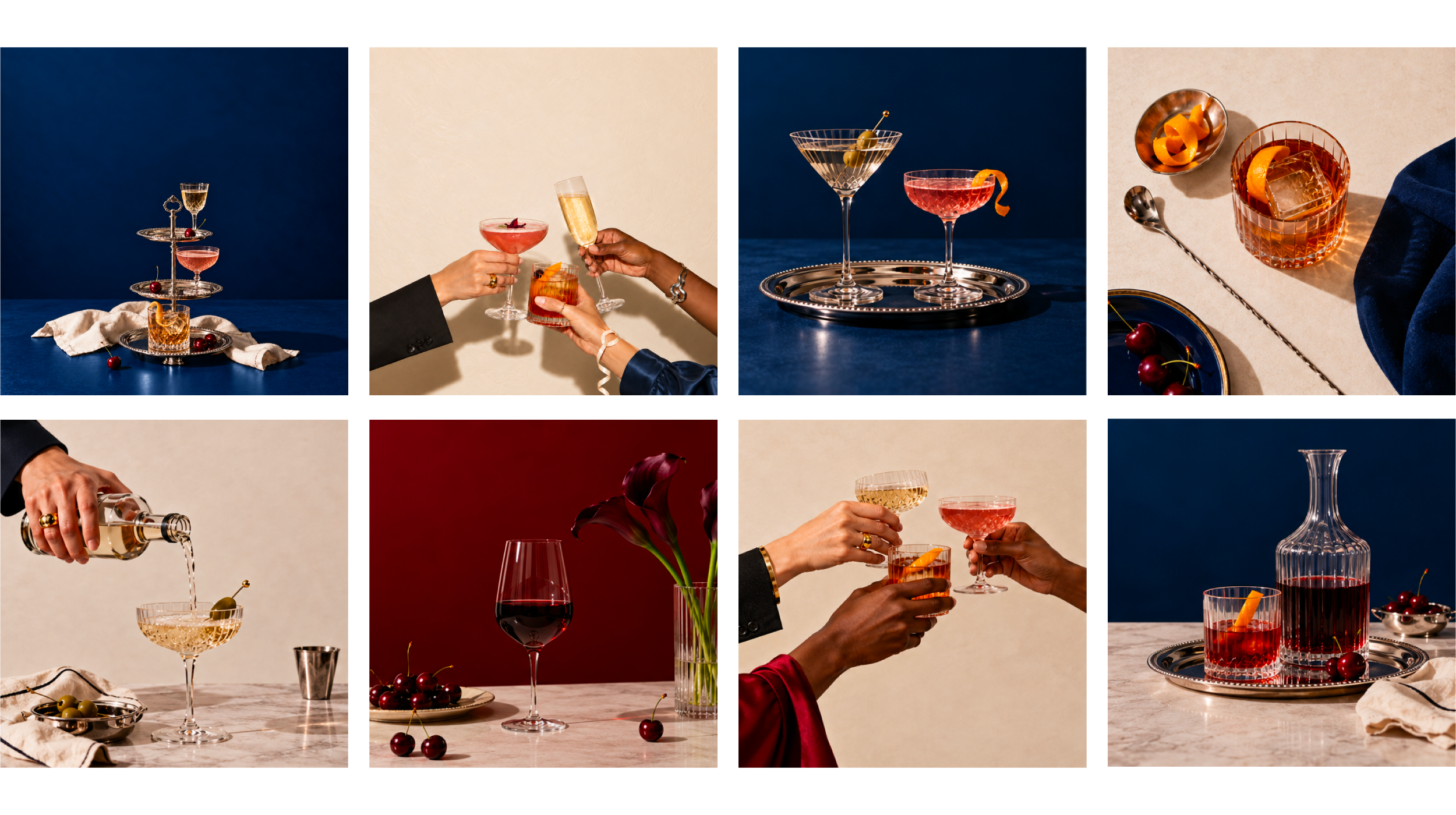
The photography pairs the elegance of a speakeasy with the warmth of a shared ritual. Cut crystal, silver trays, and rich textiles establish a refined setting, while unexpected arrangements and expressive gestures keep it playful and inviting.
Deep navy, warm cream, and burgundy connect the imagery to the brand palette. Directional light emphasizes the sensory details: reflections through glass, the texture of linen, and the color of a garnish.
Developed using AI-generated imagery under my creative direction, the series balances composed still lifes with social moments. Intentional negative space accommodates headlines and the signature motif, allowing the photography to work across web, email, and campaign formats.
Packaging Design
One identity. A distinct product family.
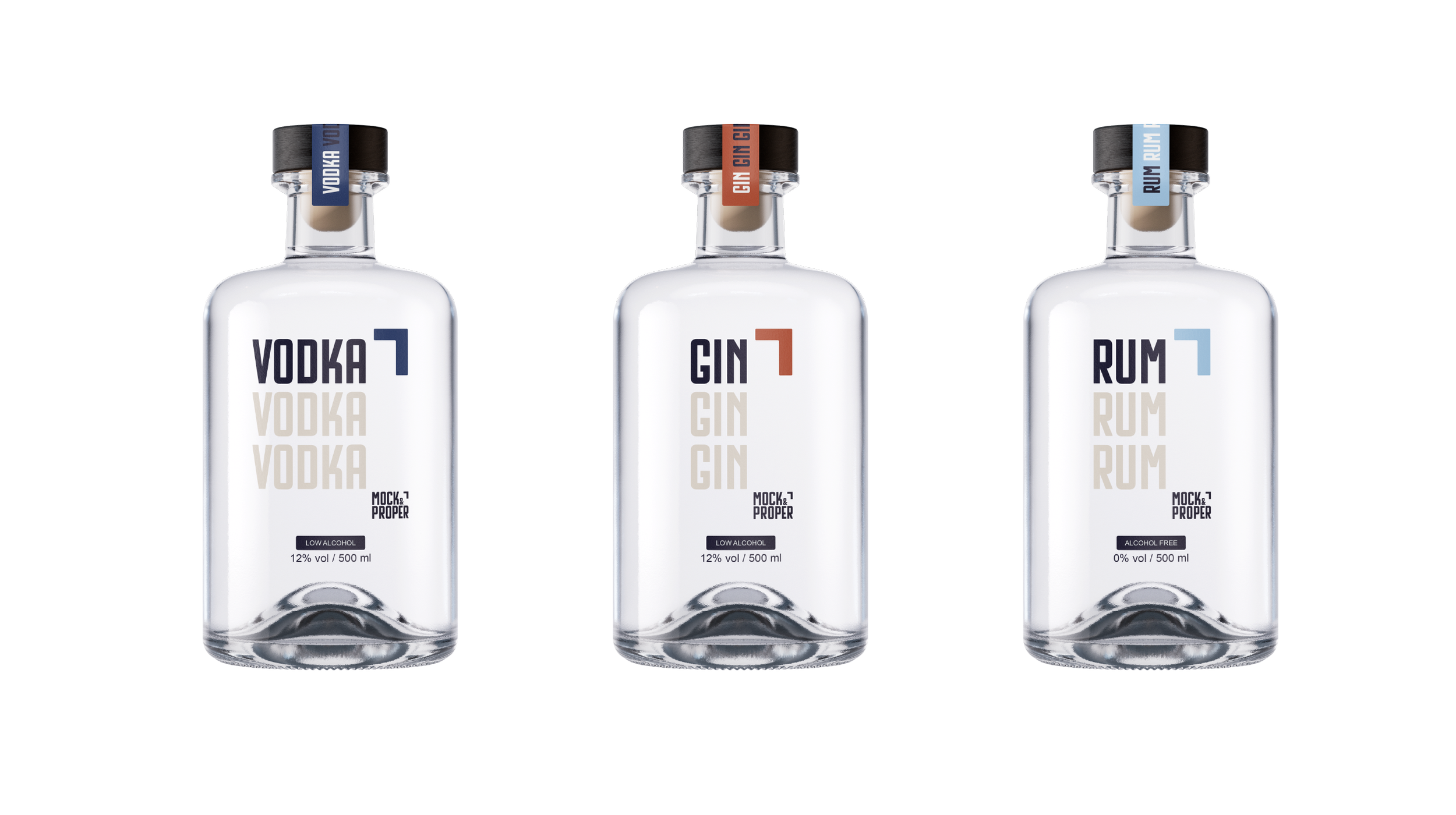
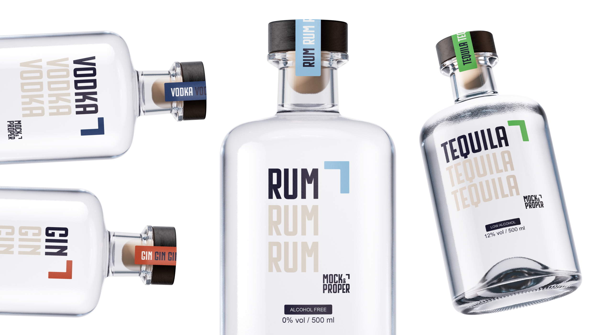
The packaging translates the identity into a coordinated range of spirit alternatives. Prominent product names establish a clear hierarchy, while repeated typography gives the labels a recognizable rhythm.
Color accents distinguish the varieties across labels and neck seals. The wordmark and signature motif remain consistent, connecting each bottle to the wider family.
I designed the labels to work both individually and as a group. That relationship carries into product photography, campaign compositions, and the website, where the range needs to remain recognizable at different scales.
The Ad Campaign
A recognizable voice across every format.
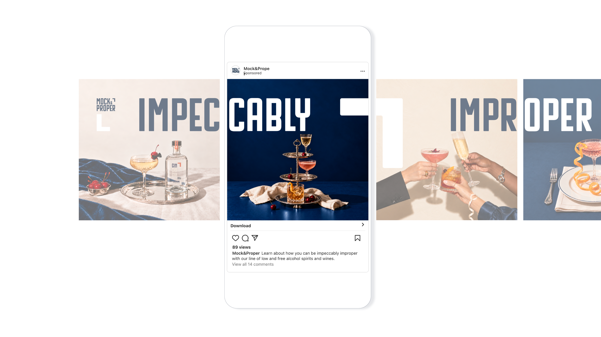
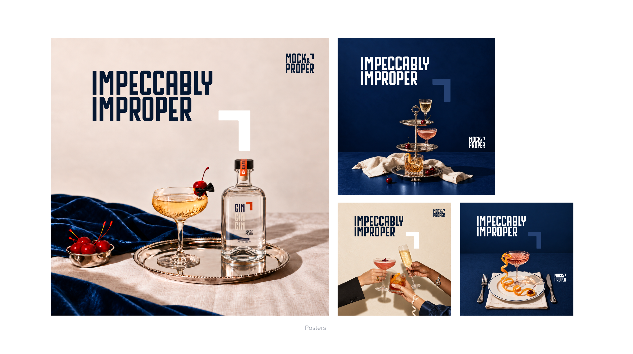
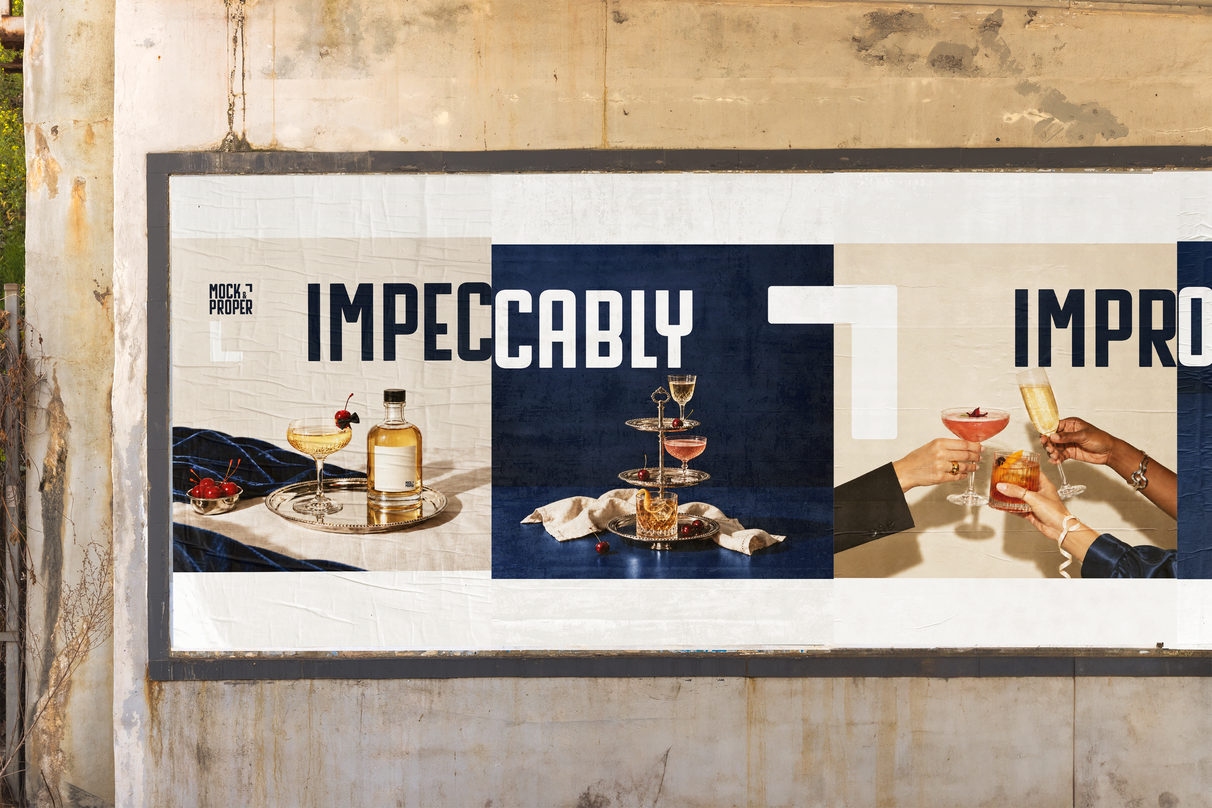
“Impeccably Improper” acts as the campaign’s recurring invitation. Bold headlines and refined imagery establish the central contrast, while the motif brings structure and movement to each application.
Across social, carousel, and advertising concepts, the system adapts to the space available. Some layouts lead with a shared moment; others focus on the product or let typography take the foreground. The motif anchors focal points and creates connections between adjacent frames.
These variations demonstrate how the identity can support different messages while retaining a clear visual point of view.
Digital Experience
From first impression to product discovery.
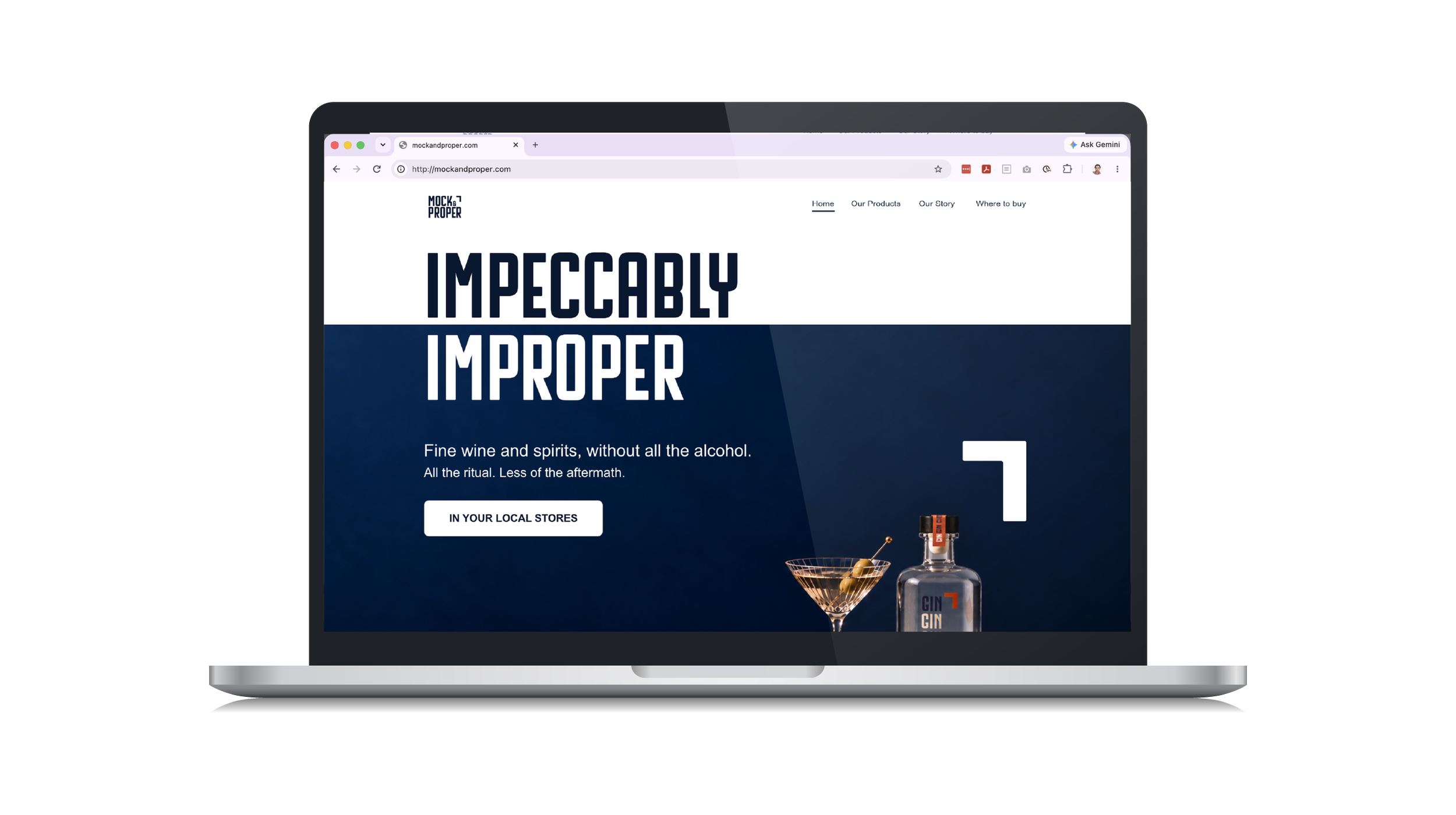
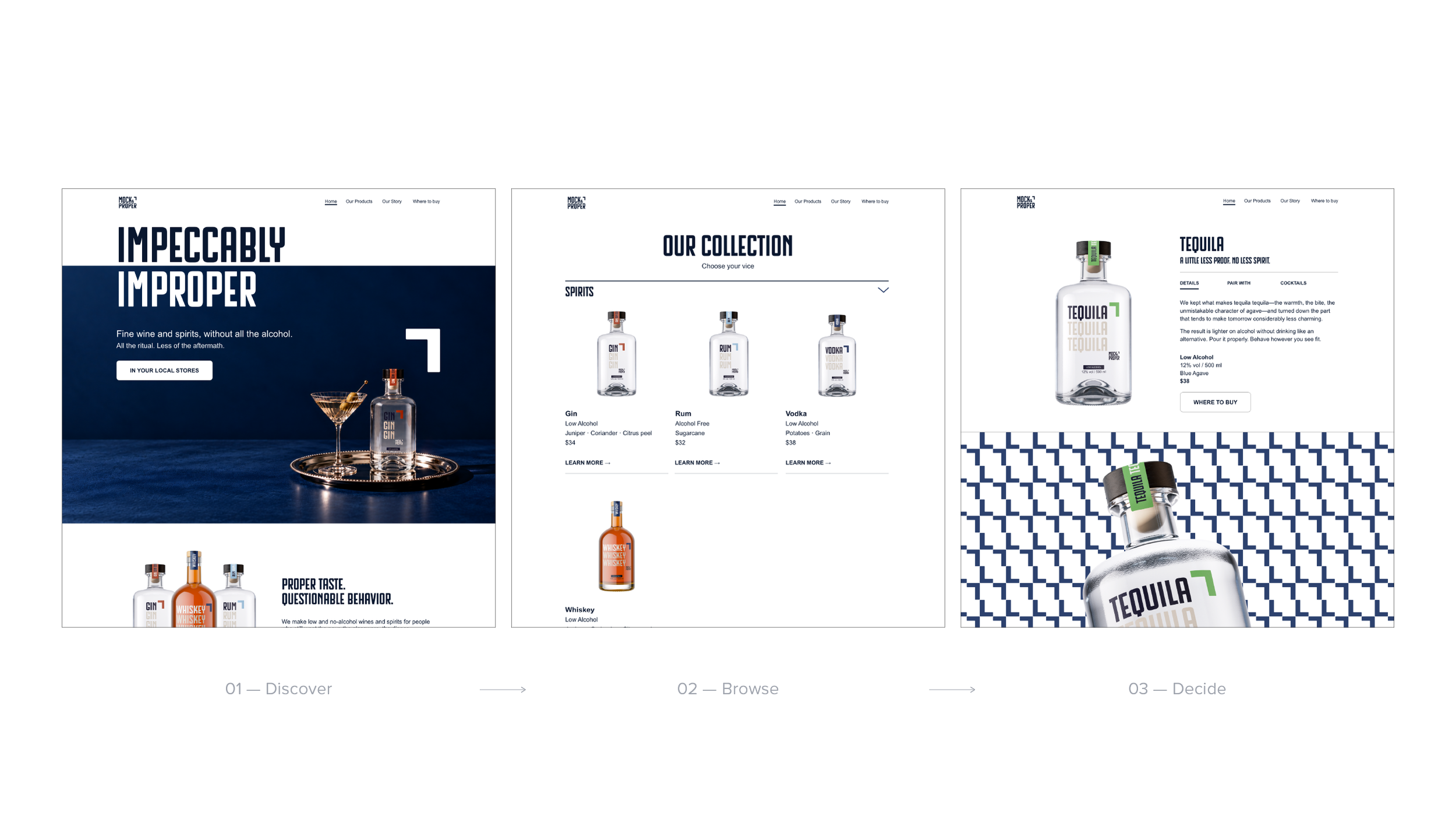
The website concept extends the campaign into a shopping experience. The homepage introduces the brand through atmospheric imagery and confident messaging, then brings the product range into focus.
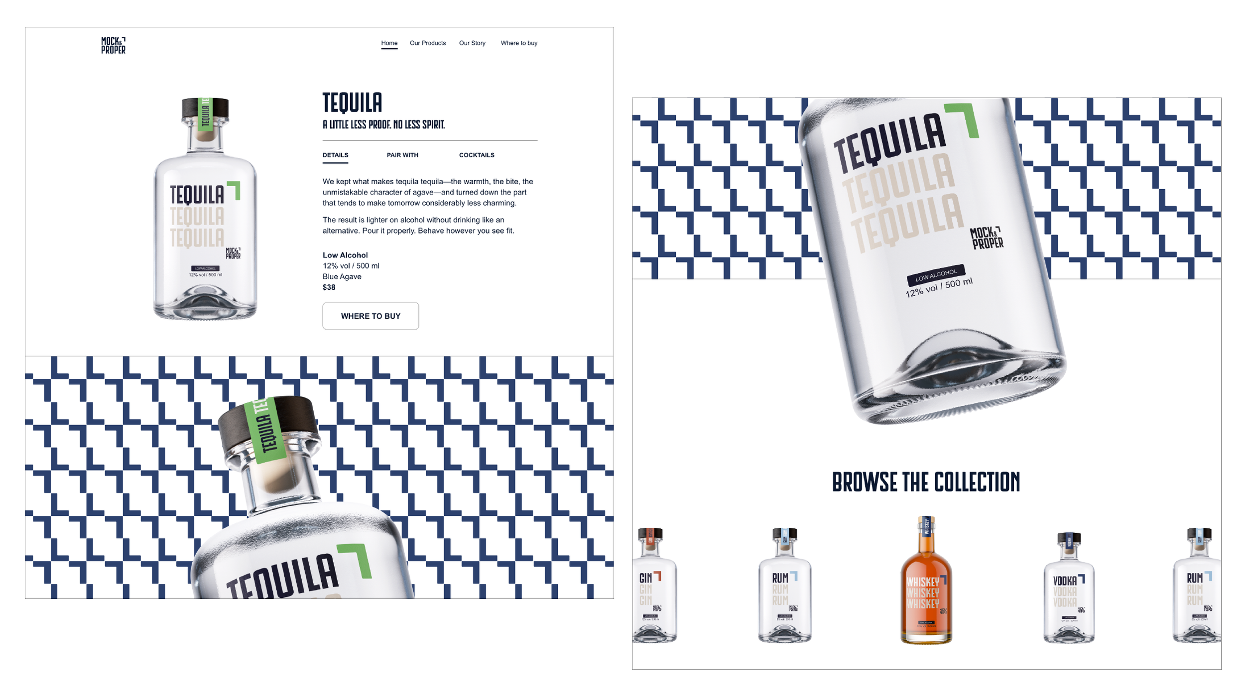
Collection and product pages use clearer, more restrained layouts to support browsing. Product imagery, color cues, and a consistent information hierarchy help visitors move from the broader brand story to an individual bottle.
The tequila product page brings packaging, photography, and copy together in one focused application. Throughout the experience, the signature motif connects expressive brand moments with more functional product content.
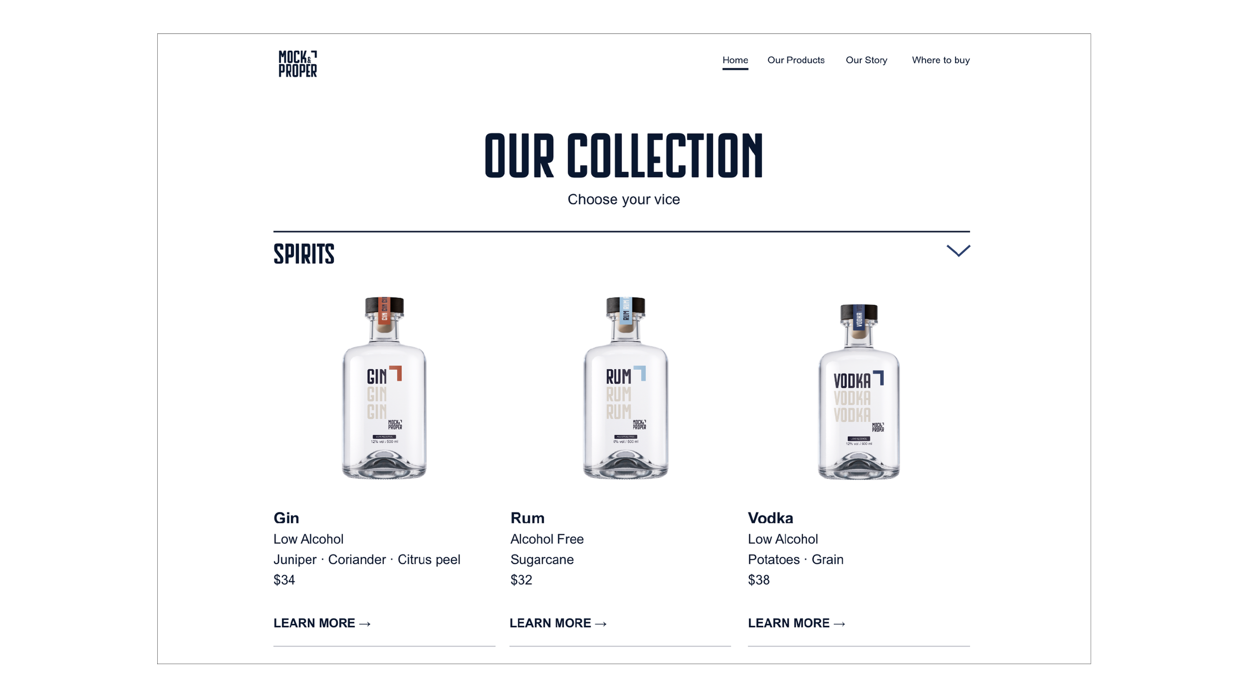
Designed to browse, not hunt.
A simplified product library removes unnecessary friction, allowing customers to understand the collection, compare products and move directly into individual product stories.
Email Campaign
Extending the invitation.
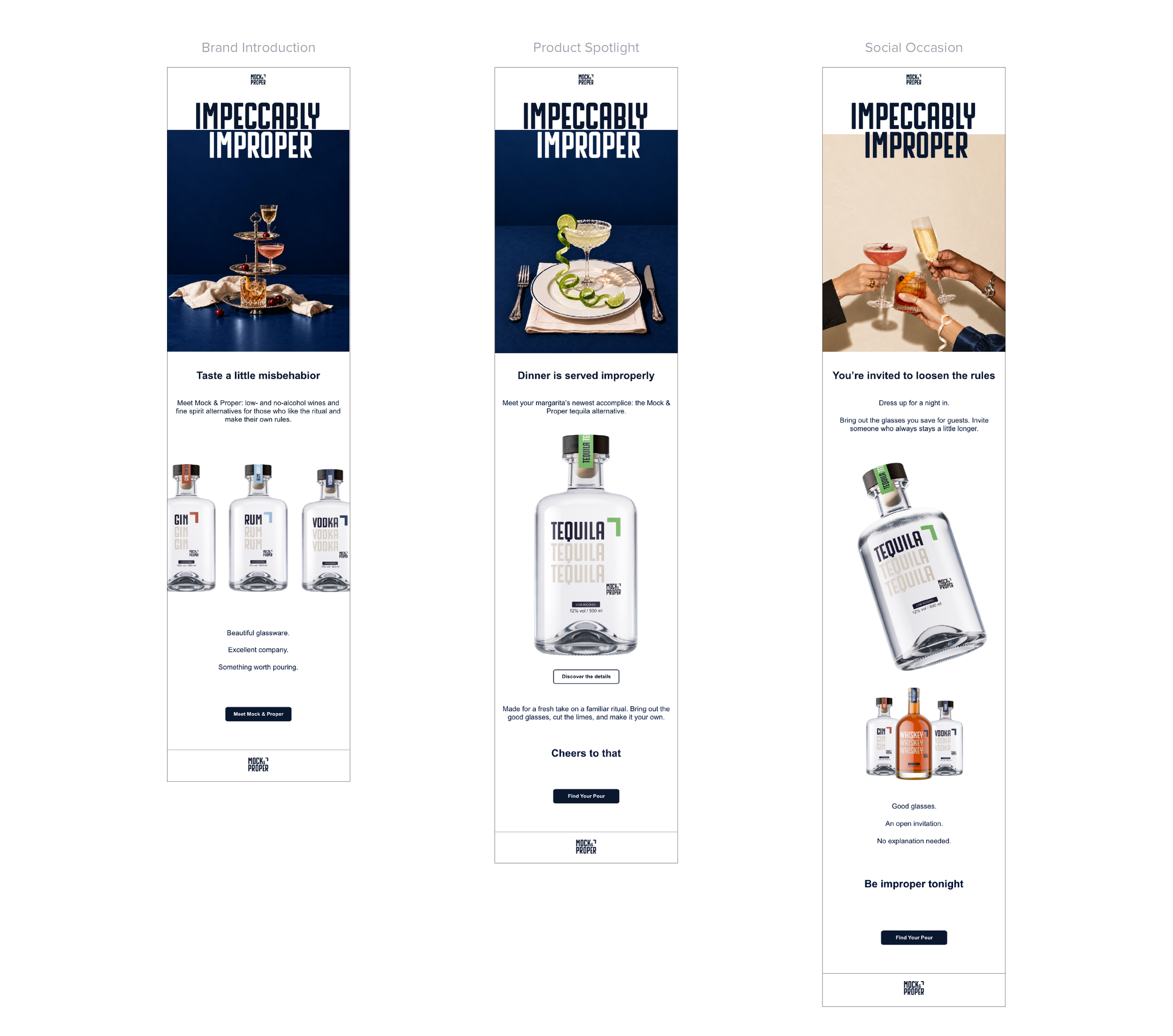
The three-email campaign gives each message a distinct purpose: introducing Mock & Proper, spotlighting its tequila alternative, and connecting the range to a social occasion.
A shared framework of campaign imagery, concise copy, and direct calls to action holds the series together. Within that framework, the content shifts from establishing the brand’s personality to presenting a product and suggesting a moment to enjoy it.
The signature motif also changes roles, appearing as an accent within photography and as an oversized backdrop for bottles. This flexibility keeps the emails connected while giving each its own composition.
Outcome
One idea carried through.
Mock & Proper developed into a brand system spanning visual identity, packaging concepts, photography direction, campaign applications, website design, and email.
The completed concept demonstrates how I translate a strategic idea into a visual language and develop it across different formats and communication needs. Each application builds on the same foundation while giving the audience another way to encounter the brand.